Analog Clock using HTML, CSS, and Javascript
by Divya M C M / September 12th, 2021
#css #javascript #webdev
Let’s start learning some cool CSS tricks and a bit of Javascript by building an analog clock using HTML, CSS, and Javascript. Trust me! This will be the best exercise for beginners in CSS and javascript.
First, let me show you a demo before starting the implementation
Analog clock demo
Folder Structure of the project
- index.html — contains the HTML layout which defines the element structure that would be shown on the page.
- images folder — contains .jpg images used in our project.
HTML Layout
Open VSCode and create the basic HTML structure in an index.html file by ! and then pressing tab. Give the title as ‘Analog Clock’.
<title>Analog Clock</title>
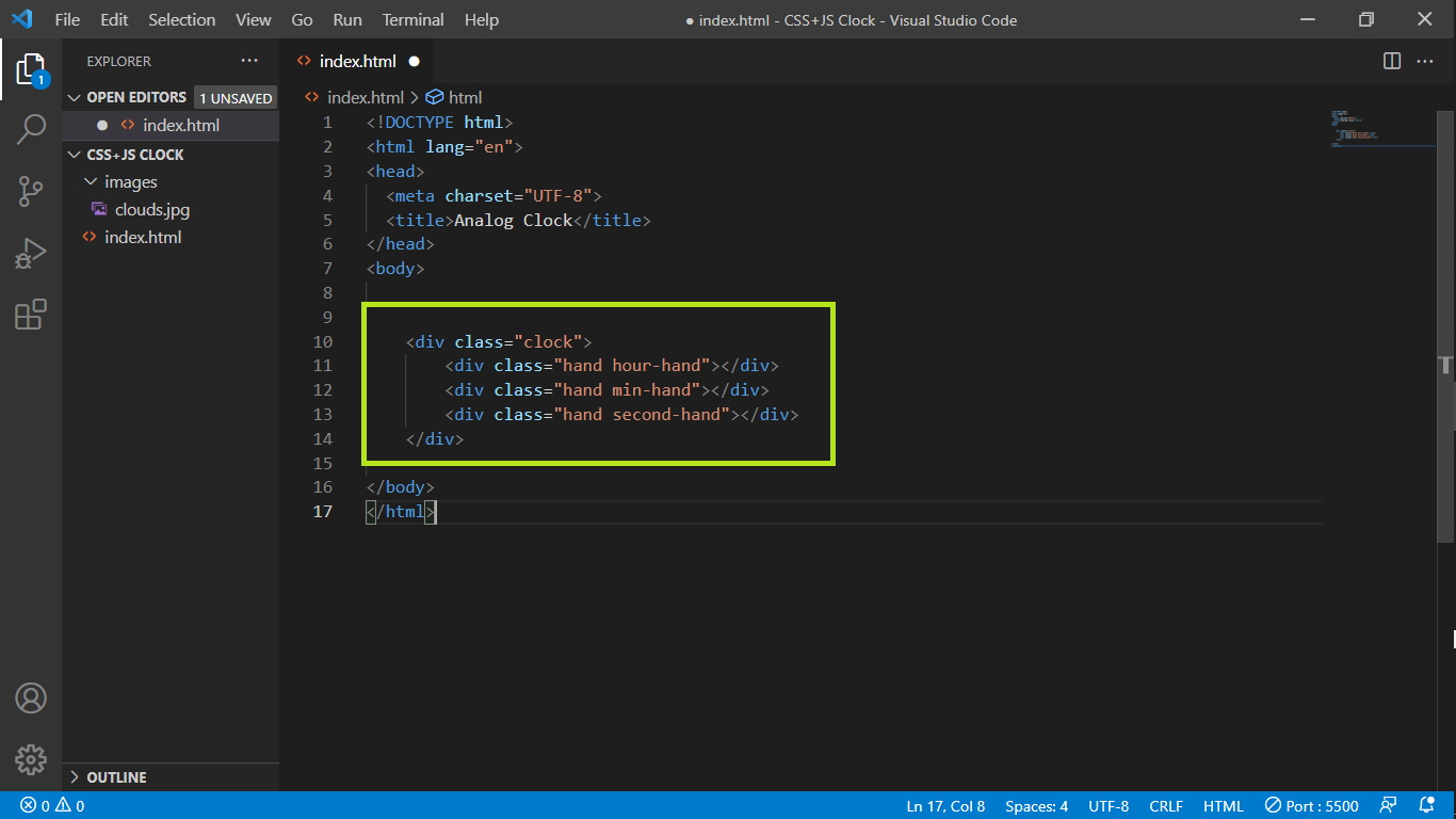
Inside the body, add the div element with the class clock which represents the outline of the clock, and add three div elements that represent the hands of the clock inside the clock class. Oh wow! we are done with HTML.
 index.html
CSS Styling
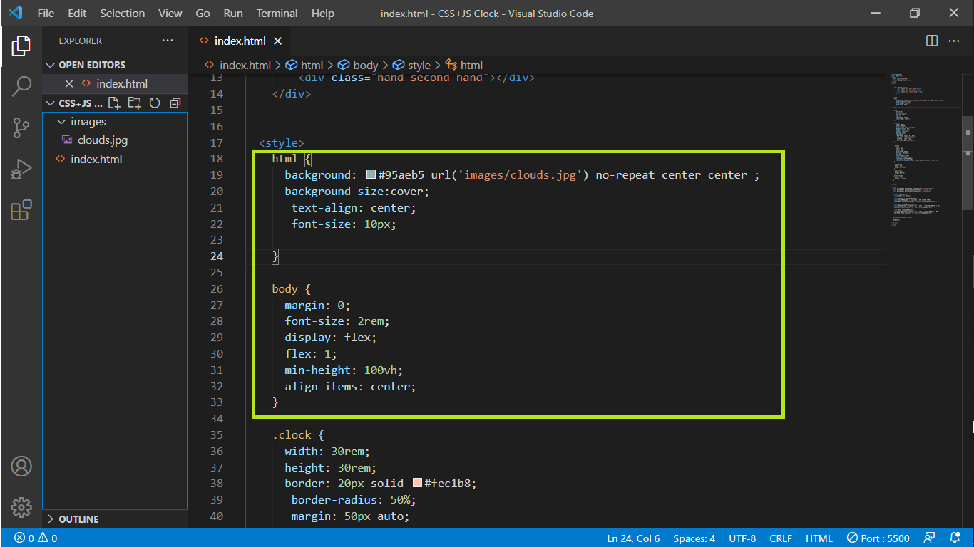
CSS is used to style the different portions and make them more visually appealing. First of all, give the background color or background image of the page in the CSS code with size and alignment.
 index.html
The outline of the clock is circular in shape so let’s set border-radius to 50%. You can experiment on border width and border color.

.clock {
width: 30rem;
height: 30rem;
border: 20px solid #fec1b8;
border-radius: 50%;
margin: 50px auto;
position: relative;
padding: 2rem;
box-shadow:
0 0 0 4px rgba(0,0,0,0.1),
inset 0 0 0 3px #f8a09b,
inset 0 0 10px black,
0 0 10px rgba(0,0,0,0.2);
}
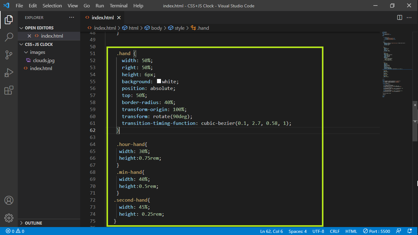
Now, let’s implement the clock hands CSS part. The idea is that we’re going to apply a rotation to each of the hands depending on what time it currently is. I am setting the width, height to place hands in proper positions inside the clock.
transform-origin: 100% will help to rotate the clock hand on the very right-hand side, by default it’s 50%. 100% along the x-axis will put that pivot point on the very right-hand side so, that the right edge of the clock hand will be fixed to the center of the clock.
transform: rotate(90deg);divs are block and they’re left to right, it’s not actually starting at 12:00. So, we could just rotate the entire thing by 90 degrees.
transition-timing-function: cubic-bezier(0.1, 2.7, 0.58, 1); It gives you this tick kind of animation. It goes forward and back, forward and back.
For individual hands add different widths and heights just to differentiate between them. That’s all with the CSS.
 index.html
Javascript logic
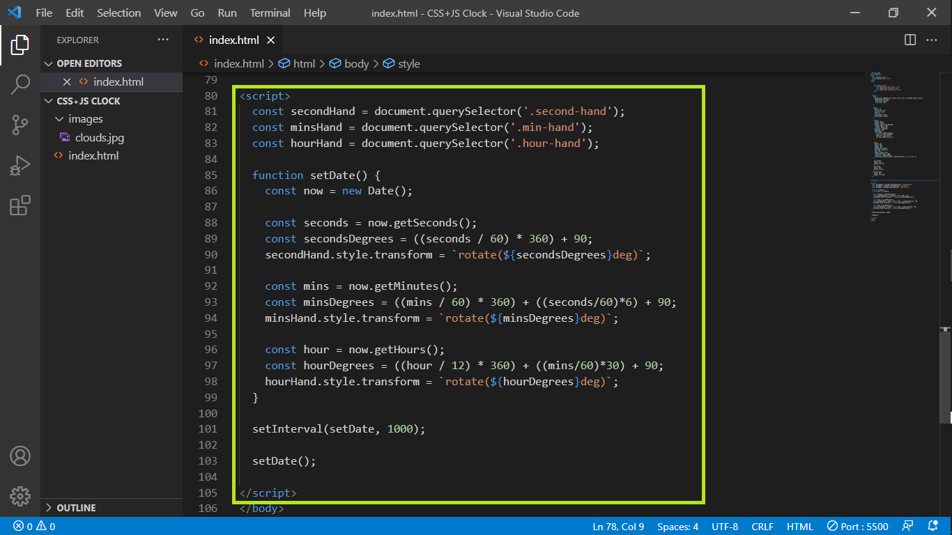
The logic of the player is defined inside the script tag.We are going to grab the reference for the following using querySelector().
.second-hand
.min-hand
.hour-hand
new Date() creates an instance of the Date class from which we can get current date, hours, minutes, seconds, etc.
const now = new Date();
I have stored in 'secondsDegrees' how the second hand will rotate.Then I use rotate(${secondsDegrees}deg) to rotate the hand.I divided by 60 because 1 minute is equal to 60 seconds.I multiplied by 360 because a circle is formed by 360 degrees.
Similarly, I have stored in 'minsDegrees' how to turn the hand of the minute.Then userotate(${minsDegrees}deg) to rotate the hand. I divided by 60 because 1 hour is equal to 60 minutes.Added second hand position with minutes. Because the minute's hand is in the right place depending on the second.
Implemented similar logic on hour hand as well.
We need to call this rotate() function every 1 second (1000 milliseconds).
 index.html
That’s all folks !!
Find the complete source code here.
Thanks for your interest.