Basics of CSS Grid — 3
by Nabendu Biswas / September 8th, 2018
#css #beginners #grid
Series: Grid-basics
Welcome to part-3 of the series. We will look into Sizing Tracks in CSS Grid how. For this we will use this codepen.
This is the initial html and css code.
    <div class="container">
        <div class="item">1</div>
        <div class="item">2</div>
        <div class="item">3</div>
        <div class="item">4</div>
        <div class="item">5</div>
        <div class="item">6</div>
        <div class="item">7</div>
        <div class="item">8</div>
        <div class="item">9</div>
        <div class="item">10</div>
        <div class="item">11</div>
        <div class="item">12</div>
        <div class="item">13</div>
        <div class="item">14</div>
        <div class="item">15</div>

    </div>
    <style>
        .container {
            display: grid;
            grid-gap: 20px;
        }
    </style>
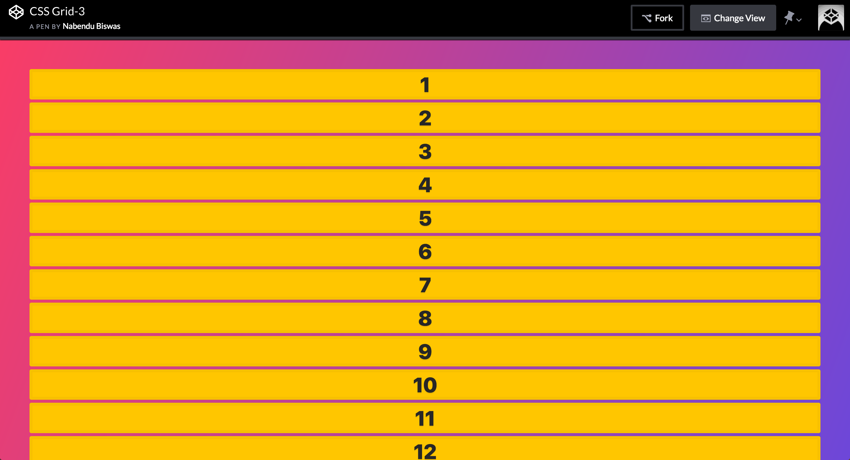 The initial result
Let use the percentage to size the column first by-
    .container {
            display: grid;
            grid-gap: 20px;
            grid-template-columns: 25% 25% 25% 25%;
        }
This will result in below and is not perfect. As you can see that item 4, 8 and 12 are to the edge and not displayed properly. It is because 25% x 4 = 100% plus the grid-gap of 20px is also added.
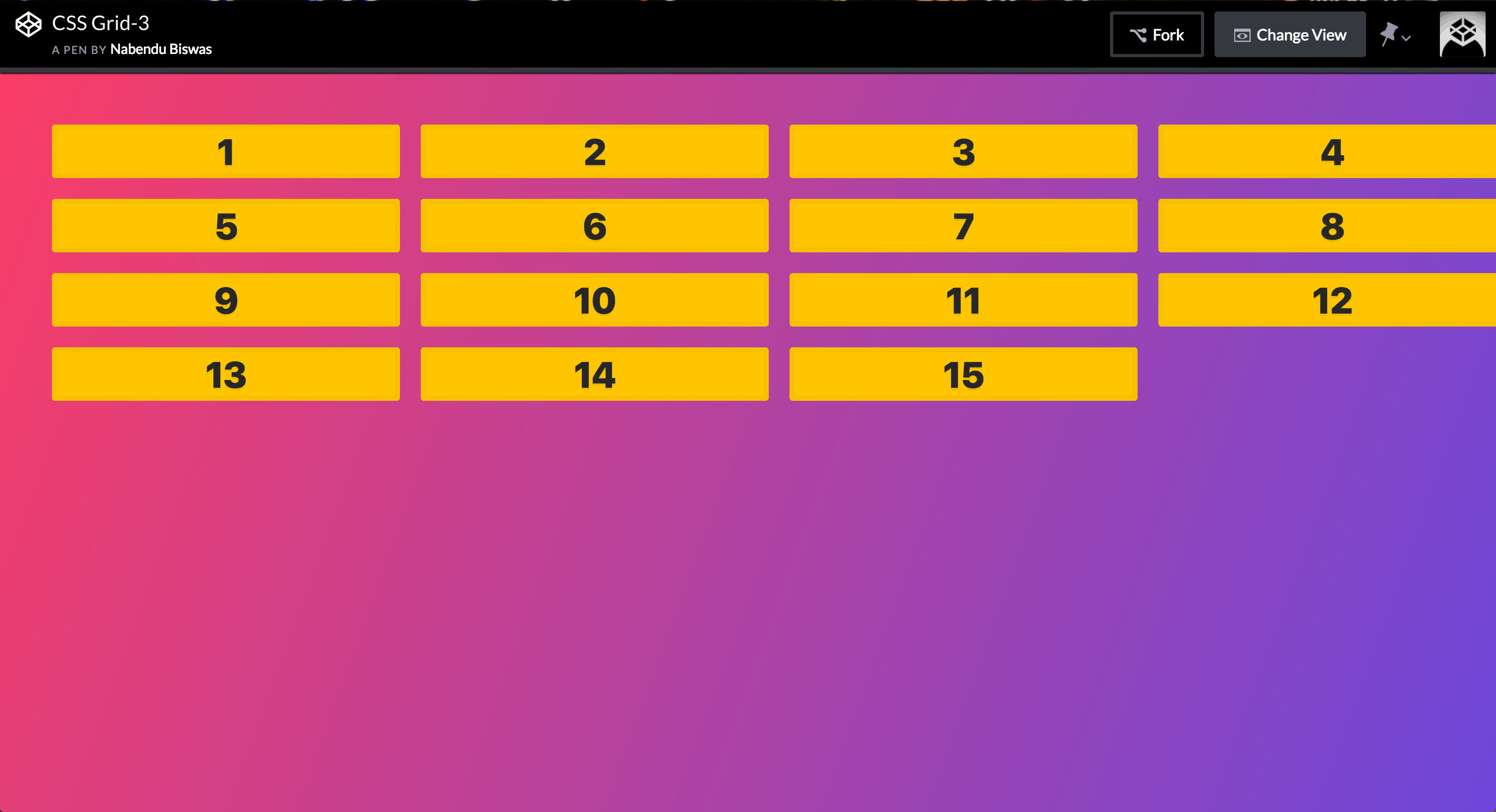 Not good
CSS Grid introduces a new unit called fr. It is the free space left after the explicit width are laid out. To understand, let’s have this basic CSS. We are also using a border to get the space taken by Grid. We have two explicit width column of 200px and 150px respectively.
    .container {
            display: grid;
            grid-gap: 20px;
            border: 5px solid black;
            grid-template-columns: 200px 150px;
        }
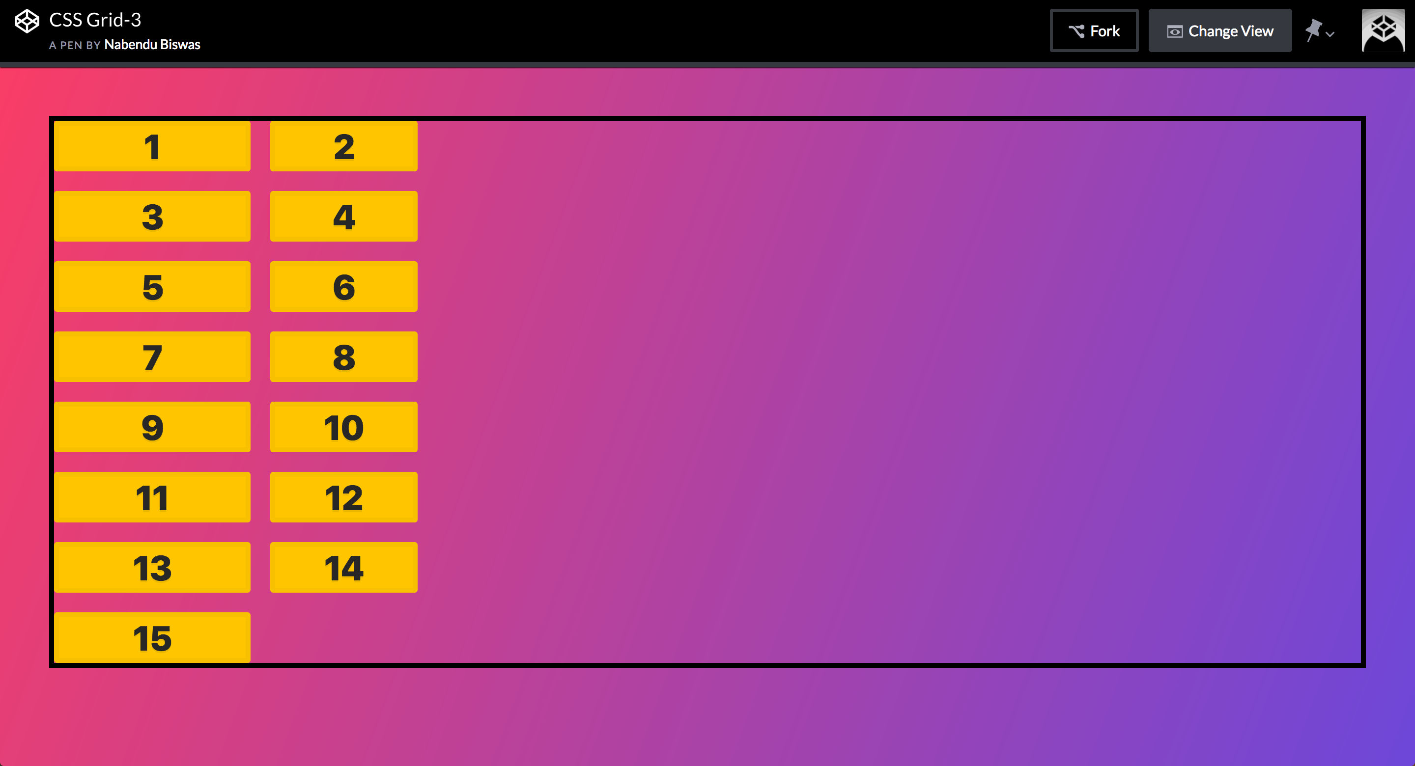 The result
Now we will add a column with 1fr and it will take the space left after the 200px and 150px column laid out.
    .container {
            display: grid;
            grid-gap: 20px;
            border: 5px solid black;
            grid-template-columns: 200px 150px 1fr;
        }
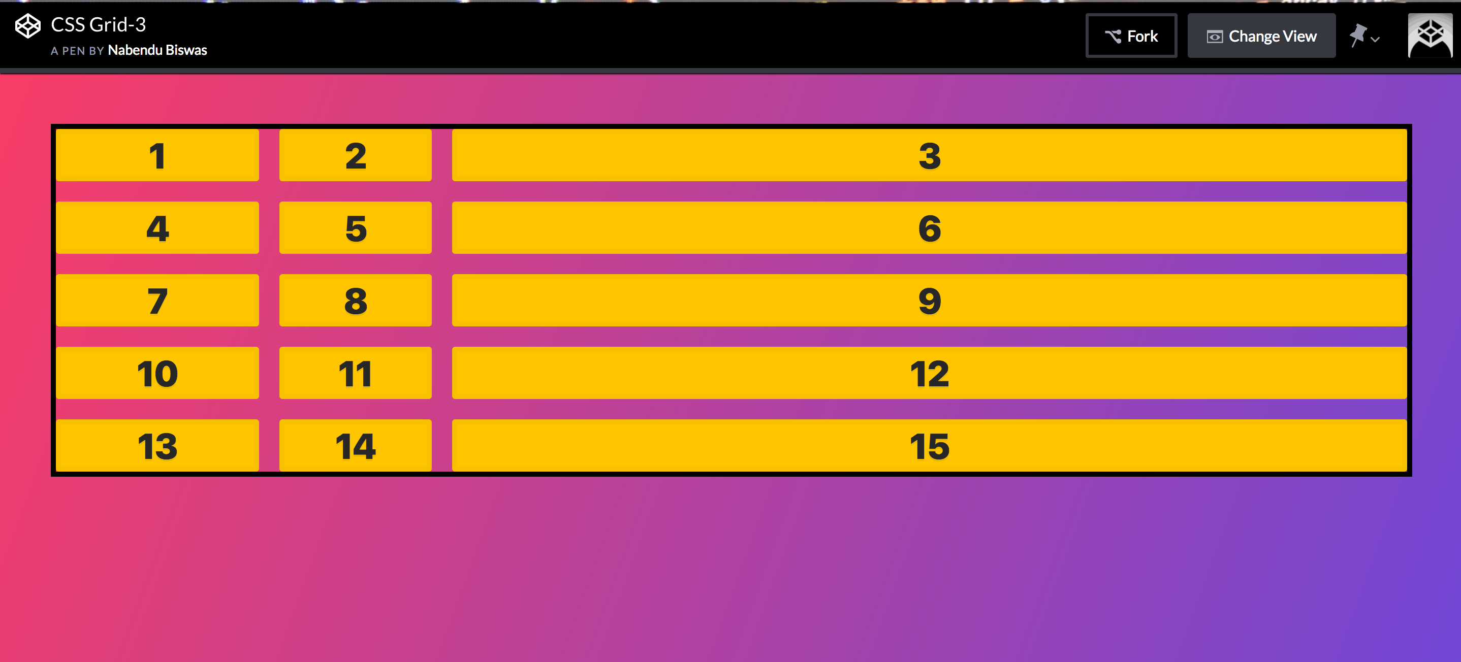 The result
Let now add another column with 2fr. It means the space left after laying 200px and 150px column will be divided into 1fr and 2fr column into 1:2 ratio.
    .container {
            display: grid;
            grid-gap: 20px;
            border: 5px solid black;
            grid-template-columns: 200px 150px 1fr 2fr;
        }
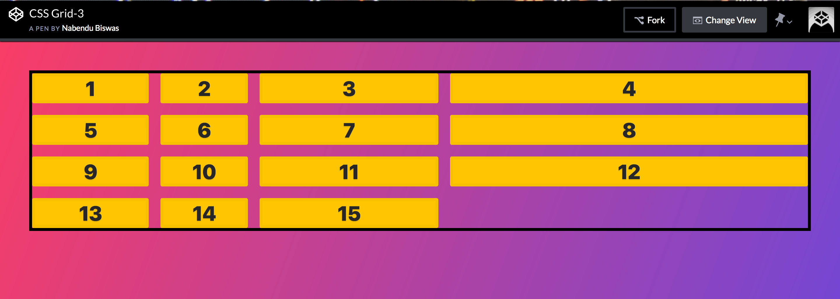 The result
Let look at the auto use to size a track. The auto property gives the column the width of the content. We are having three column of auto 1fr and 2fr size.
    .container {
            display: grid;
            grid-gap: 20px;
            border: 5px solid black;
            grid-template-columns: auto 1fr 2fr;
        }
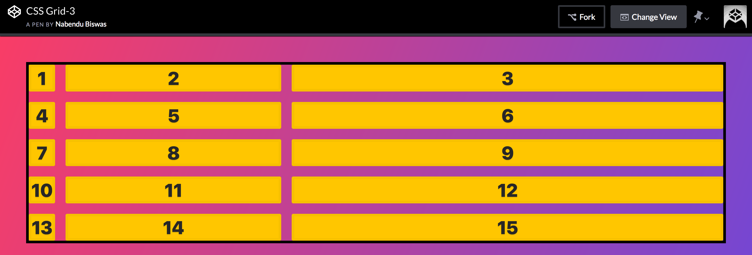 The result
Let’s add some larger content in item 4. It will adjust the whole column according to it.
    <div class="container">
        <div class="item">1</div>
        <div class="item">2</div>
        <div class="item">3</div>
        <div class="item">Nabendu - FrontEnd Developer</div>
        <div class="item">5</div>
        <div class="item">6</div>
        <div class="item">7</div>
        <div class="item">8</div>
        <div class="item">9</div>
        <div class="item">10</div>
        <div class="item">11</div>
        <div class="item">12</div>
        <div class="item">13</div>
        <div class="item">14</div>
        <div class="item">15</div>

    </div>
    <style>
        .container {
            display: grid;
            grid-gap: 20px;
            border: 5px solid black;
            grid-template-columns: auto 1fr 2fr;
        }
    </style>
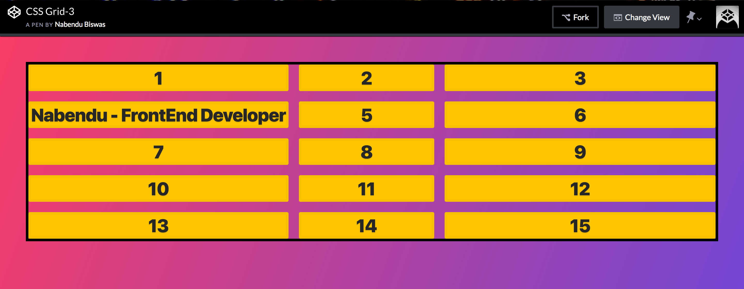 The result
We will understand one more concept of repeat here. The repeat function takes two parameters -One the times something to be repeated and the other the sizing. For example repeat(2, 1fr) means 1fr 1fr.
Let have below code which will create 4 column of auto 1fr 1fr 2fr using repeat function.
    .container {
            display: grid;
            grid-gap: 20px;
            border: 5px solid black;
            grid-template-columns: auto repeat(2, 1fr) 2fr;
        }
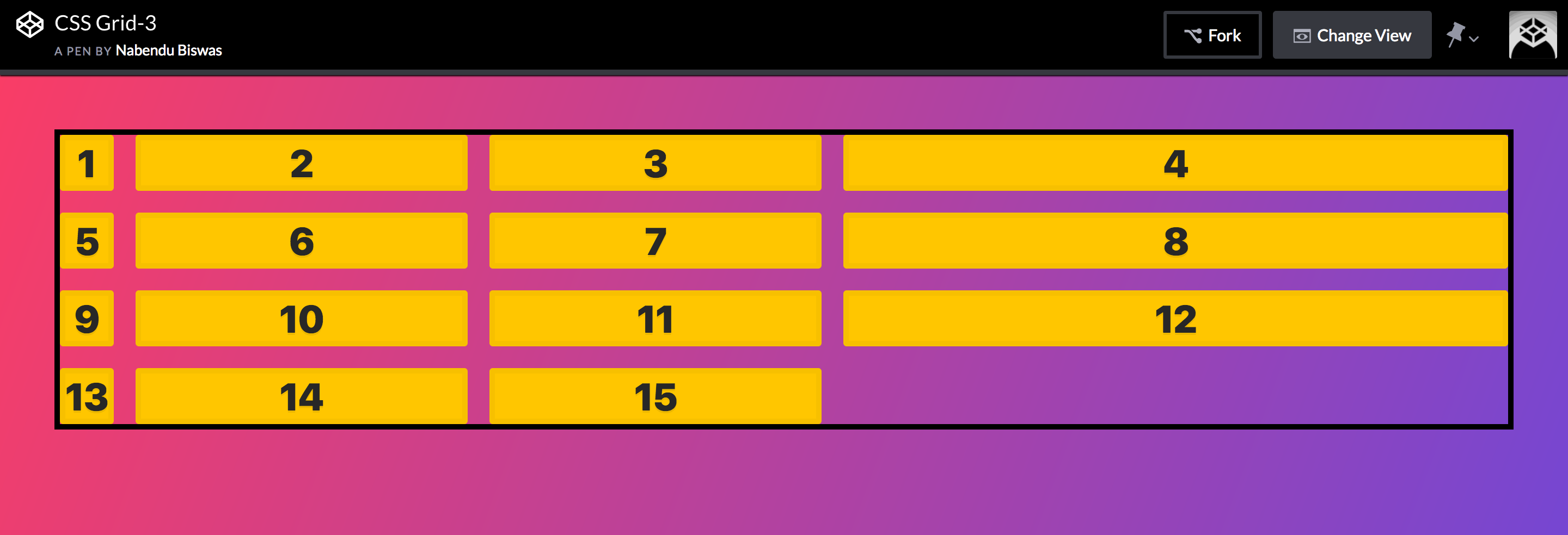 The result
The repeat function can be used in another way also. If we give repeat(2, 1fr 2fr) it means create 4 columns as 1fr 2fr 1fr 2fr.
    .container {
            display: grid;
            grid-gap: 20px;
            border: 5px solid black;
            grid-template-columns: auto repeat(2, 1fr 2fr) ;
        }
 The result
This concludes Part-3 of the series.