Basics of Flexbox — 1
by Nabendu Biswas / April 29th, 2018
#css #beginners #webdev
Series: Flexbox-basics
I have been developing sites for quite sometime now. First using Javascript, then React. Always have sort of ignored CSS because floats were weird and not responsive. So, taken the shortcut and start designing these cool layouts in Bootstrap and concentrating on the programming in JS part. But now been excited about CSS again. I am learning CSS again, now with flexbox and soon will learn CSS grid.
I used to think Flexbox is just a display property, but heard about them a lot on the awesome Podcast by Wes Bos and Scott Tolinski - Syntax
The best resource to learn about Flexbox is this article on CSS tricks. Also if you want to learn designing a complete web layout, check here
And then there is this awesome free tutorial from Wes Bos
I am creating this in codepen. Let’s first create our html structure.
<html>
<head>
    <title>Flexbox Basics</title>
</head>
<body>
    <div class="container">
        <div class="box box1">1</div>
        <div class="box box2">2</div>
        <div class="box box3">3</div>
        <div class="box box4">4</div>
        <div class="box box5">5</div>
        <div class="box box6">6</div>
        <div class="box box7">7</div>
        <div class="box box8">8</div>
        <div class="box box9">9</div>
        <div class="box box10">10</div>
    </div>
</body>
</html>
And then the CSS
* {
    box-sizing: border-box;
}
.box{
    color: white;
    font-size: 100px;
    text-align: center;
    padding: 10px;
}
.box1 {background: red;}
.box2 {background: green;}
.box3 {background: yellow;}
.box4 {background: brown;}
.box5 {background: orange;}
.box6 {background: purple;}
.box7 {background: black;}
.box8 {background: magenta;}
.box9 {background: silver;}
.box10 {background: teal;}
After adding this you will see, this as output.
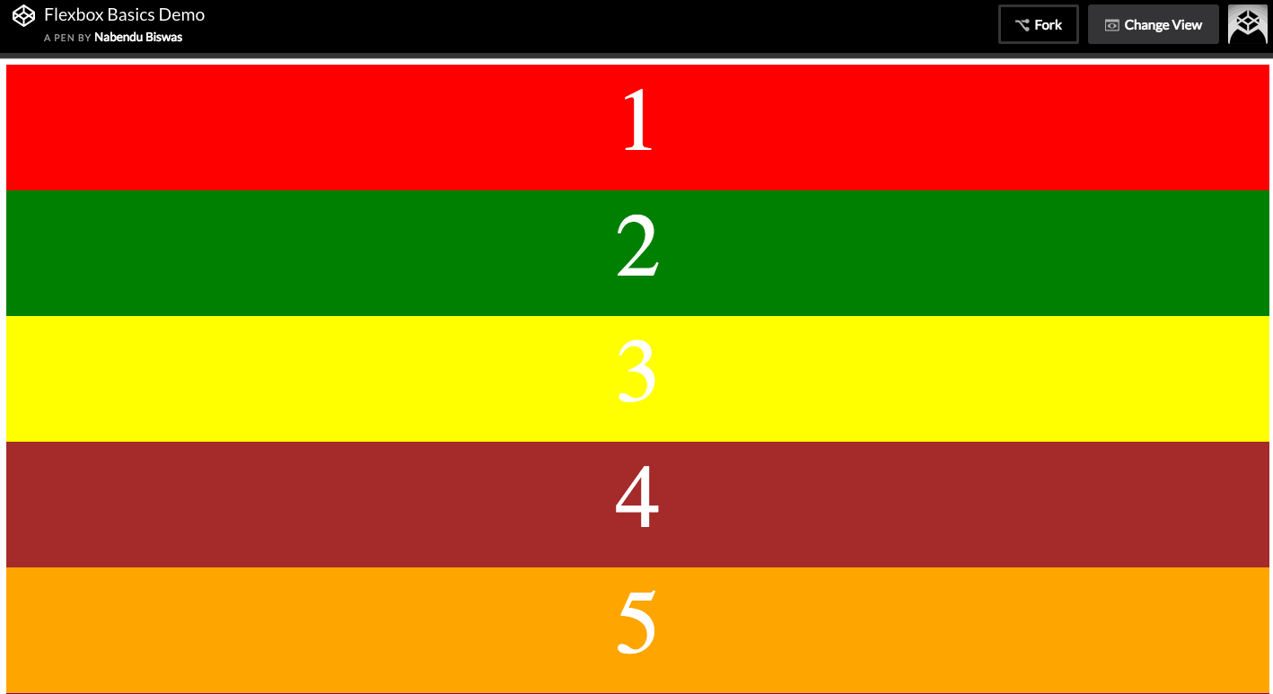 Output
Now, lets make our container a flex and also, show a border to understand what it does.
.container {
    display: flex;
    border: 5px solid goldenrod
}
Now, what it basically does is align everything in a single row.
 display: flex
There is an inline-flex also, which will have the width only till the elements.
.container {
    display: inline-flex;
    border: 5px solid goldenrod
}
 display: inline-flex
Flex Direction Now, we will learn about flex-directions, but let’s first make the height of our flex-items to be 100%.
.container {
    display: flex;
    border: 5px solid goldenrod;
    height: 100vh;
}
It will show the output as below.
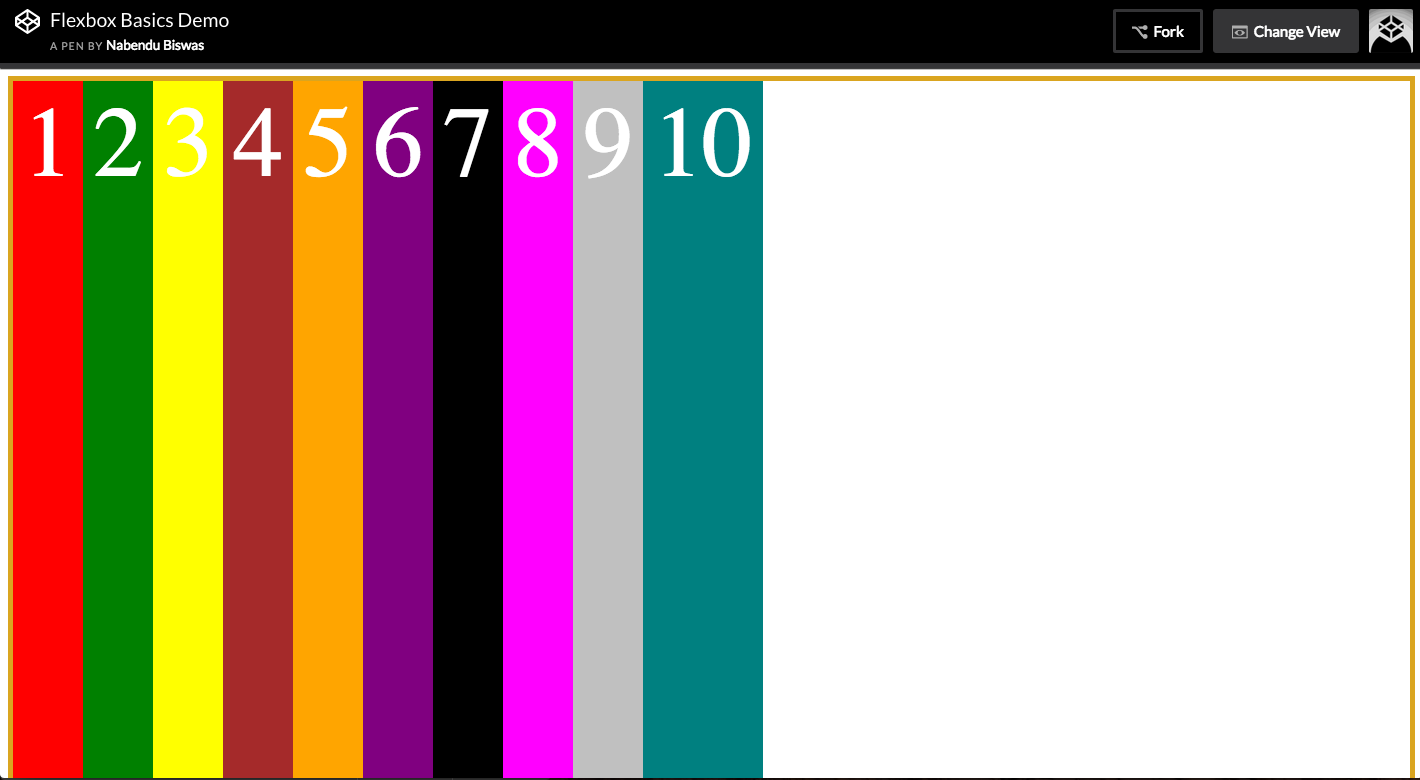 height: 100vh
Now the flex-direction is the direction in which the main axis flow. It is default row.
.container {
    display: flex;
    border: 5px solid goldenrod;
    height: 100vh;
    flex-direction: row;
}
It will output the same as above, but note Main axis is left to right-
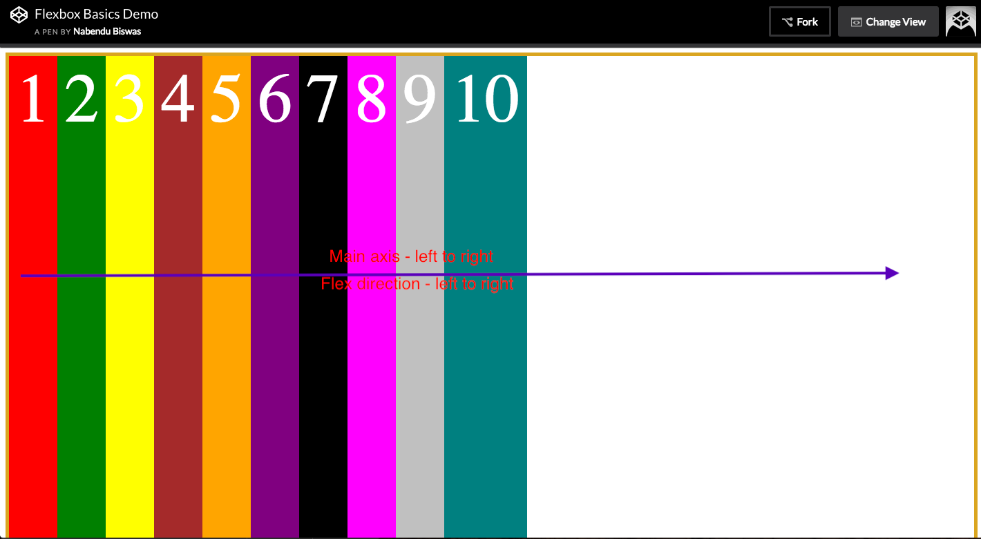 Main axis is left to right
Now let’s do flex-direction: column.
.container {
    display: flex;
    border: 5px solid goldenrod;
    height: 100vh;
    flex-direction: column;
}
Check the output, all the items are stacked top to bottom, as the main axis is now top to bottom.
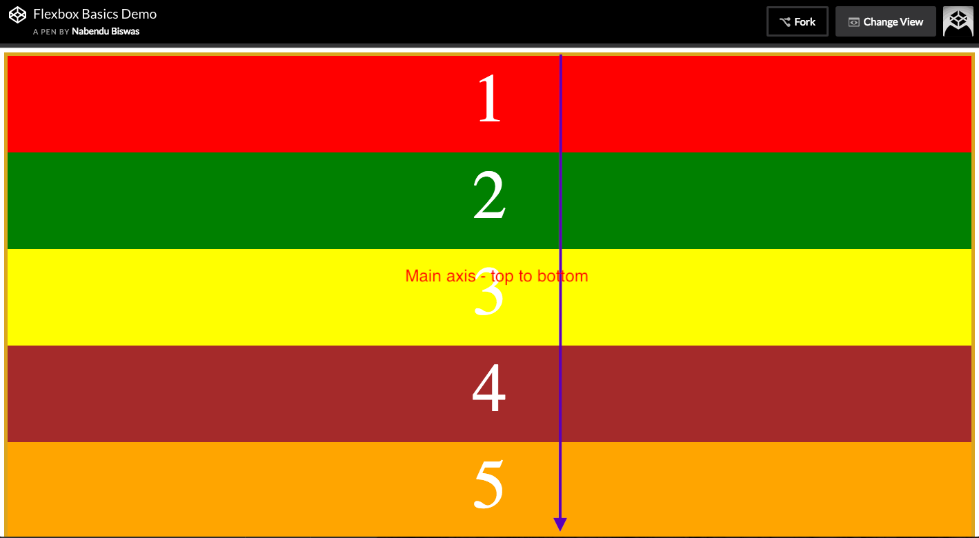 main axis is now top to bottom.
Now, there are two more properties, which we hardly use in Production sites but they are there. They are row-reverse - Main axis will become right to left column-reverse — Main axis will become bottom to top.
Flex wrap Now we will learn about the property flex-wrap. We will use the below.
.container {
    display: flex;
    border: 5px solid goldenrod;
    height: 100vh;
}
.box {
    width: 300px
}
It will show as below. What flex is doing, is first calculating the width ie 300px x 10 = 3000px. But by display is not 3000px wide. It is around 1280 px.
So, flexbox distribute the space among 10 rows.
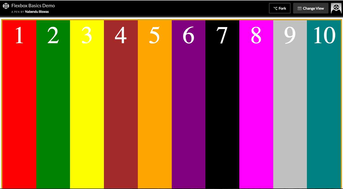 Distributing space
Now, we don’t want this. And want our flex-items to be 300 px wide. We do it by setting flex-wrap: wrap on the parent container.
.container {
    display: flex;
    border: 5px solid goldenrod;
    height: 100vh;
    flex-wrap: wrap
}
.box {
    width: 300px
}
It will make every item of 300 px wide and if not find any space on the row, then wrap it to the next row.
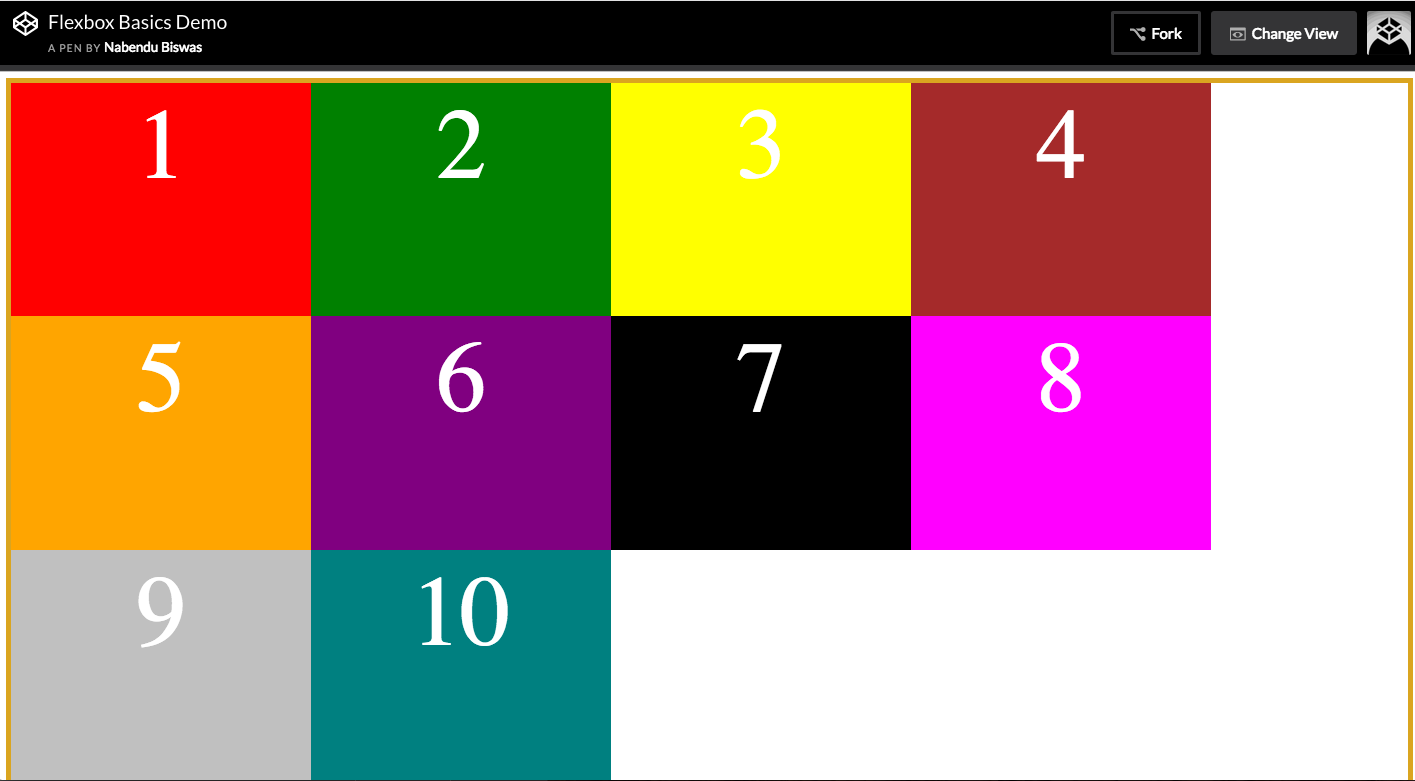 flex-wrap: wrap
We can also give the width 33.333% for 3 items to nicely fill a row (33.333 x 3 = 99.999)
.container {
    display: flex;
    border: 5px solid goldenrod;
    height: 100vh;
    flex-wrap: wrap
}
.box {
    width: 33.3333%
}
It will show as below.
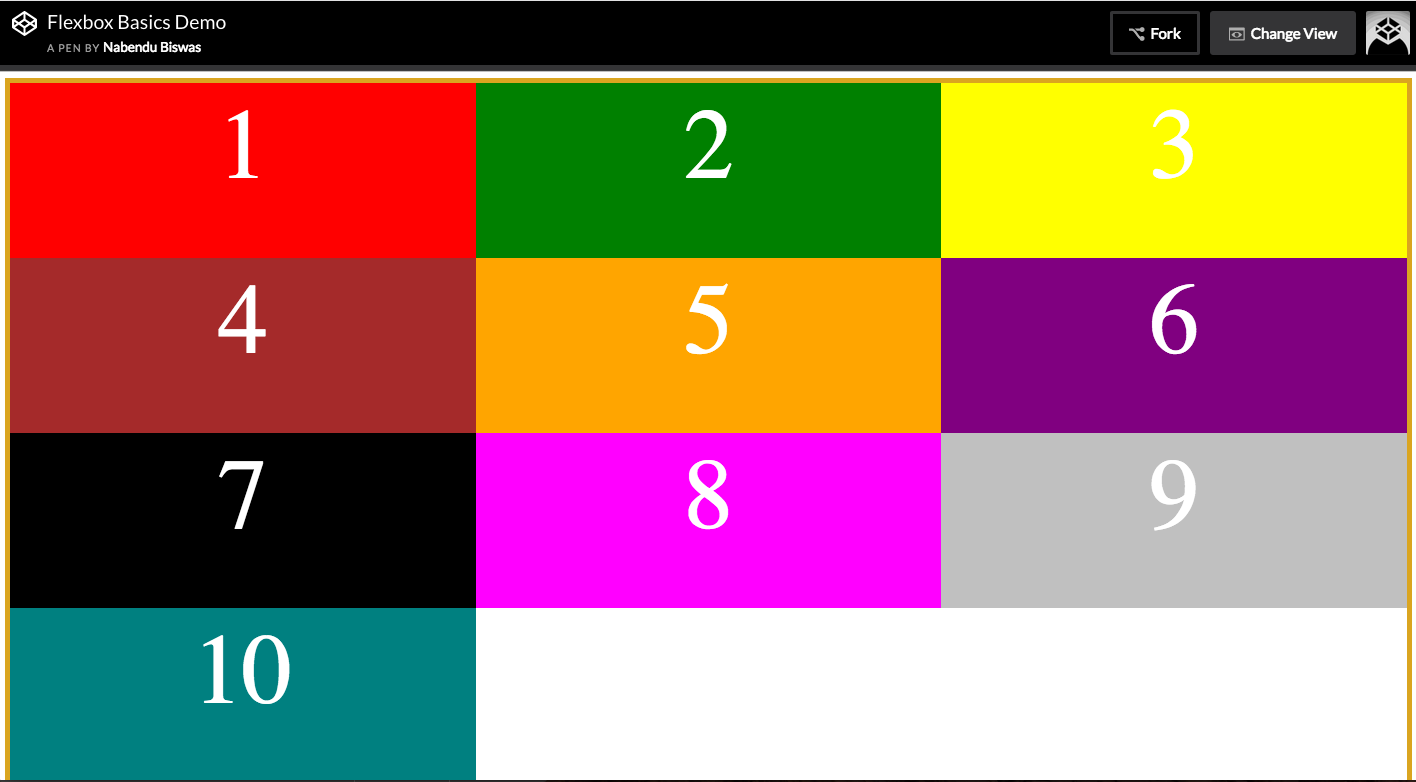 width: 33.3333%
Below is a cool trick, to give margin between these boxes. We have to do this as margin is not part of box model.
.container {
    display: flex;
    border: 5px solid goldenrod;
    height: 100vh;
    flex-wrap: wrap
}
.box {
    width: calc(33.3333% — 20px);
    margin: 10px;
}
This will produce.
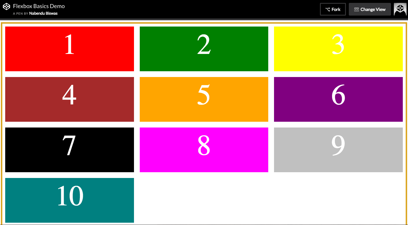 width: calc(33.3333% — 20px);
The same can be applied with help of border. As border is part of box model, we don’t need the calc to minus anything.
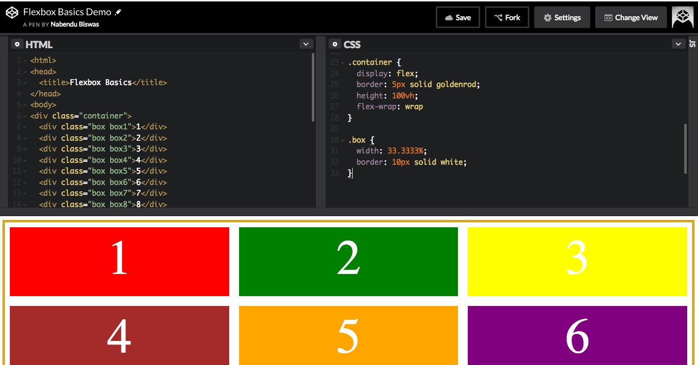 space using border
Flexbox Ordering Is a way to move the ordering of your flex-items.
For this demo, we will use flex: 1 in our flex-item. We will learn more about this later. It basically fills the whole row.
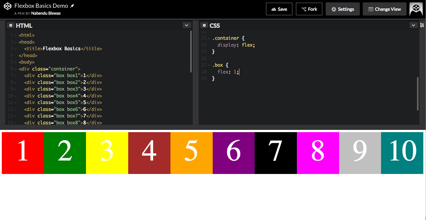 flex:1
The order property takes the item to the order of flow and place it as mentioned. As from below image the item 3 and 5 are at the end, because we have set there order to 1 and 2 respectively. The items 1 to 10 will become order 0, by default.
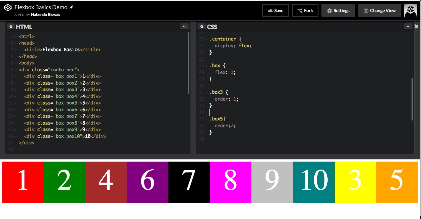 order: 1