Basics of Flexbox — 2
by Nabendu Biswas / May 1st, 2018
#css #beginners #webdev
Series: Flexbox-basics
Welcome to Part-2 of the series. We will be start where, we had left in the first part.
Alignment & Centring
We will learn alignment and centring here.
We will use this basics CSS here and modify it.
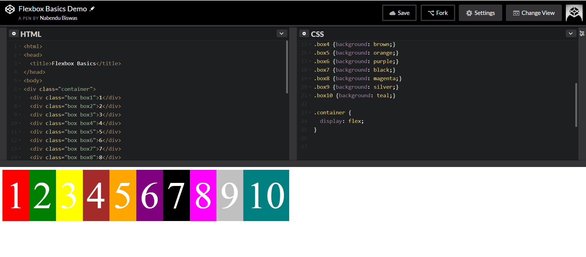 Basic CSS to be used
We will use justify-content here. This CSS tricks article is a great place for reference. We will see all the options here. We will have a border to make things clear.
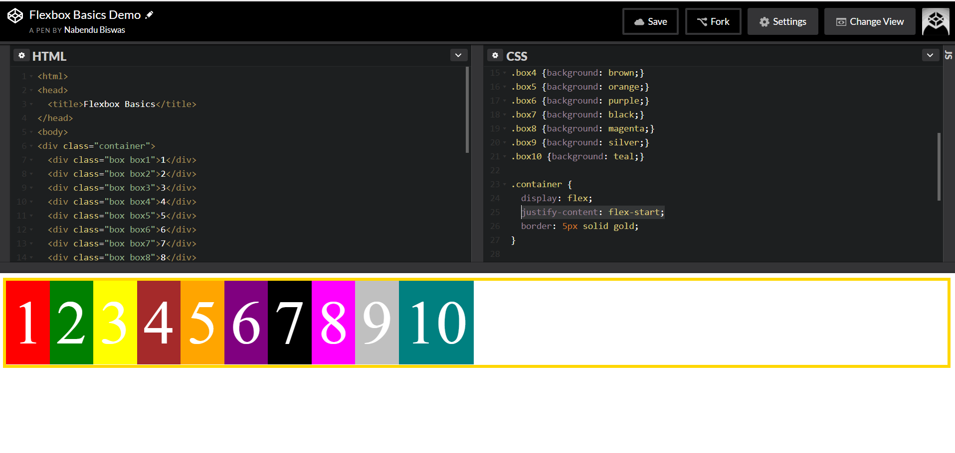 justify-content: flex-start;
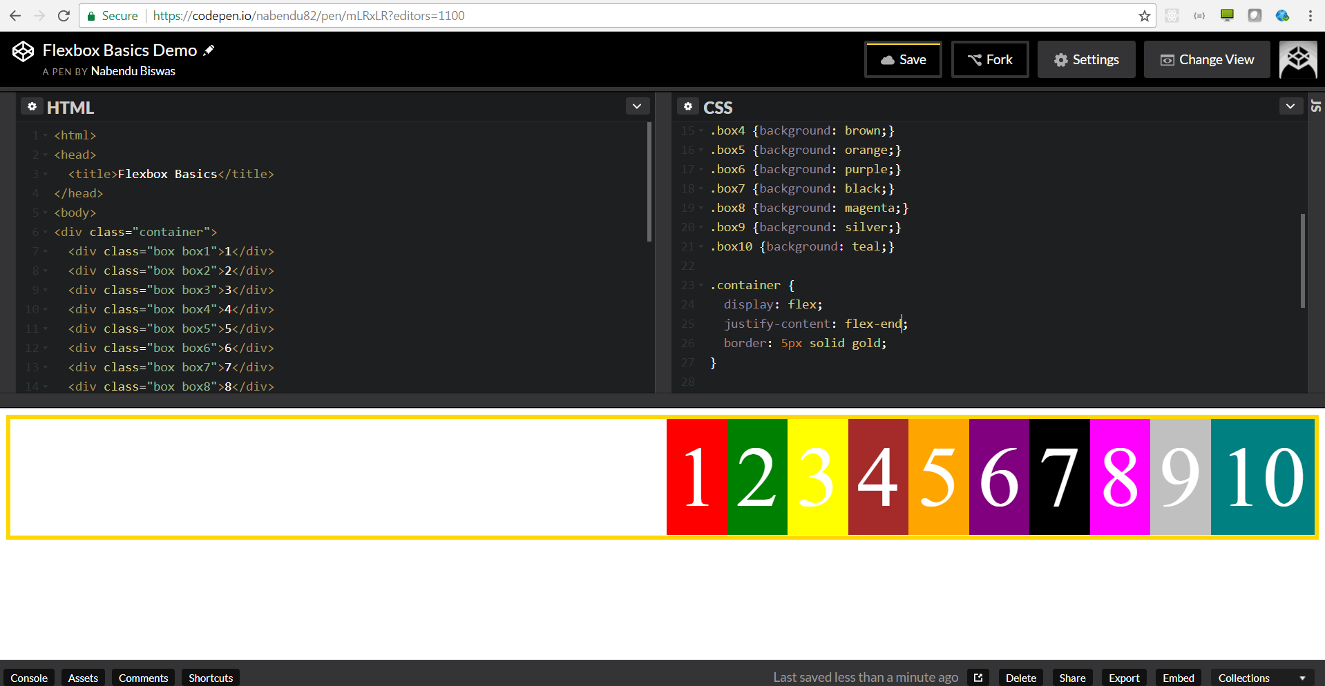 justify-content: flex-end;
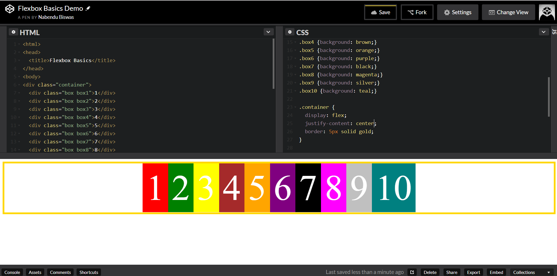 justify-content: center;
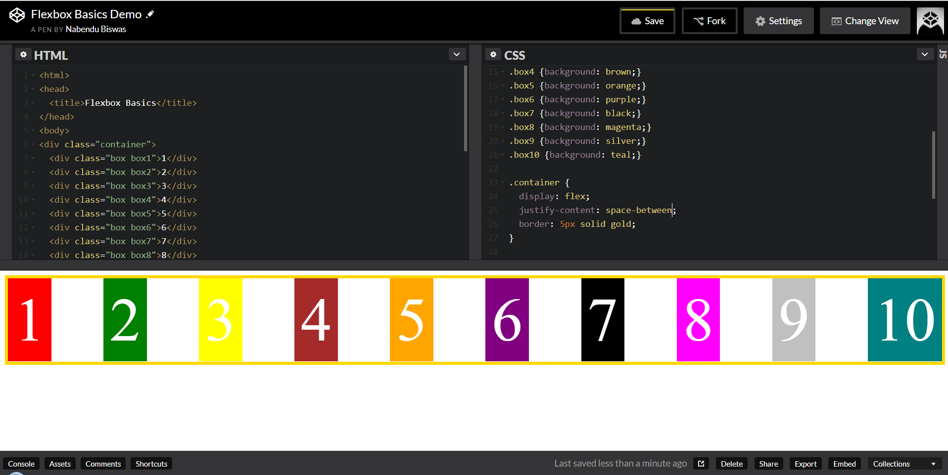 justify-content: space-between;
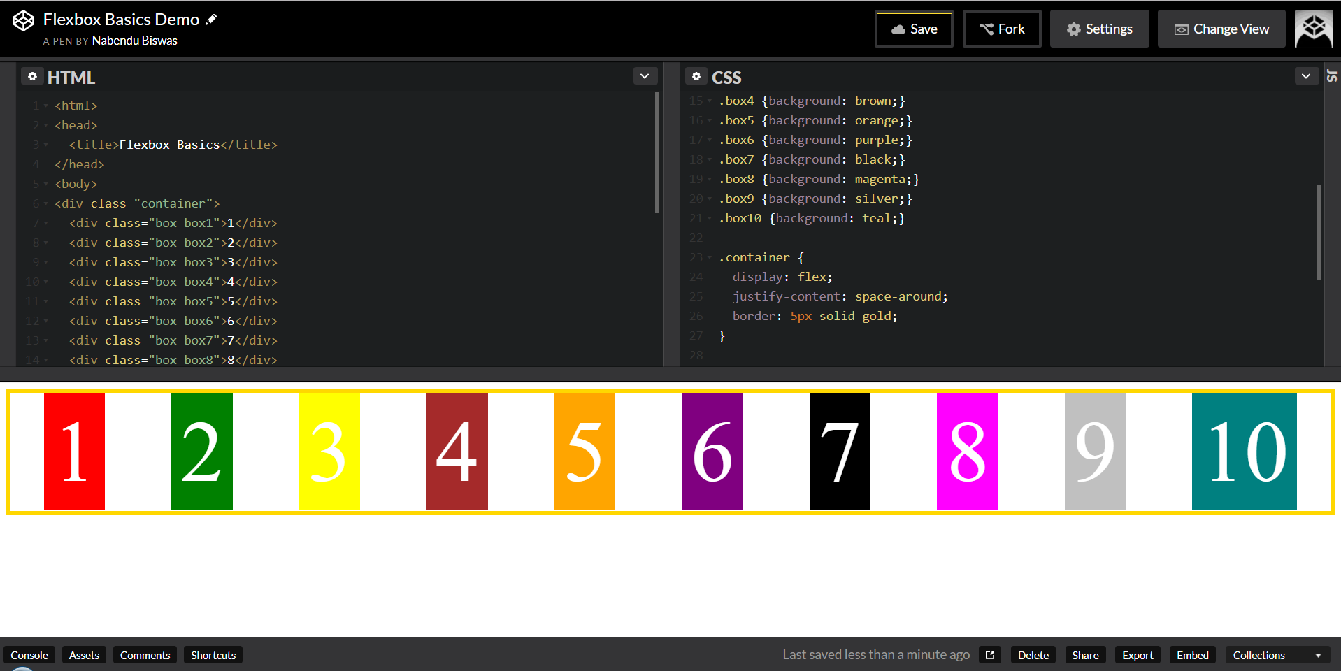 justify-content: space-around;
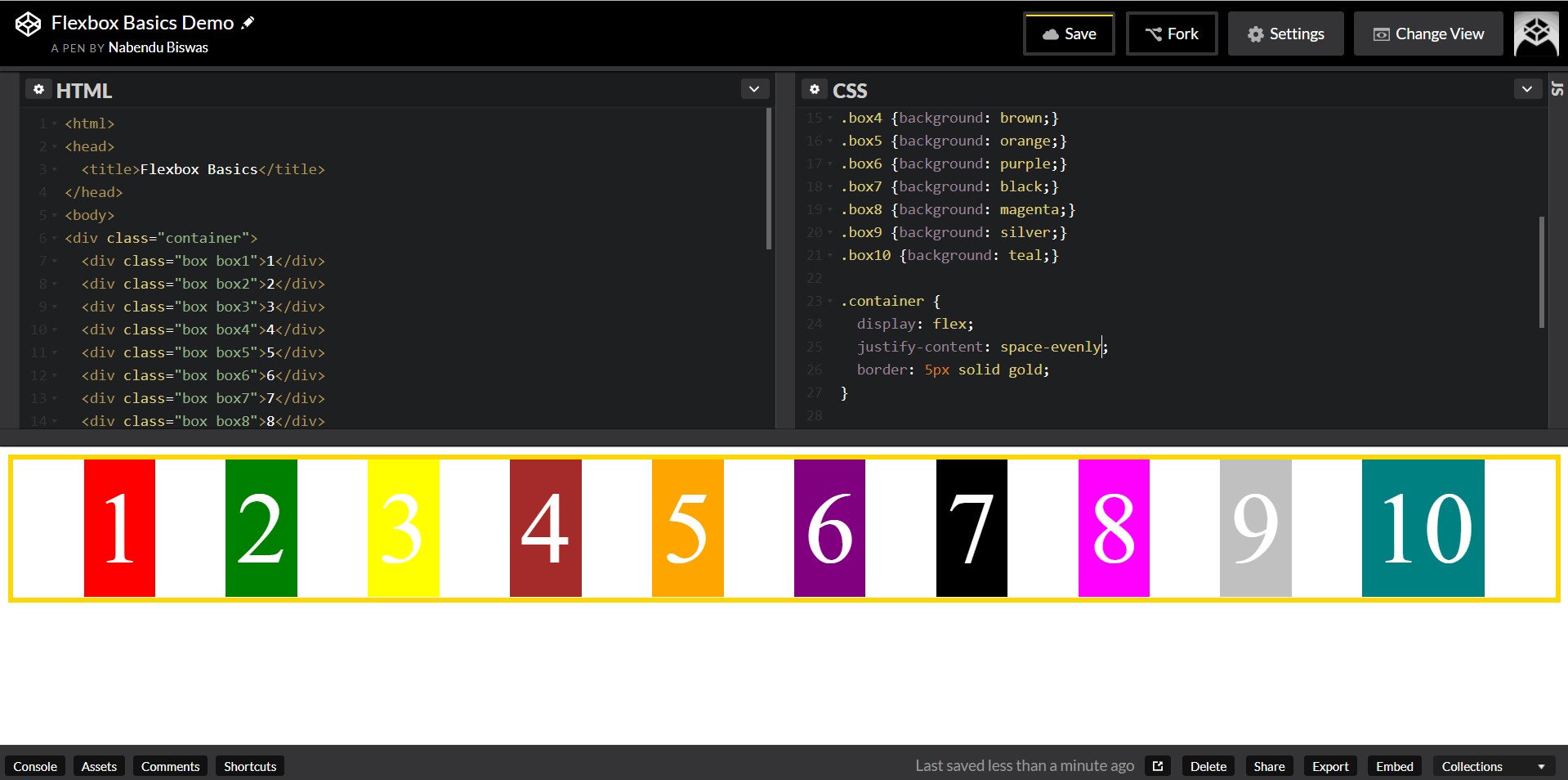 justify-content: space-evenly;
Flex Direction
The direction of the main-axis
The flex-direction is the direction of the main axis. By default it is row ie from left to right. Let’s keep this settings, then we will change the flex-direction.
.box{
  color: white;
  font-size: 30px;
  text-align: center;
  padding: 10px;
}
.container {
  display: flex;
  justify-content: flex-end;
  border: 5px solid gold;
  flex-direction: column;
  min-height: 100vh;
}
Now, when we make the flex-direction: column, it changes the main axis from top to bottom and we will get this.
Now, when we change the justify-content to different properties, we will get everything from top to down.
.container {
  display: flex;
  justify-content: flex-start;
  border: 5px solid gold;
  flex-direction: column;
  min-height: 100vh;
}
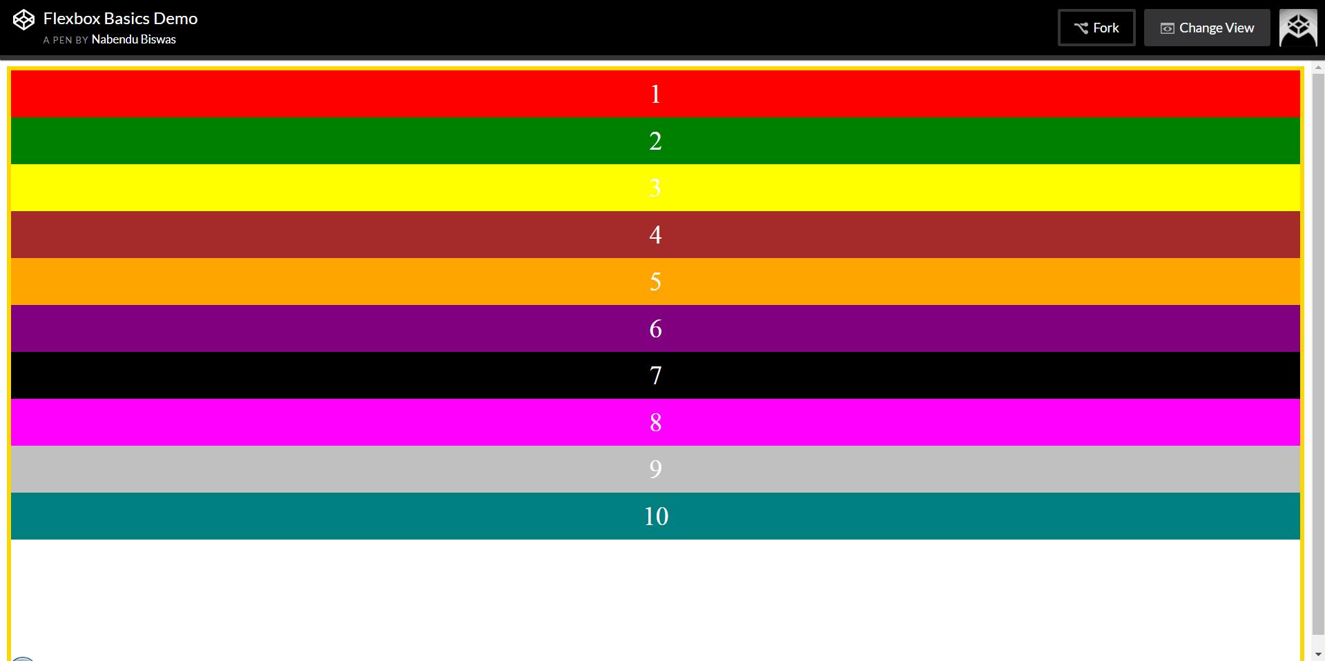 justify-content: flex-start;
.container {
  display: flex;
  justify-content: flex-end;
  border: 5px solid gold;
  flex-direction: column;
  min-height: 100vh;
}
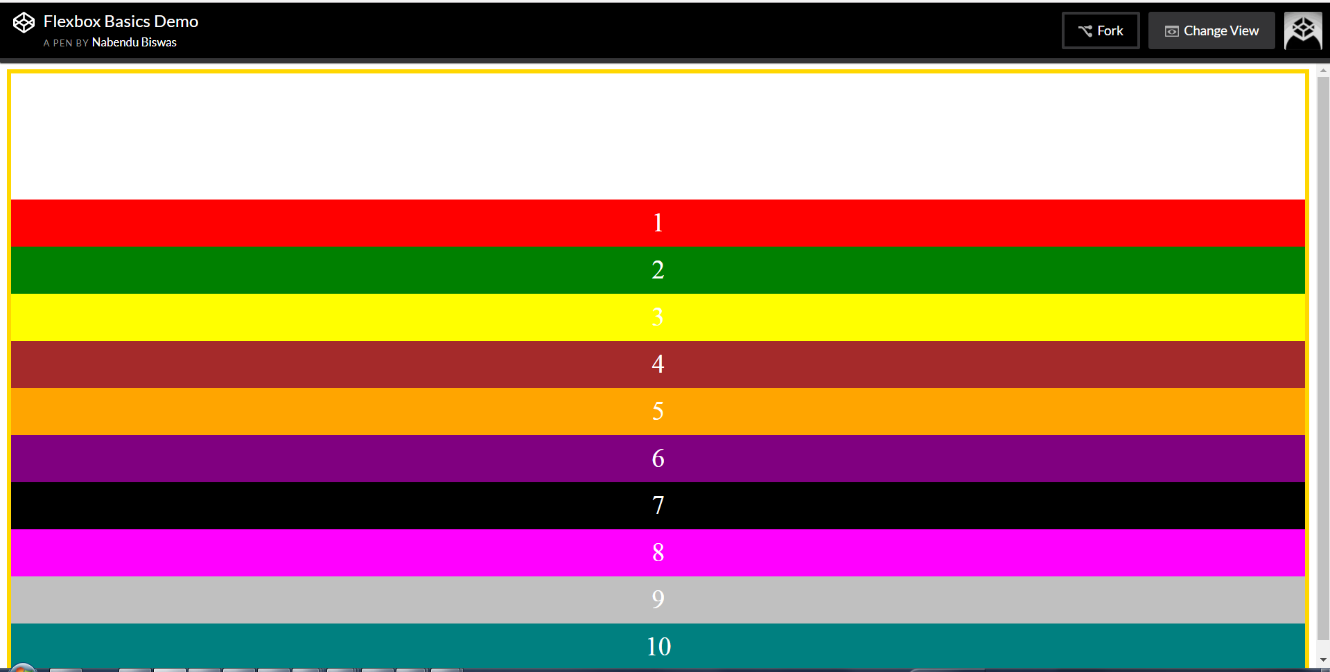 justify-content: flex-end;
.container {
  display: flex;
  justify-content: center;
  border: 5px solid gold;
  flex-direction: column;
  min-height: 100vh;
}
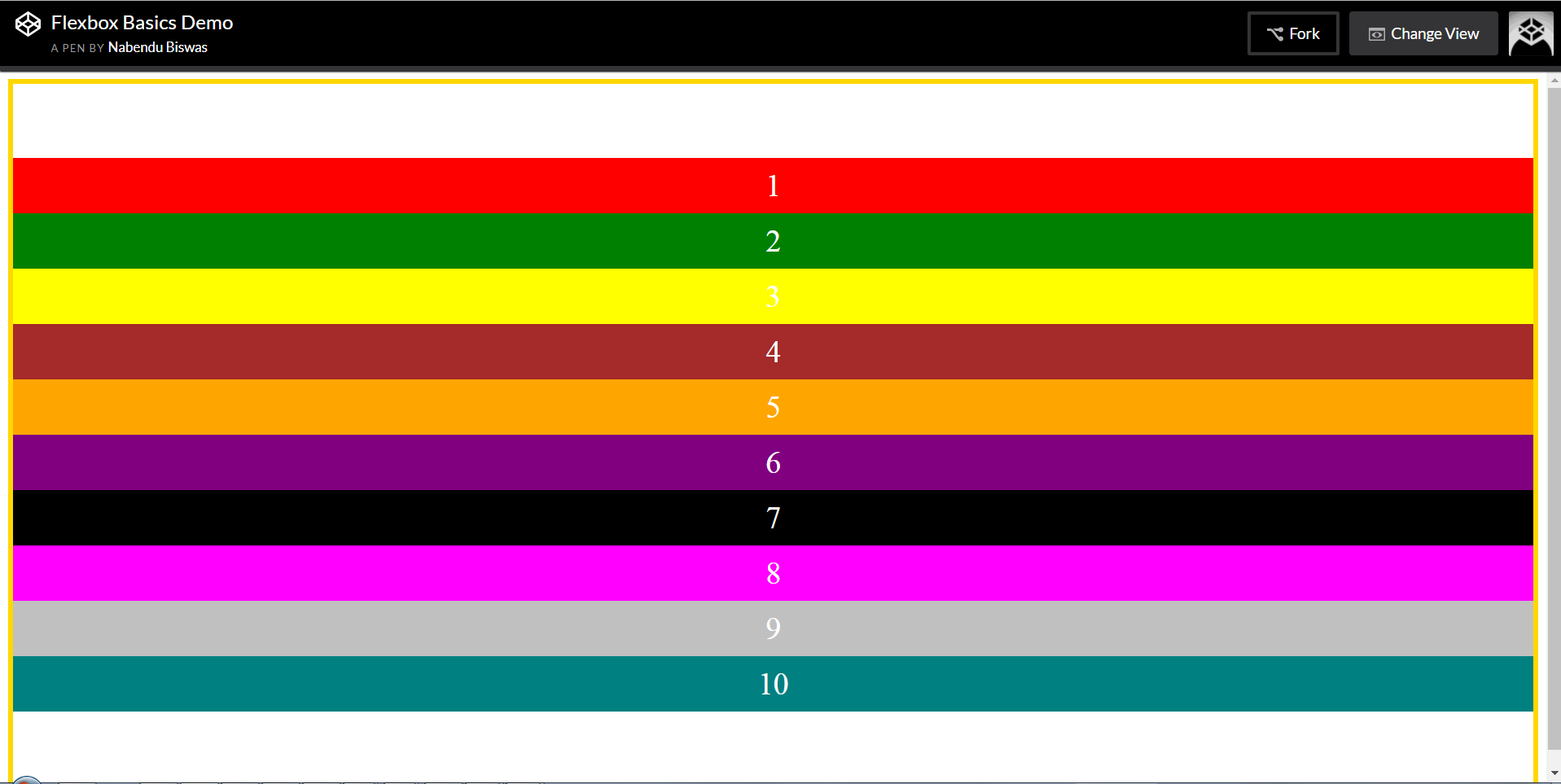 justify-content: center; — Nice trick to center the content on the screen
.container {
  display: flex;
  justify-content: space-between;
  border: 5px solid gold;
  flex-direction: column;
  min-height: 100vh;
}
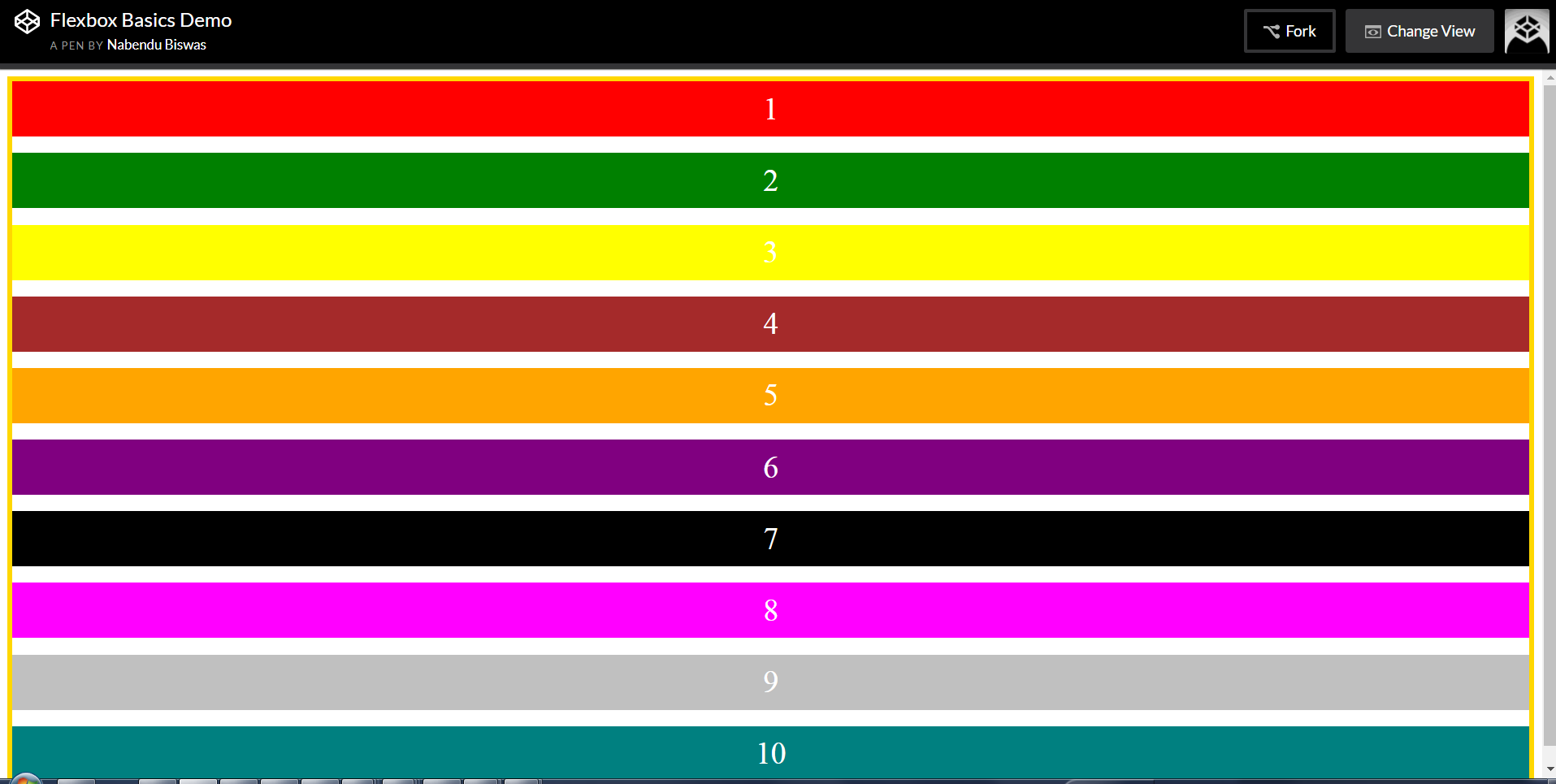 justify-content: space-between;
Align Item
To align the item on the cross-axis. It is opposite of justify-content.
We will use this as base.
.box{
  color: white;
  font-size: 100px;
  text-align: center;
  padding: 10px;
}
.container {
  display: flex;
  border: 5px solid gold;
  height: 100vh;
}
My default the align-item value is stretch
.container {
  display: flex;
  border: 5px solid gold;
  height: 100vh;
  align-items: stretch
}
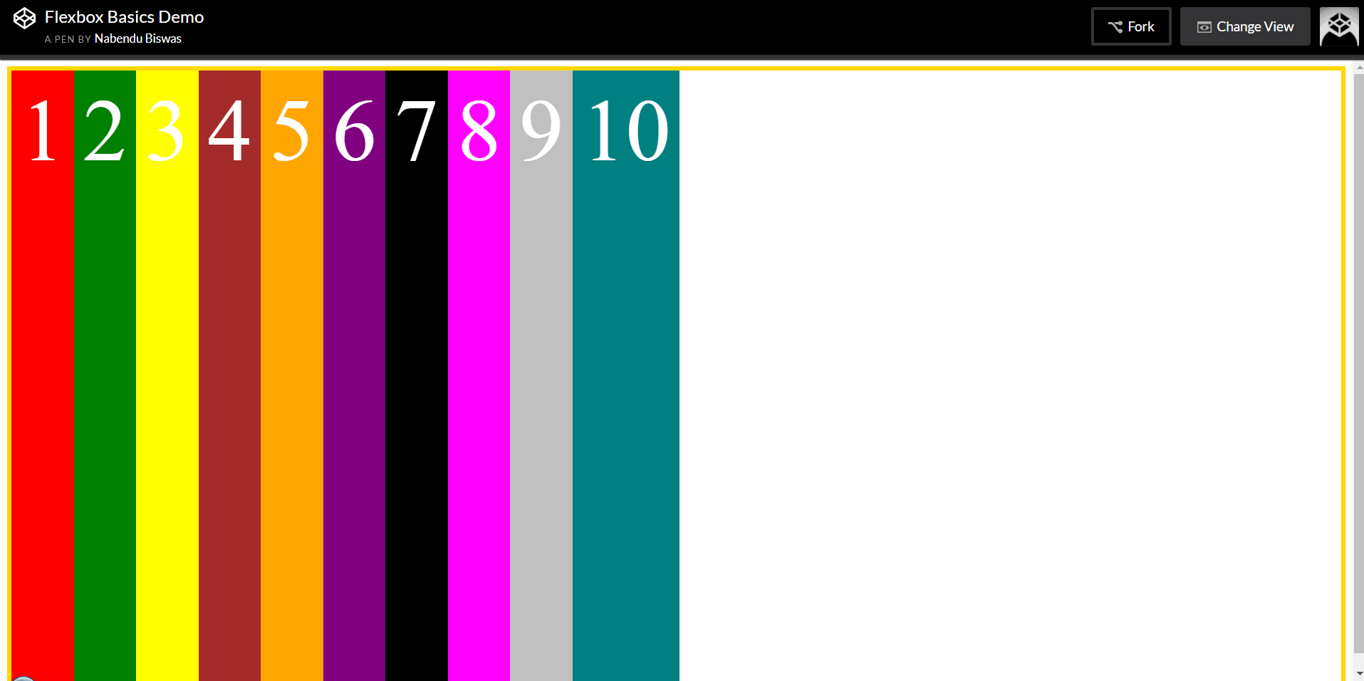 align-items: stretch
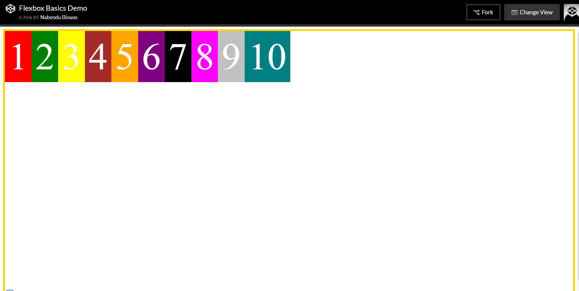 align-items: flex-start
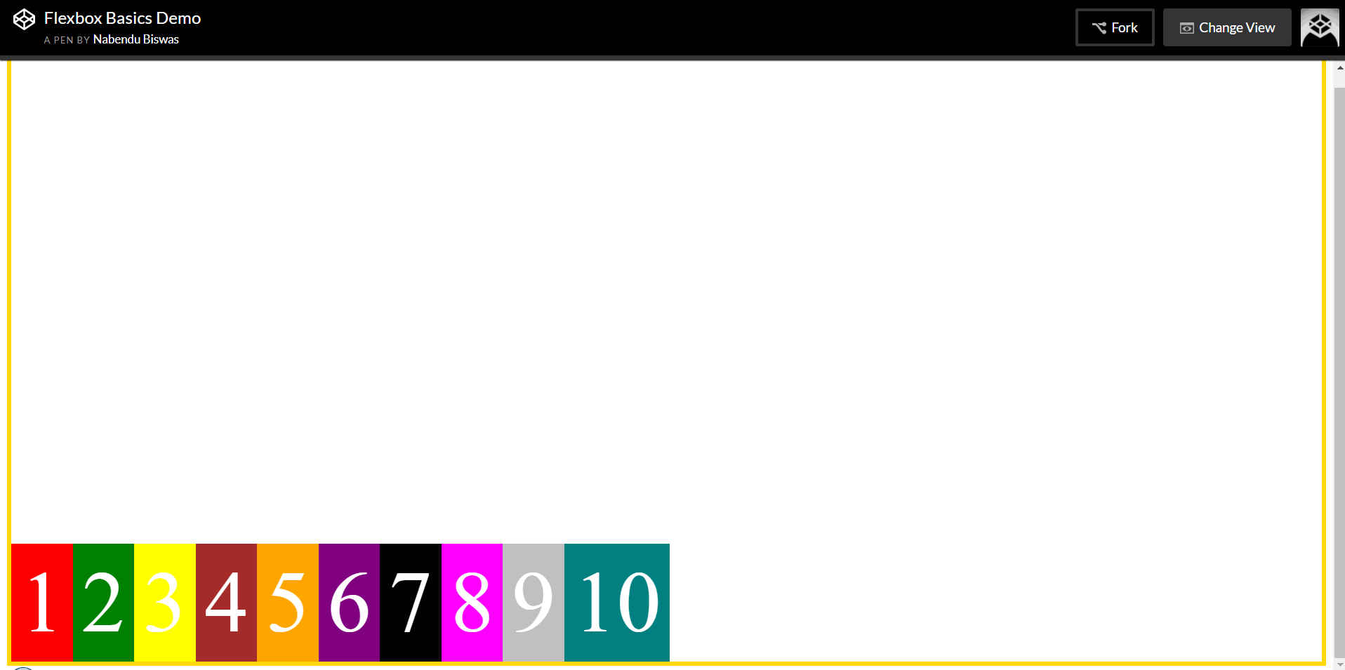 align-items: flex-end
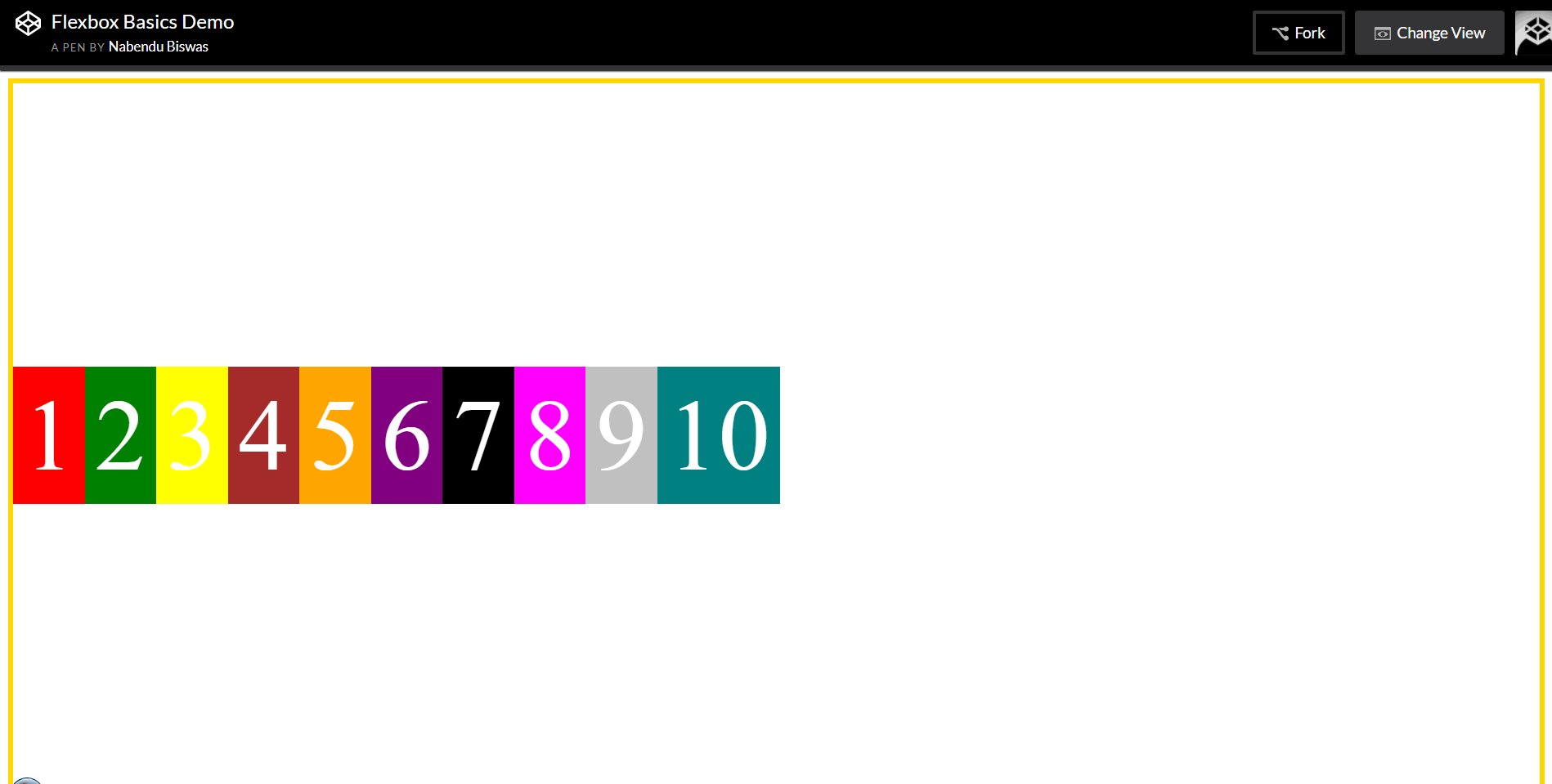 align-items: center
The property align-items: baseline is very useful as it aligns the base of all the items. It’s really useful when aligning different text in the page at the same level.
We will use this.
.container {
  display: flex;
  border: 5px solid gold;
  height: 100vh;
  align-items: baseline;
}
.box1 {font-size: 30px;}
.box2 {font-size: 60px;}
.box3 {font-size: 90px;}
.box4 {font-size: 120px;}
.box5 {font-size: 160px;}
.box6 {font-size: 180px;}
.box7 {font-size: 160px;}
.box8 {font-size: 120px;}
.box9 {font-size: 90px;}
.box10 {font-size: 60px;}
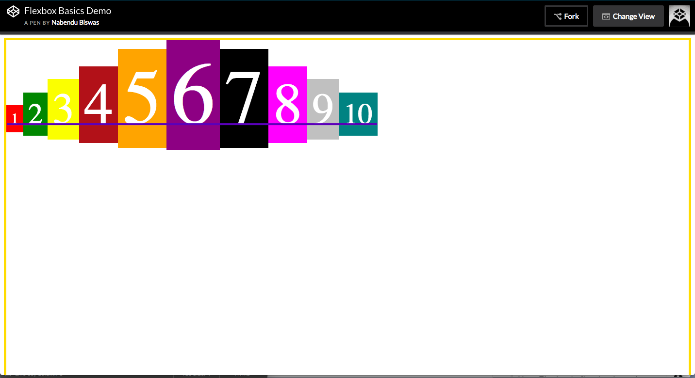 align-items: baseline