Basics of Flexbox — 3
by Nabendu Biswas / May 27th, 2018
#css #beginners #webdev
Series: Flexbox-basics
You can find the codepen used in this part here.
We will start with flex container property align-content. It basically aligns items across the cross-axis, when there are extra space.
Note: this property has no effect when there is only one line of flex items.
The basic HTML used is -
<div class=”container”>
  <div class=”box box1">1</div>
  <div class=”box box2">2</div>
  <div class=”box box3">3</div>
  <div class=”box box4">4</div>
  <div class=”box box5">5</div>
  <div class=”box box6">6</div>
  <div class=”box box7">7</div>
  <div class=”box box8">8</div>
  <div class=”box box9">9</div>
  <div class=”box box10">10</div>
</div>
And the basic CSS used is -
/* Some default styles to make each box visible */
.box {
  color:white;
  font-size: 100px;
  text-align: center;
  text-shadow:4px 4px 0 rgba(0,0,0,0.1);
  padding:10px;
}

/* Colours for each box */
.box1 { background:#1abc9c;}
.box2 { background:#3498db;}
.box3 { background:#9b59b6;}
.box4 { background:#34495e;}
.box5 { background:#f1c40f;}
.box6 { background:#e67e22;}
.box7 { background:#e74c3c;}
.box8 { background:#bdc3c7;}
.box9 { background:#2ecc71;}
.box10 { background:#16a085;}

/* We start writing out flexbox here. The above is just page setup */
.container {
  display:flex;
  border:10px solid mistyrose;
  height:100vh;
}
.box {
  width:33.333%;
}
This gives as the below -
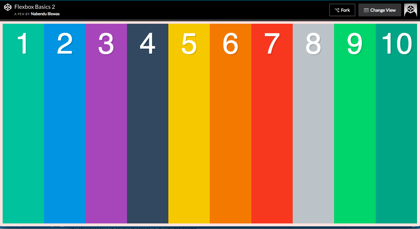 The basics
We will require the flex-wrap property to spread it to multiple lines, which is required to use align-content. Let’s do it.
.container {
  display:flex;
  border:10px solid mistyrose;
  height:100vh;
  flex-wrap: wrap;
}
Which results in -
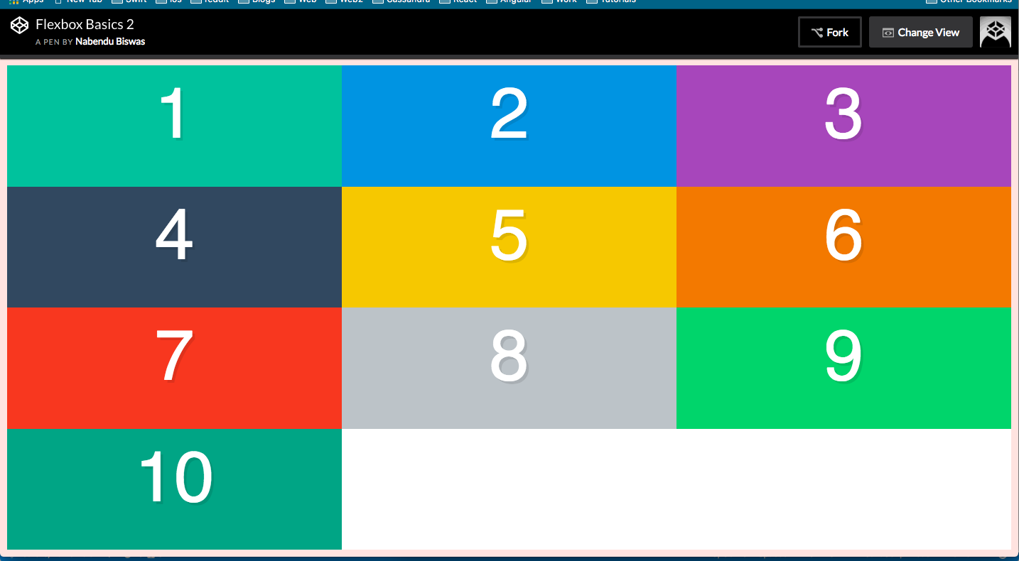 flex-wrap: wrap;
Now, we are ready to use the align-content property. According to the CSS trick article , it contains the similar set of properties as justify-content. We will go through them one by one and it will be self-explanatory.
.container {
  display:flex;
  border:10px solid mistyrose;
  height:100vh;
  flex-wrap: wrap;
  align-content: flex-start;
}
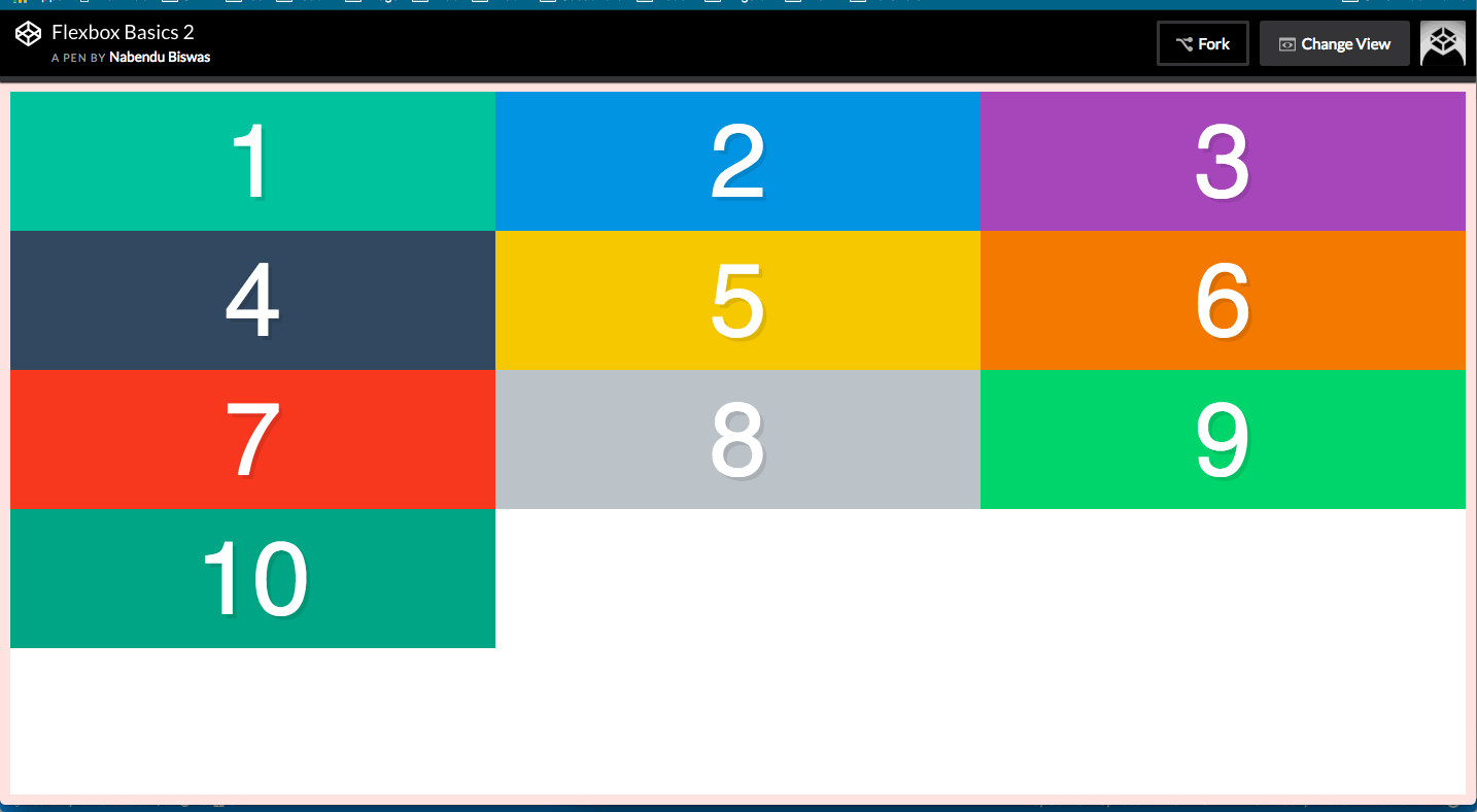 align-content: flex-start;
.container {
  display:flex;
  border:10px solid mistyrose;
  height:100vh;
  flex-wrap: wrap;
  align-content: flex-end;
}
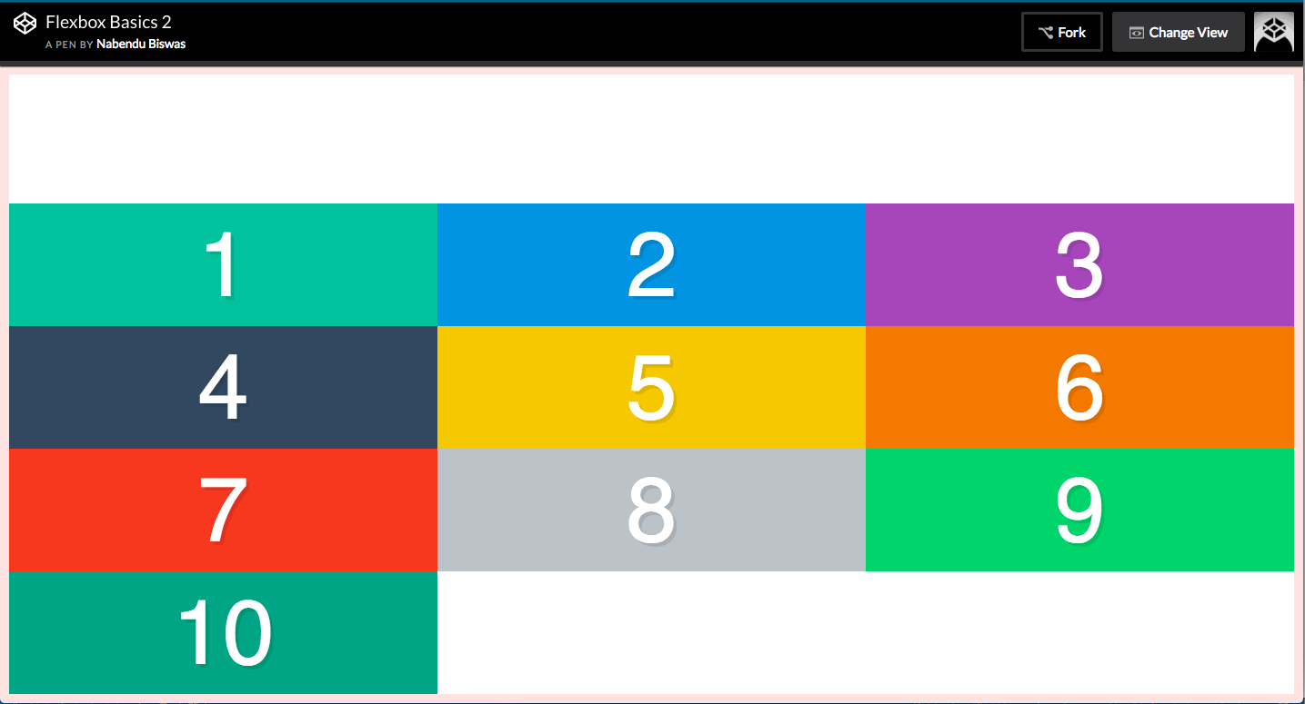 align-content: flex-end;
.container {
  display:flex;
  border:10px solid mistyrose;
  height:100vh;
  flex-wrap: wrap;
  align-content: center;
}
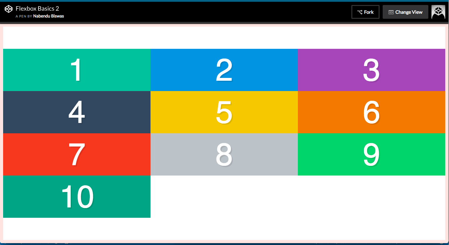 align-content: center;
.container {
  display:flex;
  border:10px solid mistyrose;
  height:100vh;
  flex-wrap: wrap;
  align-content: space-between;
}
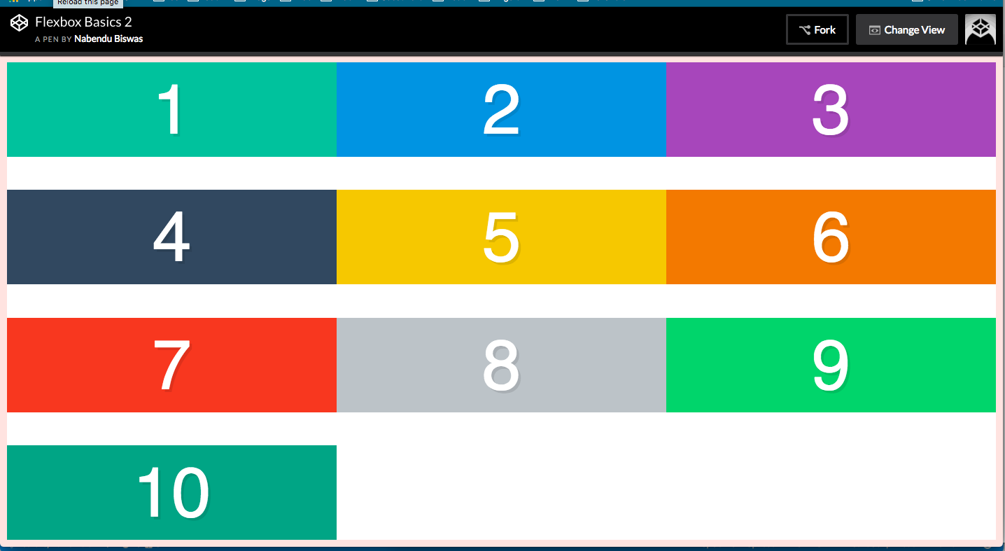 align-content: space-between;
.container {
  display:flex;
  border:10px solid mistyrose;
  height:100vh;
  flex-wrap: wrap;
  align-content: space-around;
}
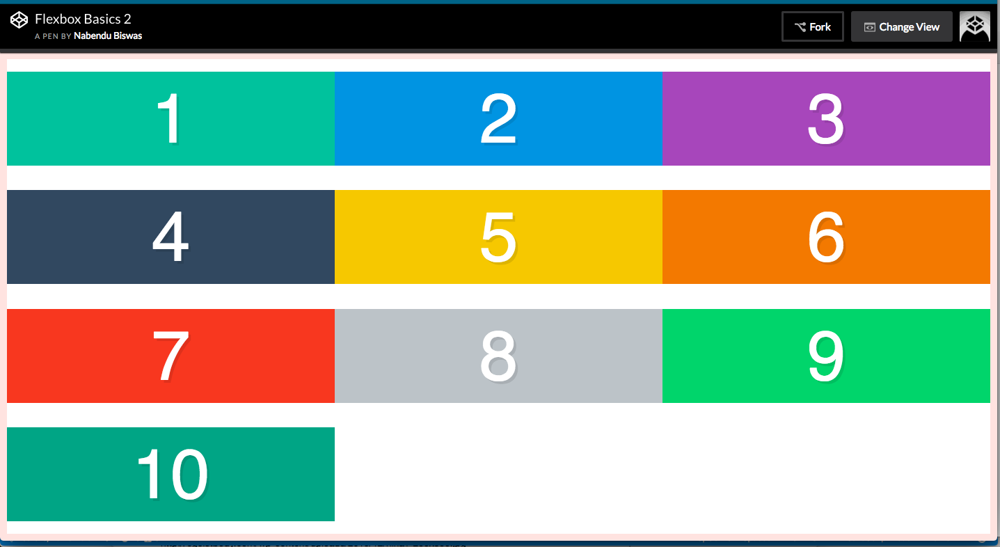 align-content: space-around;