CSS Crash Course for Beginners -2
by Nabendu Biswas / July 18th, 2020
#css #beginners #webdev
Series: CSS-Basics
Welcome to part-2 of the series.
Colors In CSS
We had added a lot of back-ground color and text color in the previous part. There are three ways to represent color in CSS. They are -
Color Names
Hexadecimal
RGB
Let’s update our project to contain all CSS from the styles.css file only. So, go ahead and remove the Inline and Internal CSS from index.html.
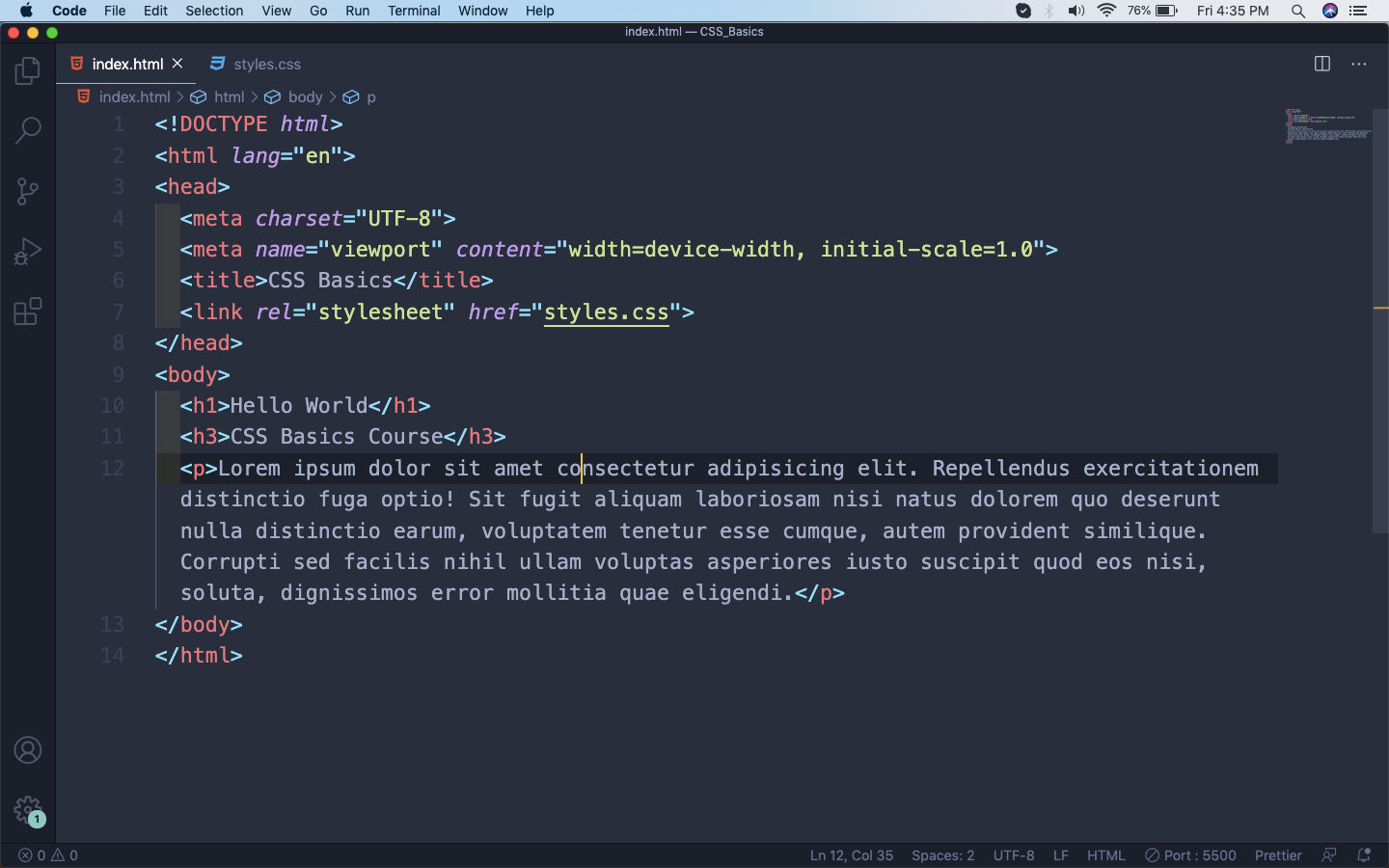 index.html
Now, in the styles.css we will add colors through all three ways.
First, we are targeting the whole body and making the background color as a form of grey. But we are using the hexadecimal code for it. The hexadecimal system in color starts from #000000(black) to #ffffff(white), with everything else falling between them. There are many hexadecimal color picker and you can pick one from a site like this.
Next, is the normal color names which we have been using from the previous part. In that we give the normal color name like red, blue, green. Modern browsers supports 140 color names. You can find the list here.
The third way, which we had used in the paragraph tag in the below example. It is by using the rgb(red, green, blue) values. As we all know by mixing red, blue and green we can get all the colors. You can get a color picker for rgb from this site.
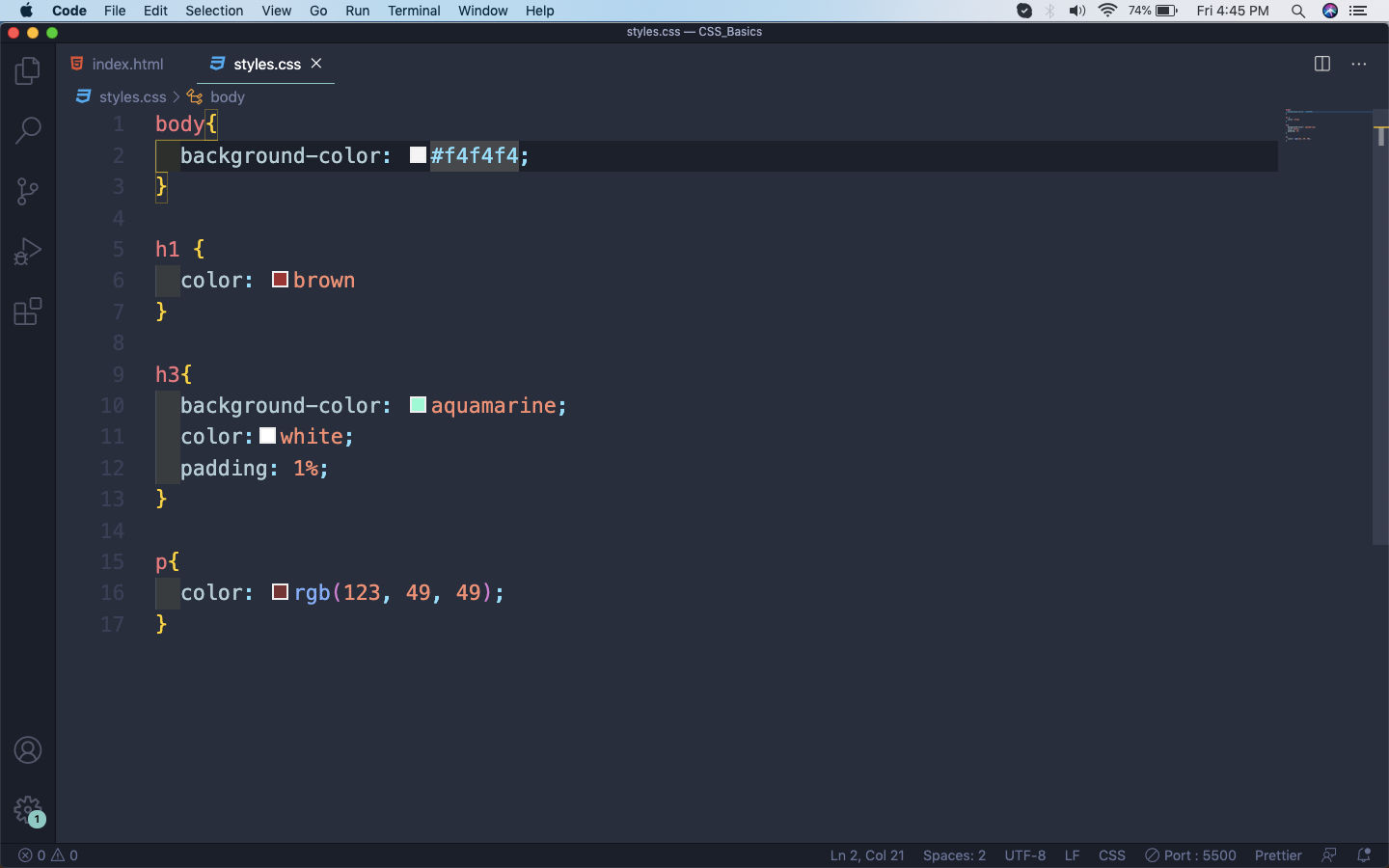 styles.css
Now, our page looks like this.
 Web-page
Font In CSS
We have many properties for font in CSS. The first and the main property been the font-family property, by which you can choose between different fonts.
We will add the most basic fonts to our whole web-page.
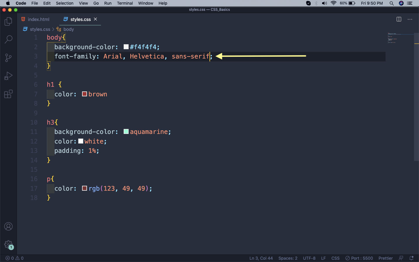 font-family
Beside these there are many web-safe fonts, which are available to every browser. Beside this there are many awesome fonts available through google, but they require imports and can be checked later.
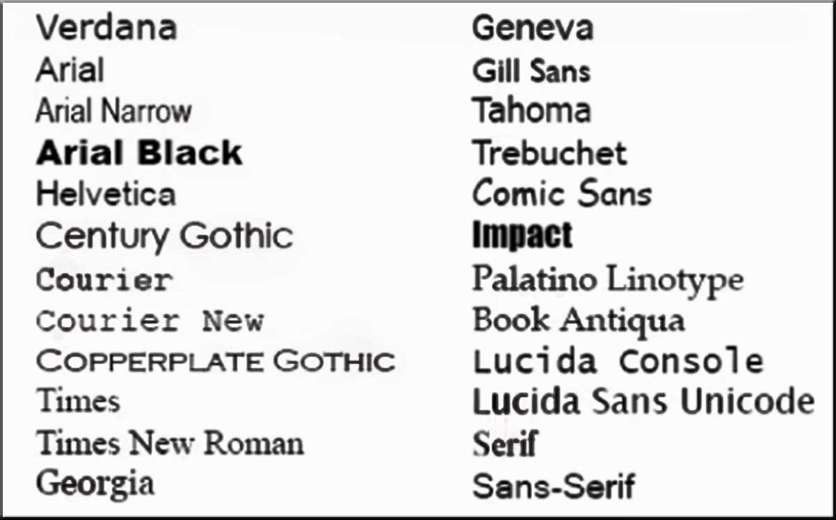 Web Safe fonts
Next, we will learn about font-size and font-weight which are used to give the font a size and weight respectively.
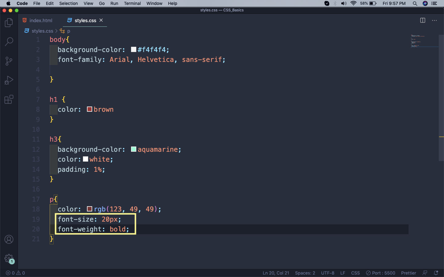 font-size and font-weight
Now, our web-page with these changes will look like below.
 Web-page
Let’s learn about one more property which is related to fonts and it is called line-height. It decides the gap between each line and useful to set it for paragraphs.
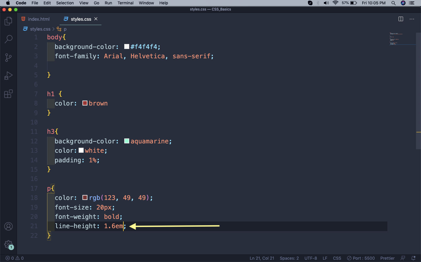 line-height
Now, the gap between each line of the paragraph is more.
 Gap between line
Unit of measurements
We have seen till now, who measurement units and they are — px and em. There is actually a third one also called rem.
Pixel(px) is the easiest of the unit and it will change the size of the font according to the number.
An em is equal to the computed font-size of that element’s parent. For example, if a div have font-size: 30px, then for the div and it’s children 1em = 16px
The rem values are relative to the root html element, not to the parent element. That is, if font-size of the root element is 16px then 1rem = 16px for all elements.
It is generally advisable to have a base font-size in the body tag and use rem, through-out the project. It helps with the calculations.
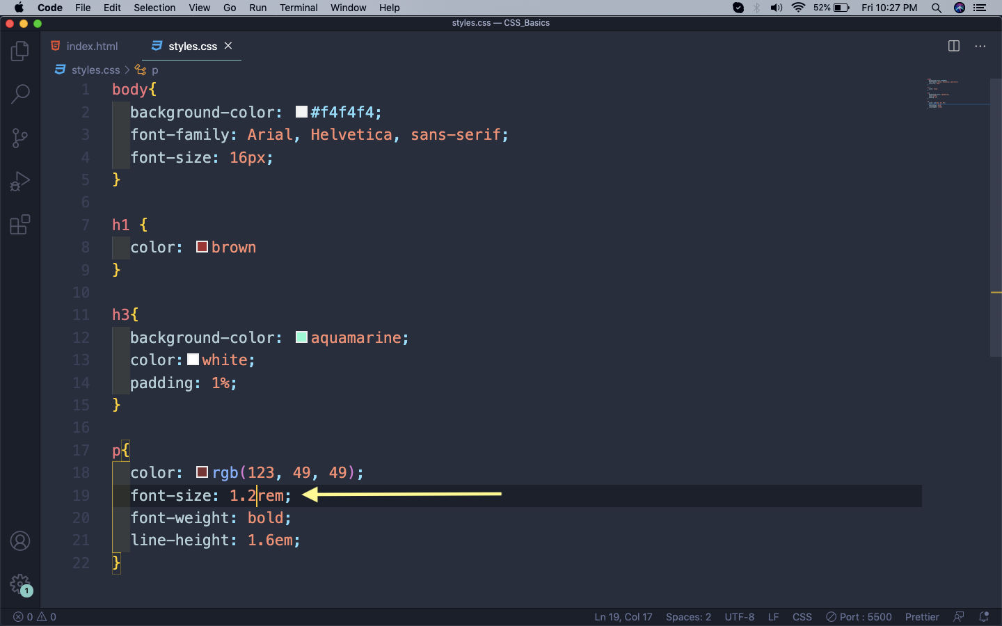 rem
rem
You can find an awesome article above all three here.
This completes part-2 of the series.