CSS3 in 10 days — Day 6
by Nabendu Biswas / September 26th, 2019
#css #beginners #webdev
Series: CSS-10days
Welcome to Day 6 of learning CSS. As i have told earlier, this series is inspired by this awesome youtube series in freecodecamp channel.
We will start with Tooltip on day-6. Open your code editor and create a new 6.1-Tooltip folder and two files index.html and sandbox.css inside it.
Next, in index.html put the basic html.
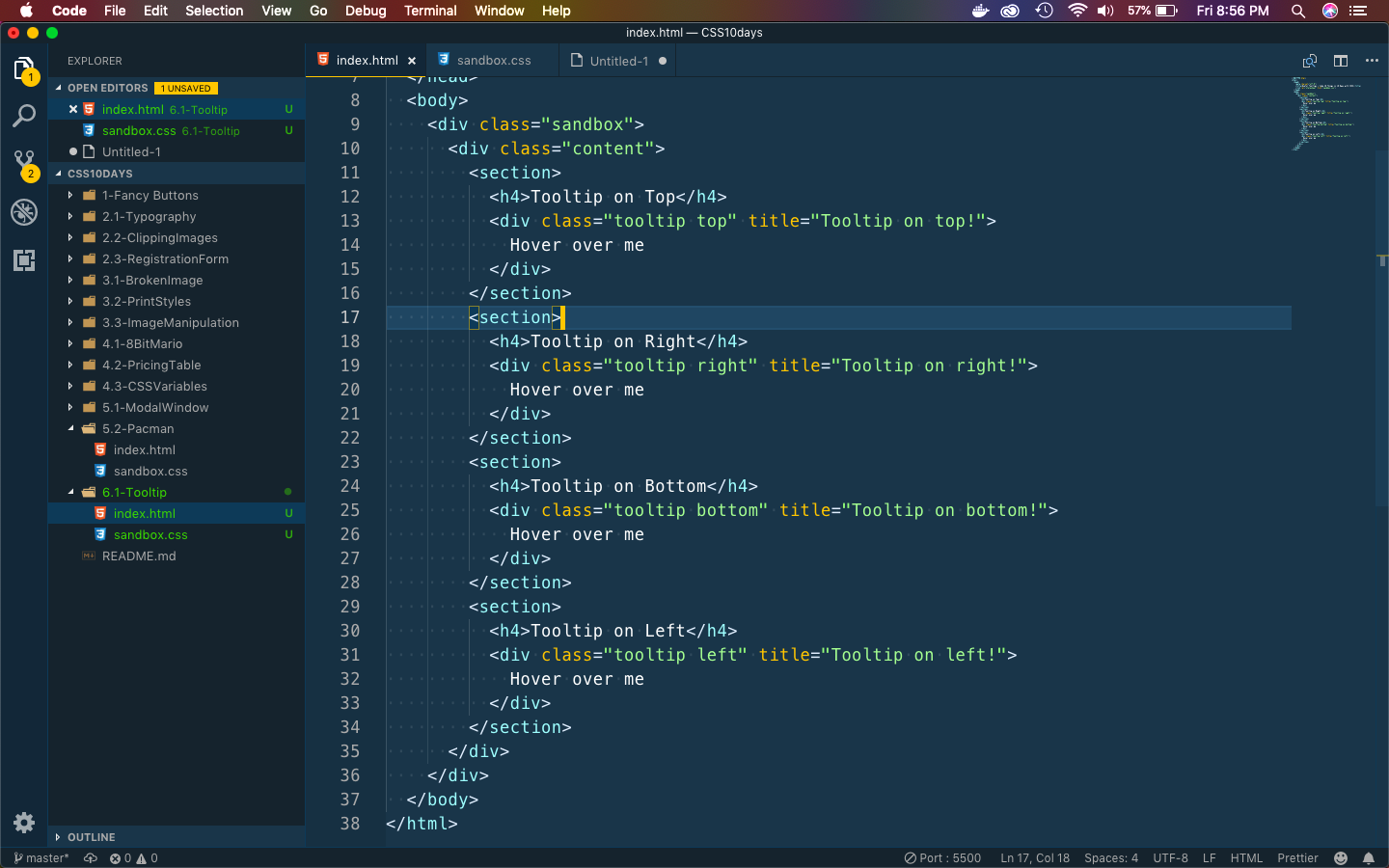 Basic index
Let first put some basic css in sandbox.css to show four boxes.
 tooltip
It will show as below.
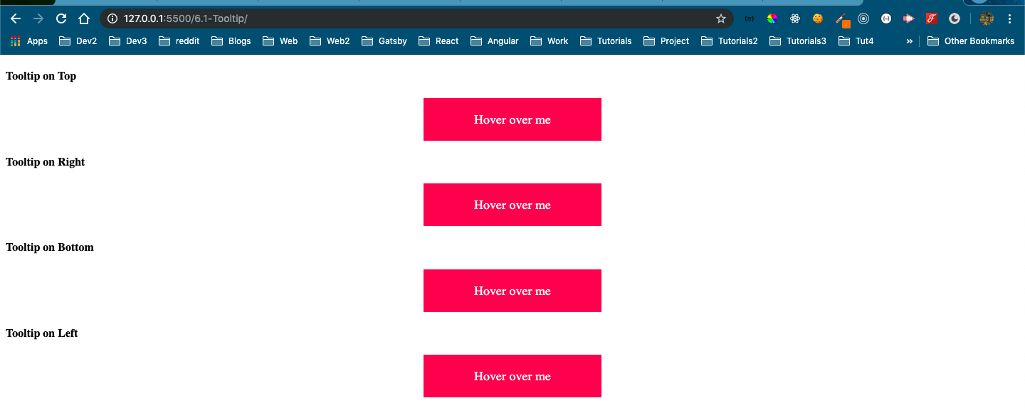 Basic box
Now, let’s create a tooltip on hover. We will use the after and before pseudo element.
 Tooltip code
It will show below. Both after and before are not in correct position. We will fix it later.
 Tooltip
We will fix it now, but also create two new CSS rule for top.
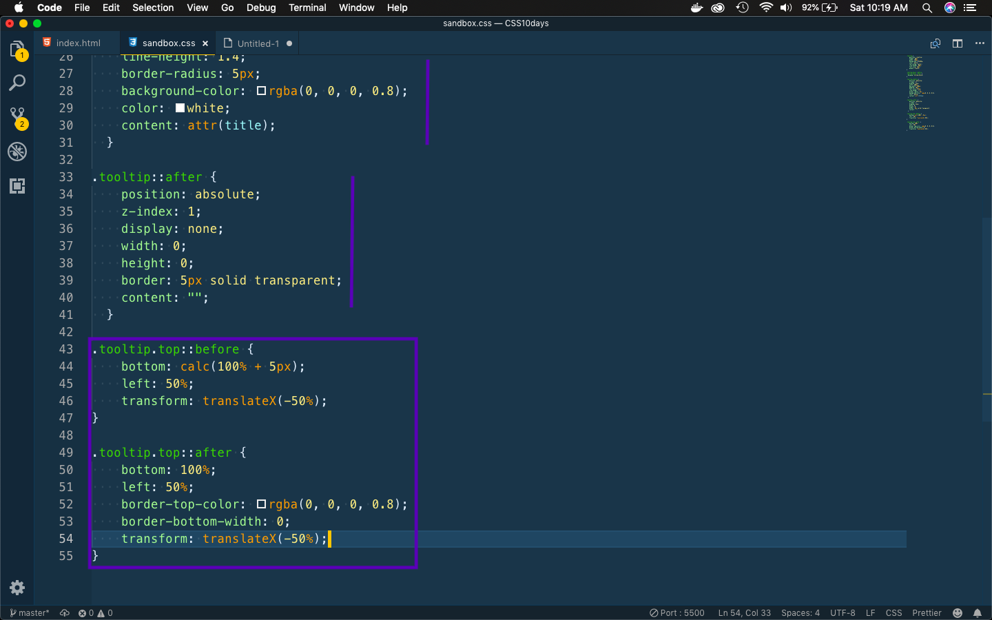 Fixing top
It will fix our first tooltip.
 First one fixed
Now, we will write the code for tooltip right.
 Tooltip right
It will show as below.
 Right
Right
Next, we will write the code for tooltip bottom.
 Tooltip bottom
It will show as below.
 Bottom
Next, we will write the code for tooltip left.
 tooltip left
It will show as below.
 Left
Left
Next we will Animated Progress Bar on day-6. Open your code editor and create a new 6.1-ProgressBar folder and two files index.html and sandbox.css inside it.
Next, in index.html put the basic html.
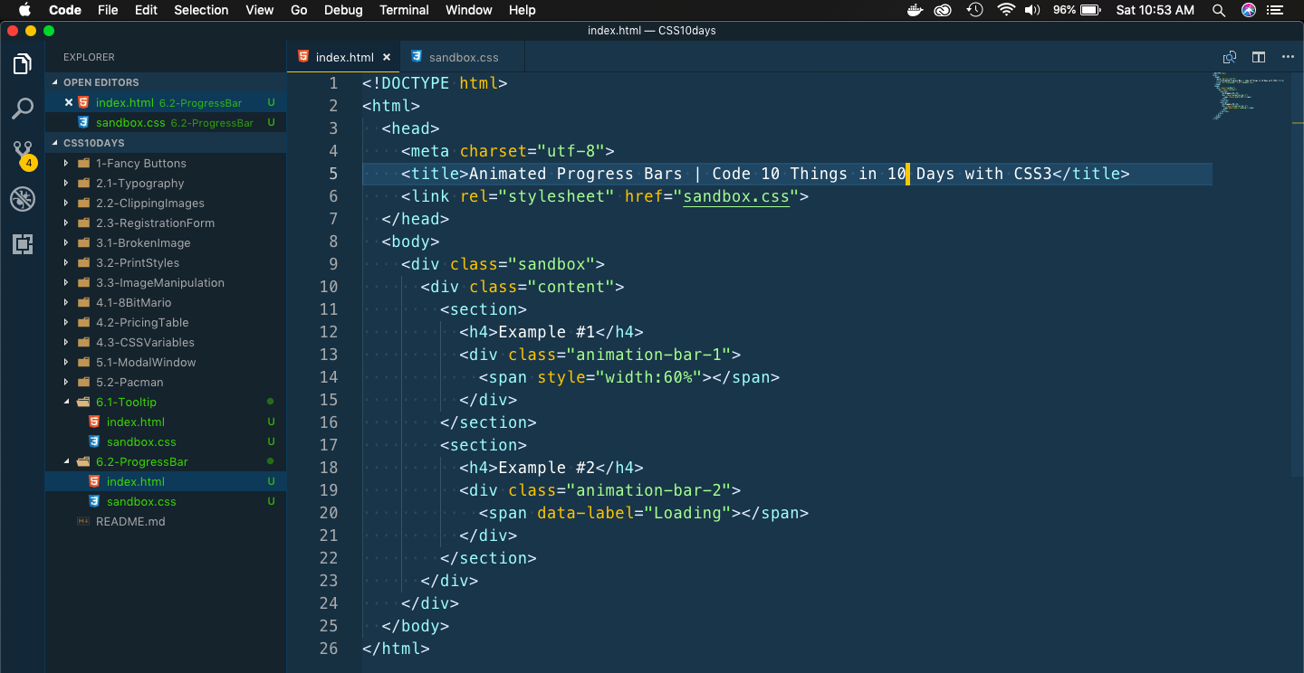 Basic index
Let’s create the style for the first Progress bar.
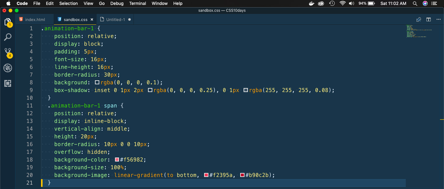 First style
It will show this beautiful Progress bar.
 Beautiful Bar
Next, we will write code to make it like stripe.
 Stripe effect
It will show the progress bar with beautiful stripes.
 Stripes
Now, we will add animations to the progress bar. We will add animation for both going forward and the stripe moving.
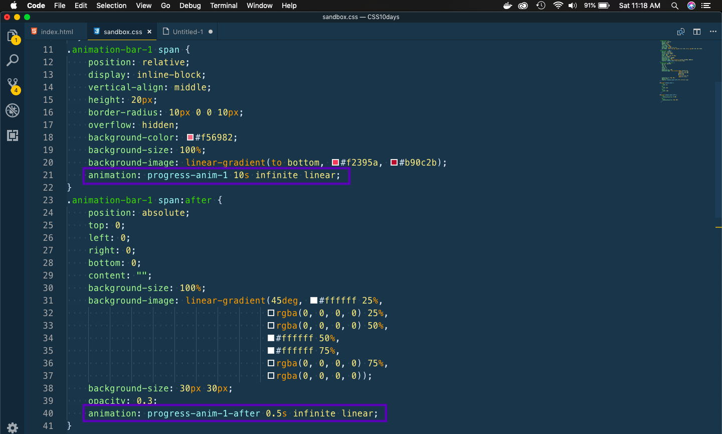 Code added
The animation keyframes.
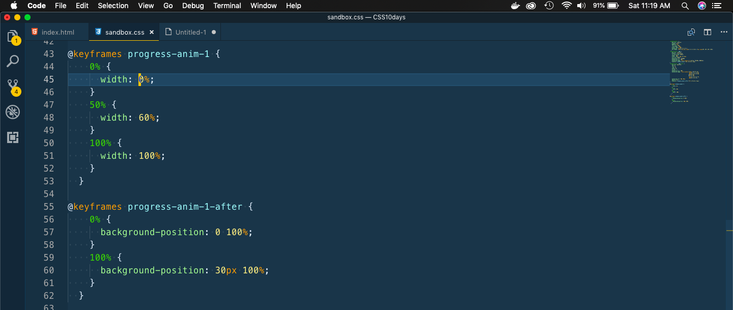 Keyframes
The animation is as below.
 The animation
We will next write code for the second Progress bar, which will have a tooltip also.
    .animation-bar-2 {
        position: relative;
        display: block;
        font-size: 16px;
        line-height: 16px;
        background: rgba(0, 0, 0, 0.1);
        box-shadow: inset 0 1px 2px rgba(0, 0, 0, 0.25), 0 1px rgba(255, 255, 255, 0.08);
    }
    .animation-bar-2 span {
        position: relative;
        display: inline-block;
        vertical-align: middle;
        height: 20px;
        background-color: #00e6e7;
        background-size: 100%;
        background-image: linear-gradient(to bottom, #00b3b4, #008081);
    }
    .animation-bar-2 span:before {
        position: absolute;
        right: 0;
        bottom: 100%;
        display: inline-block;
        width: 0;
        height: 0;
        border: 10px solid transparent;
        border-right-width: 0;
        border-bottom-width: 0;
        border-top-color: rgba(0, 0, 0, 1);
        content: "";
    }
    .animation-bar-2 span:after {
        position: absolute;
        right: 0;
        bottom: calc(100% + 5px);
        z-index: 1;
        display: inline-block;
        content: attr(data-label);
        padding: 5px;
        border-radius: 3px;
        font-size: 0.8em;
        background-color: rgba(0, 0, 0, 1);
        color: #FFFFFF;
    }
It will initially show like below.
 Initial bar
Now, we will add animation to the Progress bar.
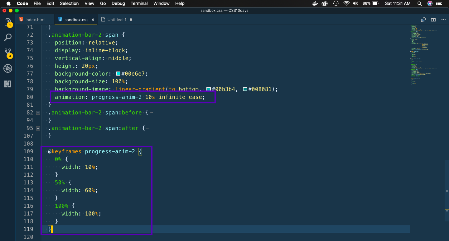 Animation
It will show this nice animation.
 The animation
This completes day 6 of the course. You can find the code for the same here.