Conquering Frontend Mentor -1
by Nabendu Biswas / November 15th, 2020
#css #beginners #webdev
Series: Frontend-Mentor
Recently i found i great site to develop your frontend skills. The site is Frontend mentor and this is the Fylo data storage challenge. The great thing about the challenges is that they provide all the assets and also the color schemes. After that you have to check the desktop and mobile screens.
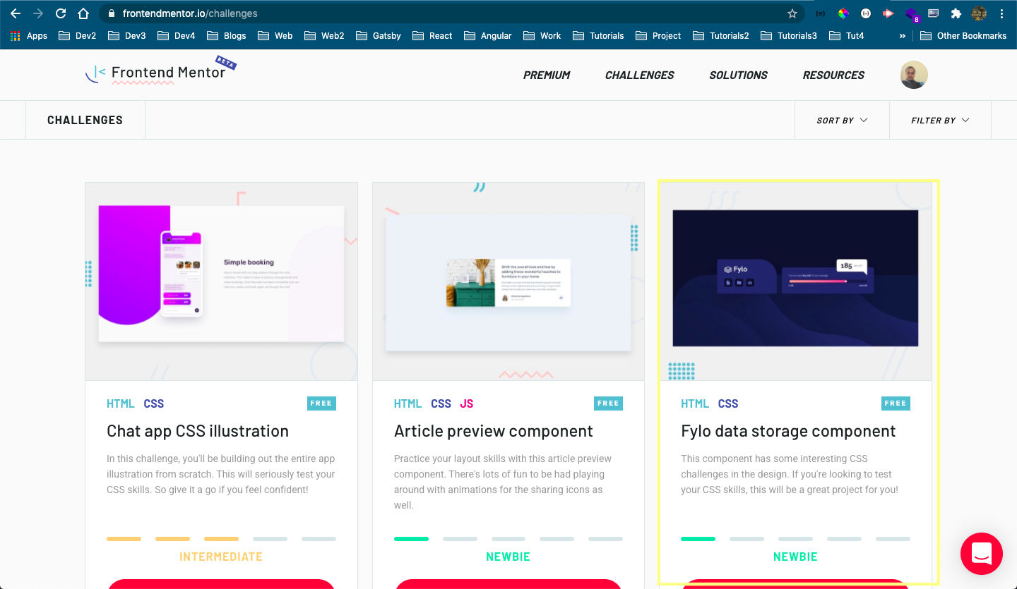 Fylo data storage
I will first add all the html and then start with the styles. Below is the index.html file. There is a container class, which wraps everything. Then the card class contain the main classes of navigation and details-wrapper, which will contain the two parts.
    <!DOCTYPE html>
    <html lang="en">
      <head>
        <meta charset="UTF-8" />
        <meta name="viewport" content="width=device-width, initial-scale=1.0" />
        <link
          rel="icon"
          type="image/png"
          sizes="32x32"
          href="./images/favicon-32x32.png"
        />
        <title>Frontend Mentor | Fylo data storage component</title>
        <link rel="stylesheet" href="styles.css" />
      </head>
      <body>
        <div class="container">
          <main class="card">
            <section class="navigation">
              <img src="./images/logo.svg" alt="Logo" />
              <nav class="navigation-bar">
                <button class="nav-item" name="document">
                  <img src="./images/icon-document.svg" alt="document icon">
                </button>
                <button class="nav-item" name="folder">
                  <img src="./images/icon-folder.svg" alt="folder icon">
                </button>
                <button class="nav-item" name="upload">
                  <img src="./images/icon-upload.svg" alt="upload icon">
                </button>
              </nav>
            </section>
            <div class="details-wrapper">
              <div class="details-remaining">
                <span>185 GB</span> Left
              </div>
              <section class="details-container">
                <p>You’ve used <b>815 GB</b> of your storage</p>
                <div class="range-indicator-container">
                  <div class="range-indicator">
                    <div class="range-point" />
                  </div>
                </div>
                <div class="details-range">
                  <span>0 GB</span>
                  <span>1000 GB</span>
                </div>
              </section>
            </div>
          </main>
          <div class="attribution">
            Our Site <a href="[https://www.thewebdev.tech](https://www.thewebdev.tech)" target="_blank">The Web Dev</a>.
            Coded by <a href="#">Nabendu Biswas</a>.
          </div>
        </div>
      </body>
    </html>
With this basic html our site looks like below.
 Basic html
Now, we will add the basic css in our styles.css file. The font and the colors are provided by frontend mentors in style-guide.md file.
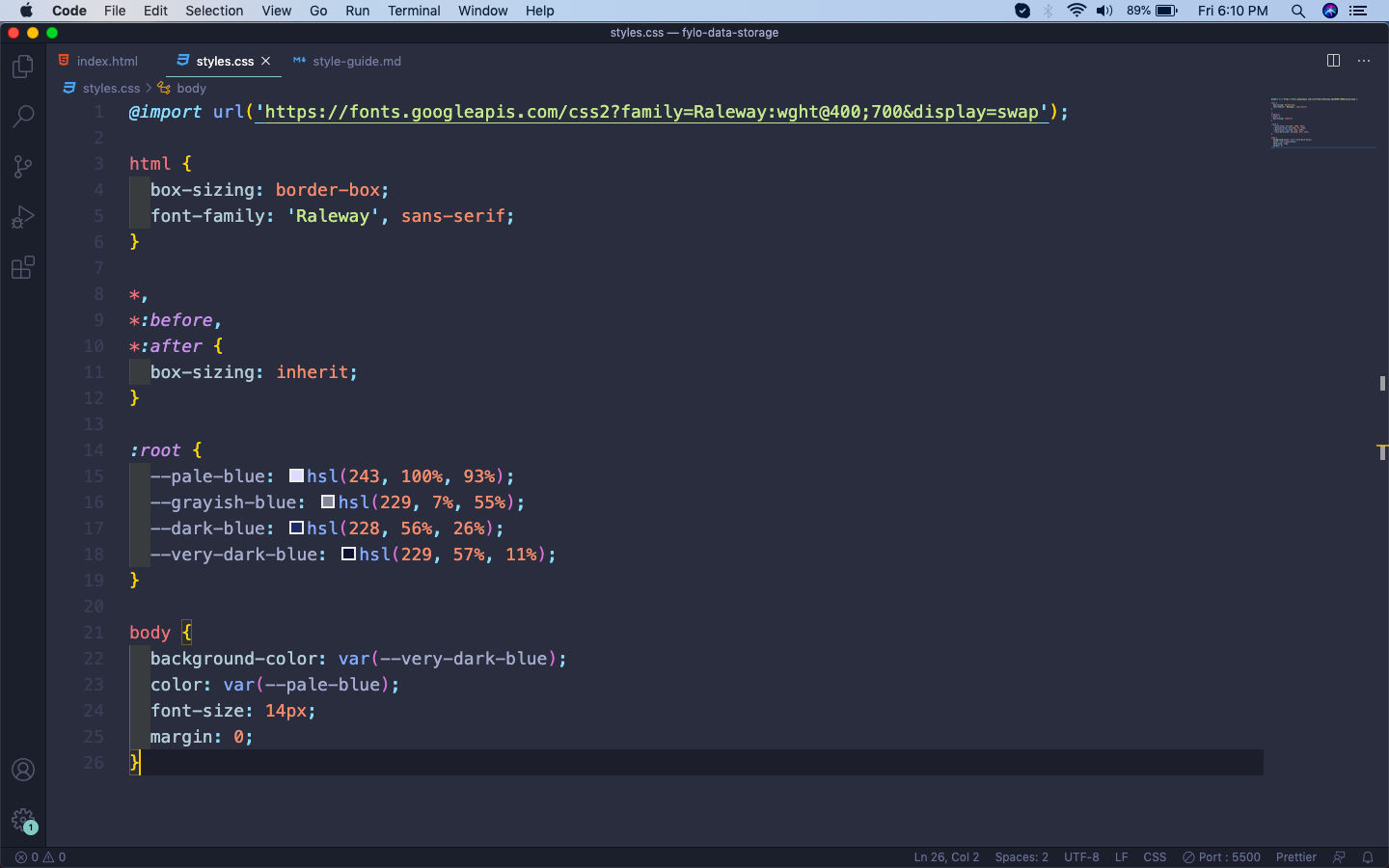 styles.css
Now, our site with the basic styles will look like below.
 basic
basic
First, we will add the styles for container and card. Here, we are making both of them as grid. Also, adding the background image at the bottom.
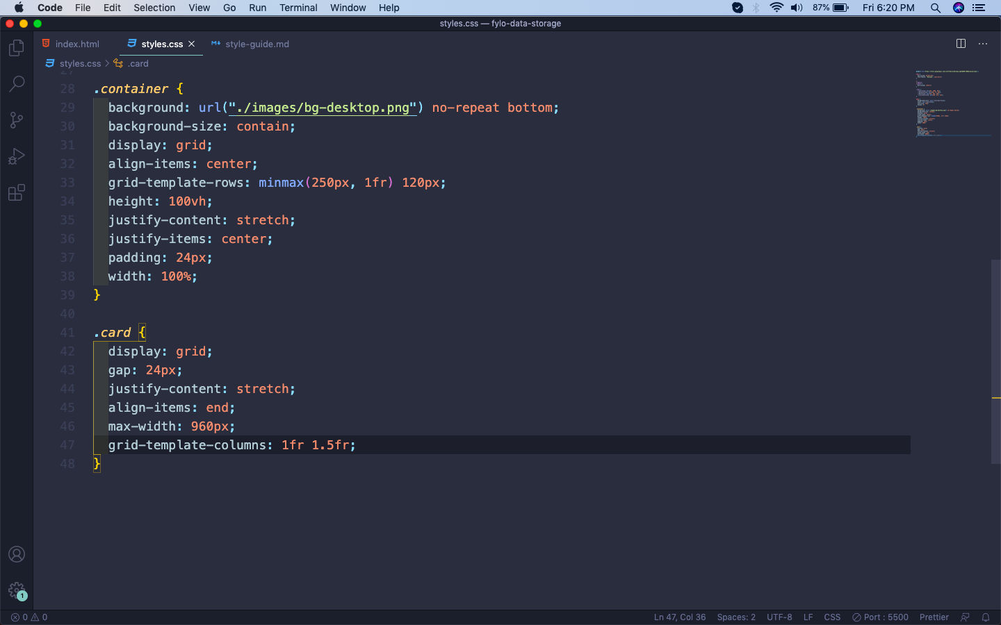 container
The web-page will look like below and quite nice.
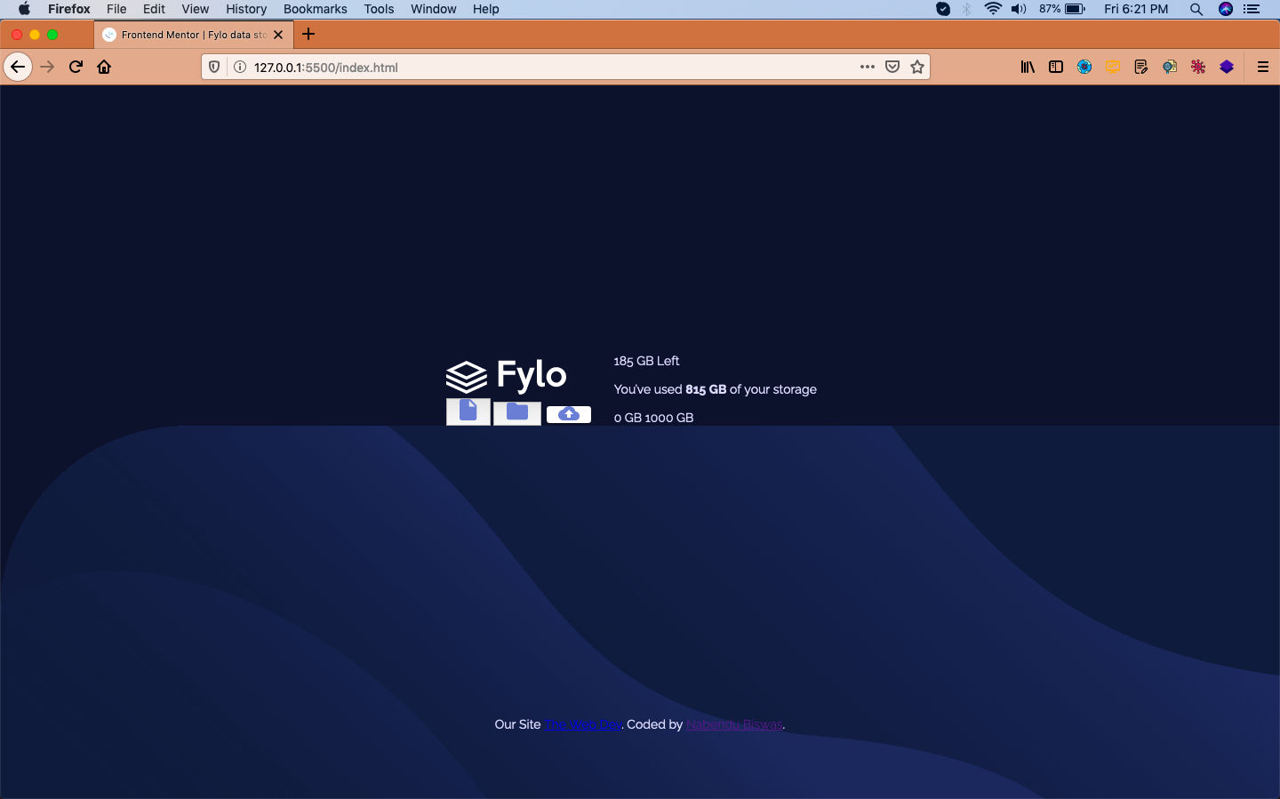 Web-page
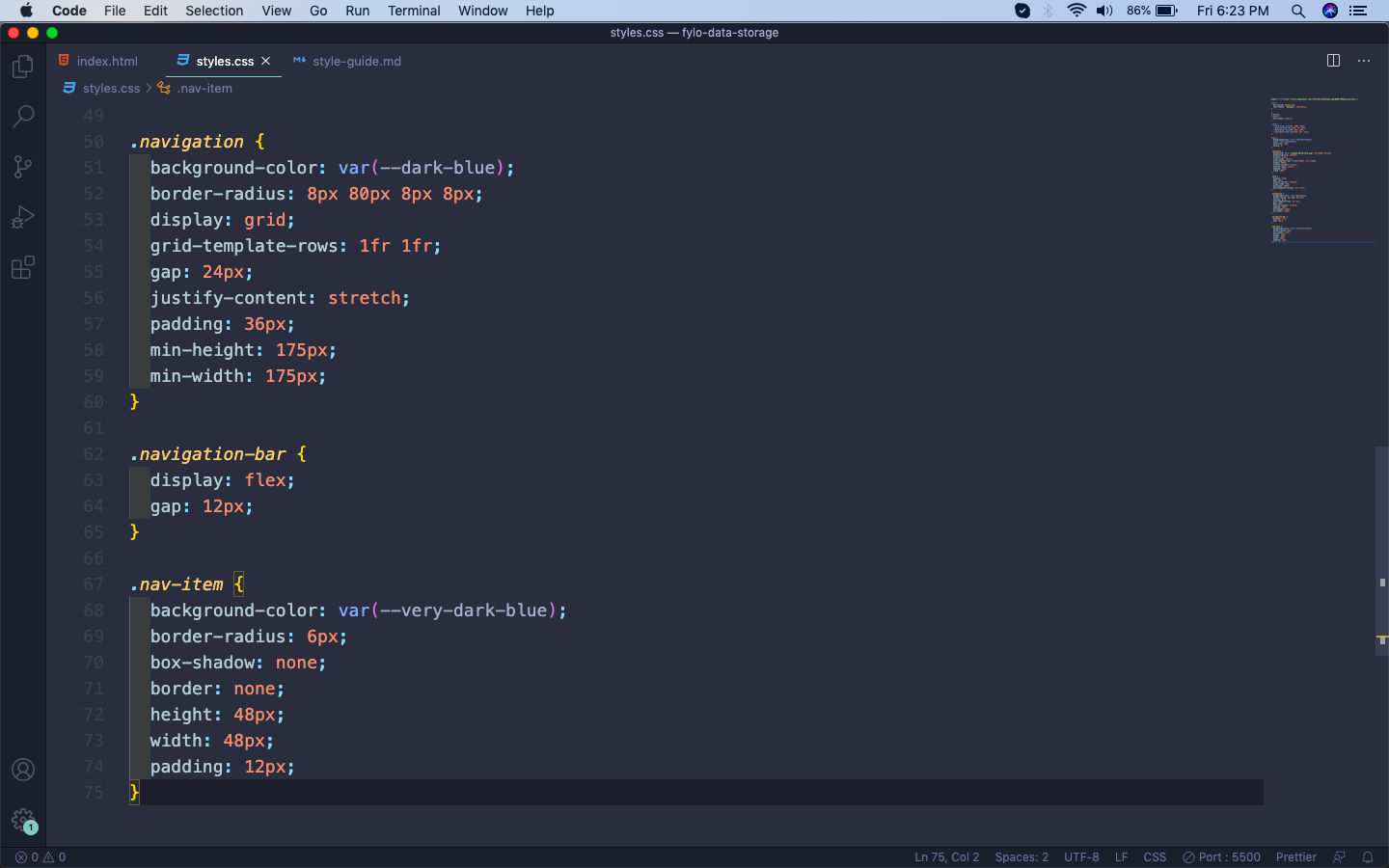
Now, we will style our first section containing the Fylo logo. Here, we will first make the wrapping class navigation as grid, with two rows. Then the class navigation-bar containing our icons will be made flex.
After that just giving a bit styles for each icon with the nav-item class.
 Fylo
Fylo
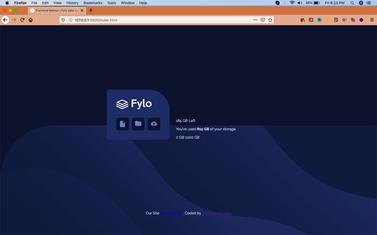
Now, our web-page will look like below with fylo component done.
 Fylo Done
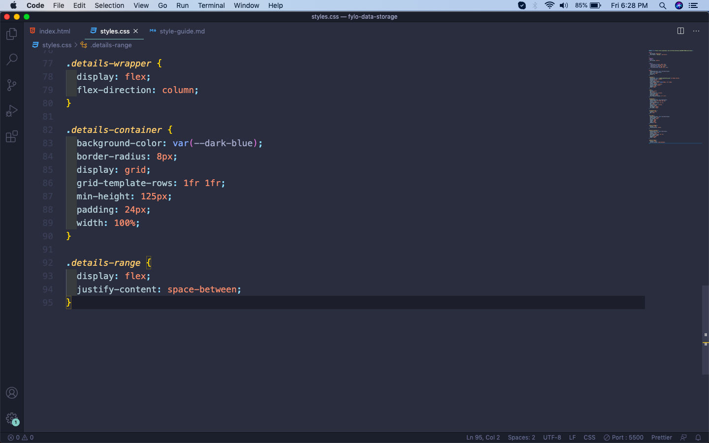
We will target the next section details-wrapper now and making it flex first with direction as column. After that we are making our details-container class containing the main part as grid.
We are also making the details-range class as flex, with it’s two items having space in-between.
 details-container
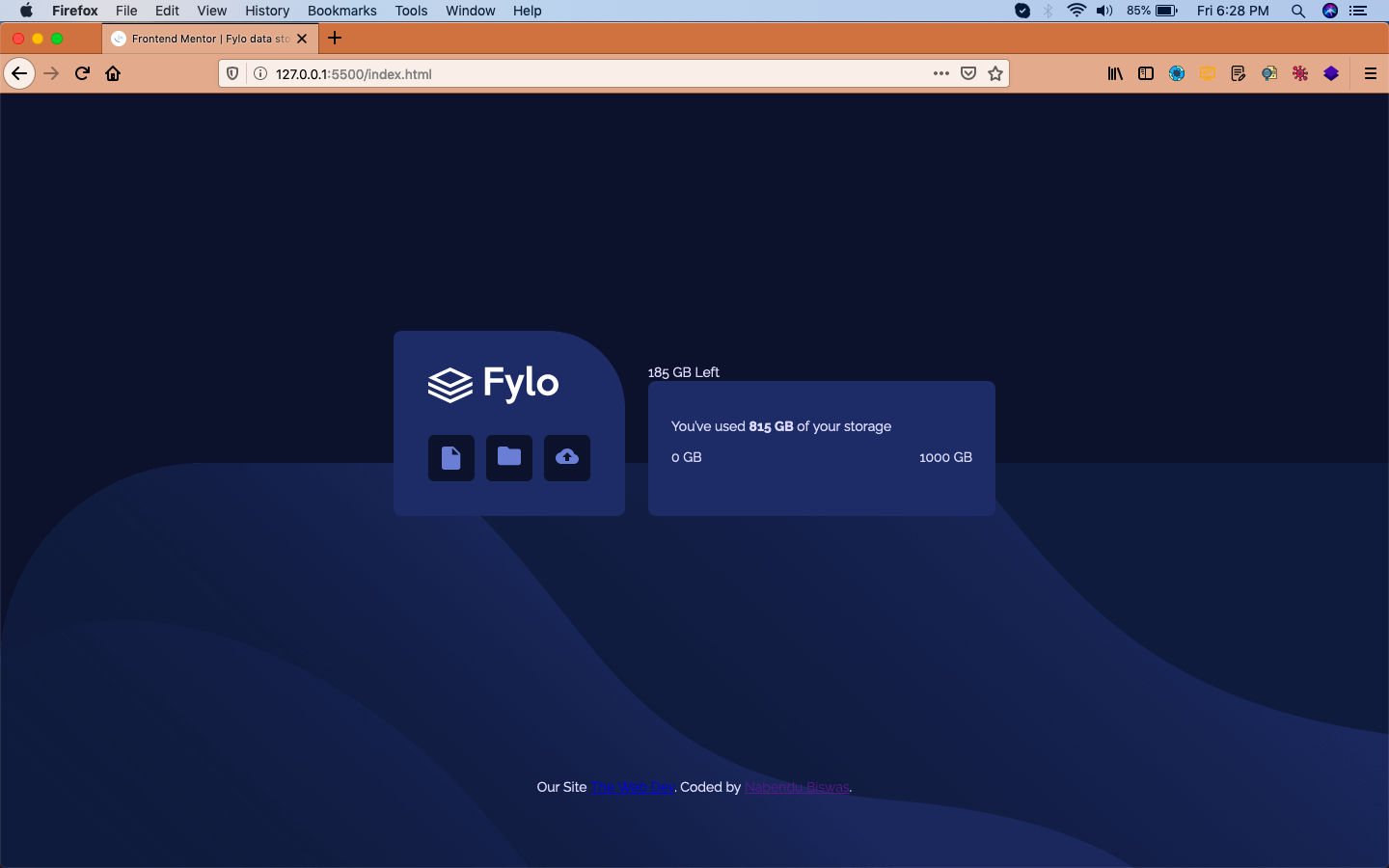
Now, our details section will look like below.
 details-container
Next, we will add the styles for range. Here, also we are using the linear-gradient provided to us in style-guide.md file in the range-indicator.
Also, making the dot with the range-point class.
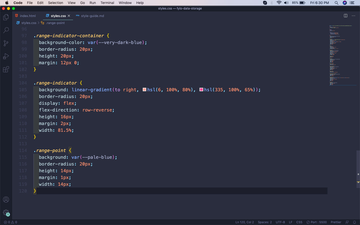 range-indicator
Now, our range will show perfectly.
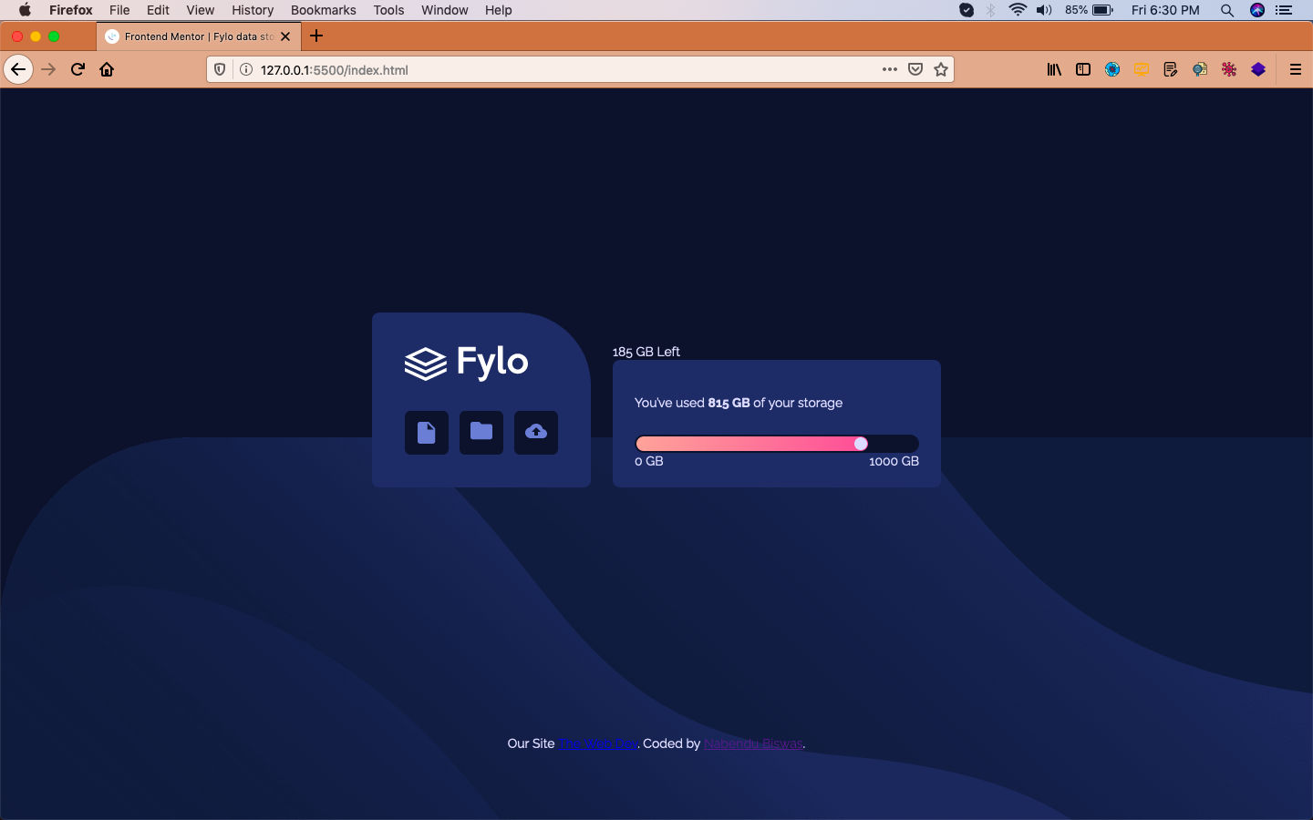 Range
Range
Now, it’s time to style the details-remaining class. We are making it flex and the main thing is that making its position as relative.
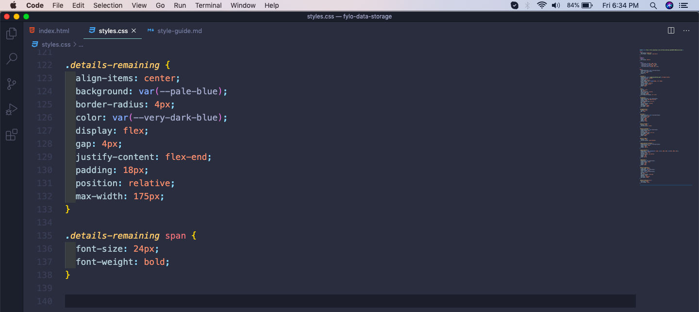 details-remaining
Now, the details-remaining is looking as below.
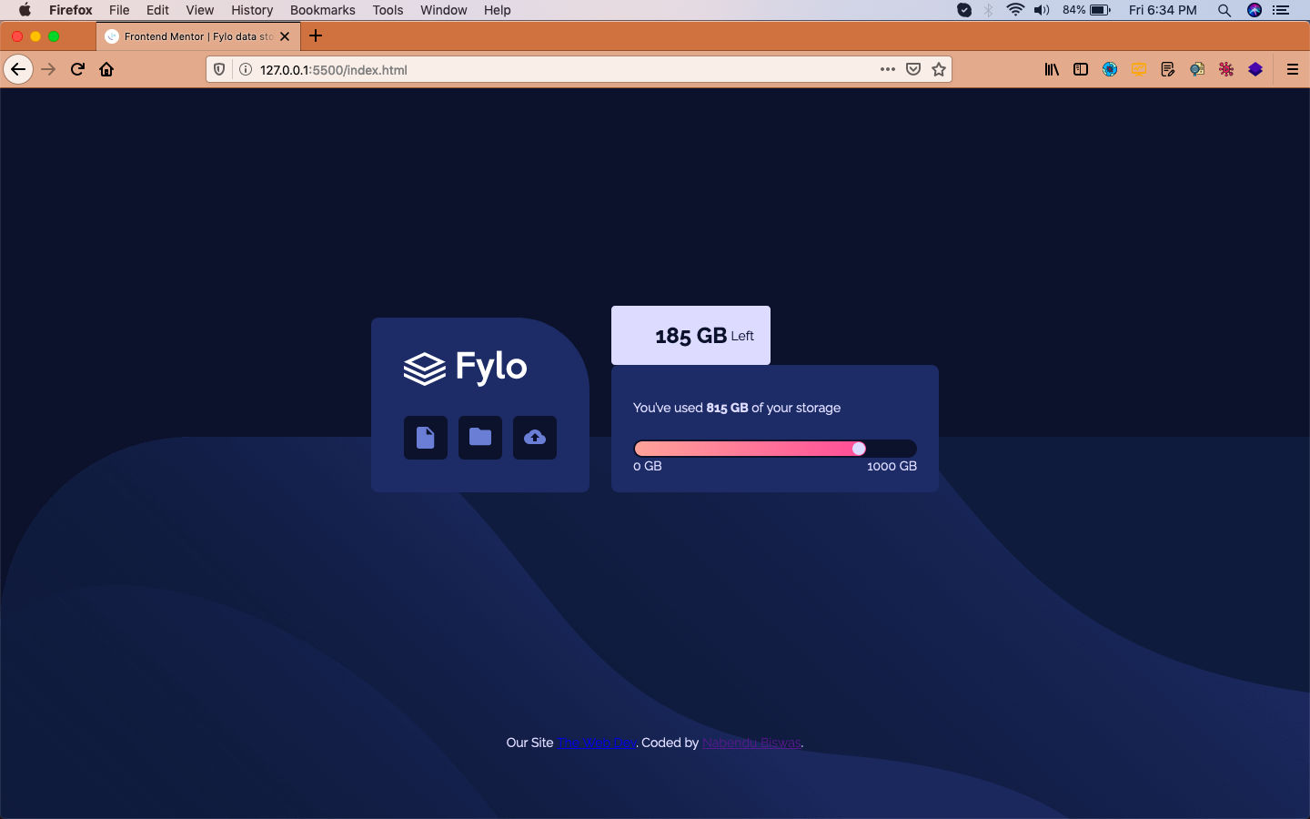 details
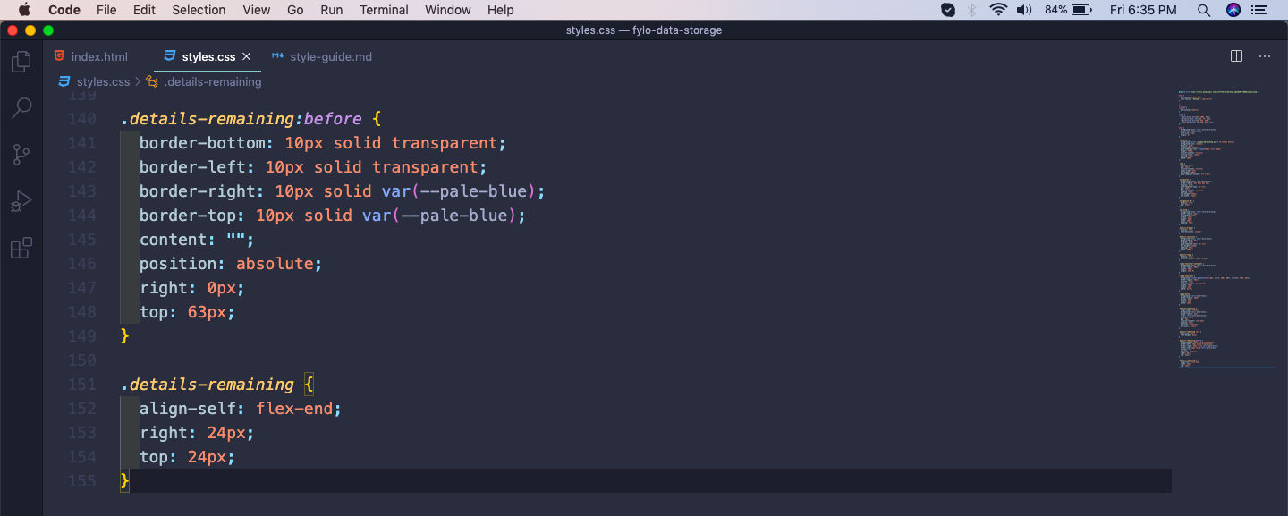
Now, we will make the small arrow using the pseudo class before and moving it to the right position using absolute.
After that moving it to the right place using align-self and right and top.
 Arrow
Arrow
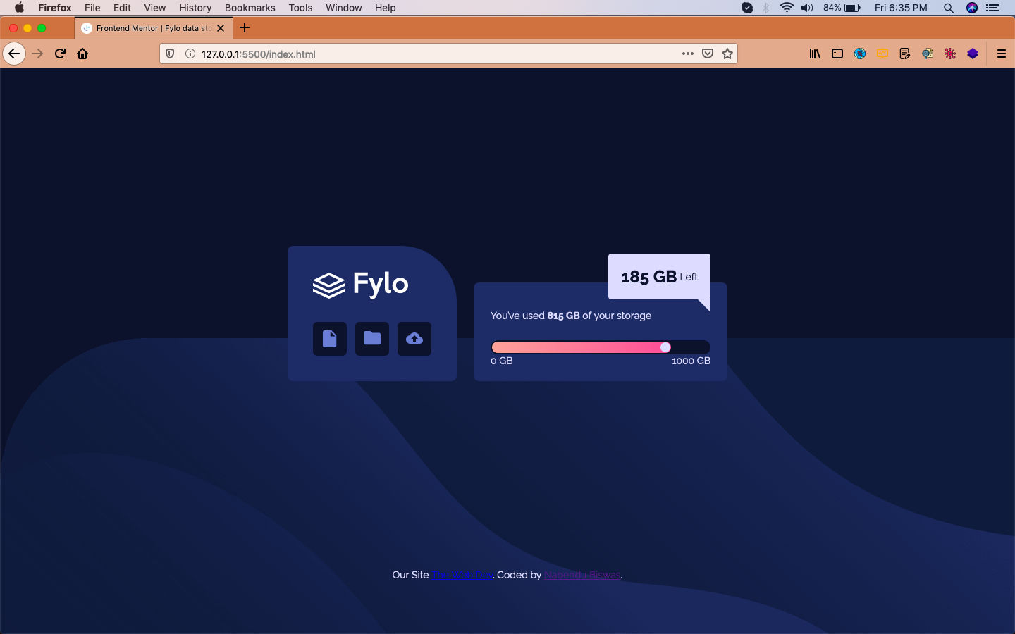
Now, our whole design is complete for the desktop view.
 Desktop view
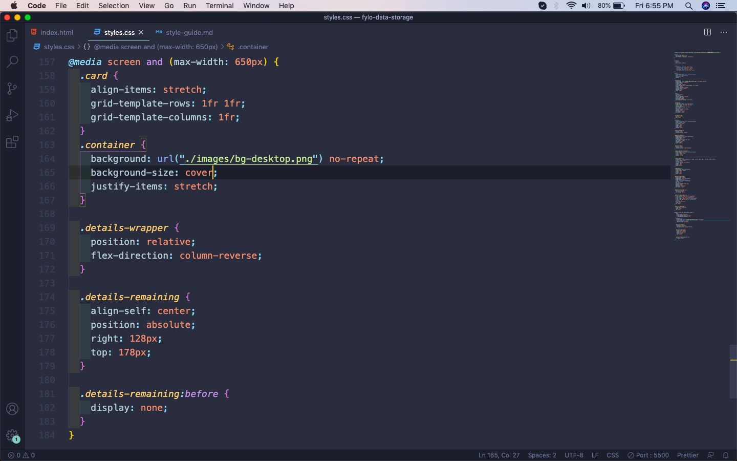
Now, for the mobile view we don’t have to do much changes. In card class the grid-template-columns is been made as one column. Beside this in the container class the background image, is been made as cover.
For the details-remaining we are moving it to a different place with the help of position absolute. Also making the arrow disappear for details-remaining:before using it’s display as none.
 Mobile View
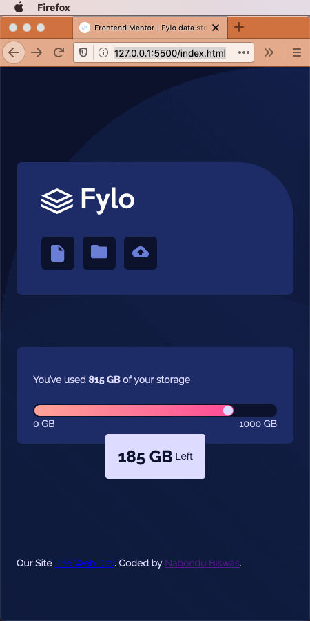
Our mobile site is complete and it will look like below.
 Mobile
This completes our first Frontend mentor challenge. You can find the code for the same in this github link.