Conquering Frontend Mentor -4
by Nabendu Biswas / January 24th, 2021
#css #beginners #webdev
Series: Frontend-Mentor
Welcome to the part-4 of the series. We will continue with the next frontend master challenge which is Base Apparel Challenge.
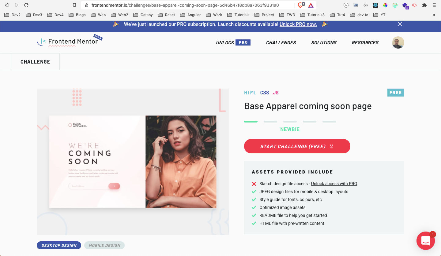 Base Apparel
After downloading the resources, I had extracted the zip file and copied it in the Frontend-mentor-challenges folder. After that opened the index.html file with Live Server.
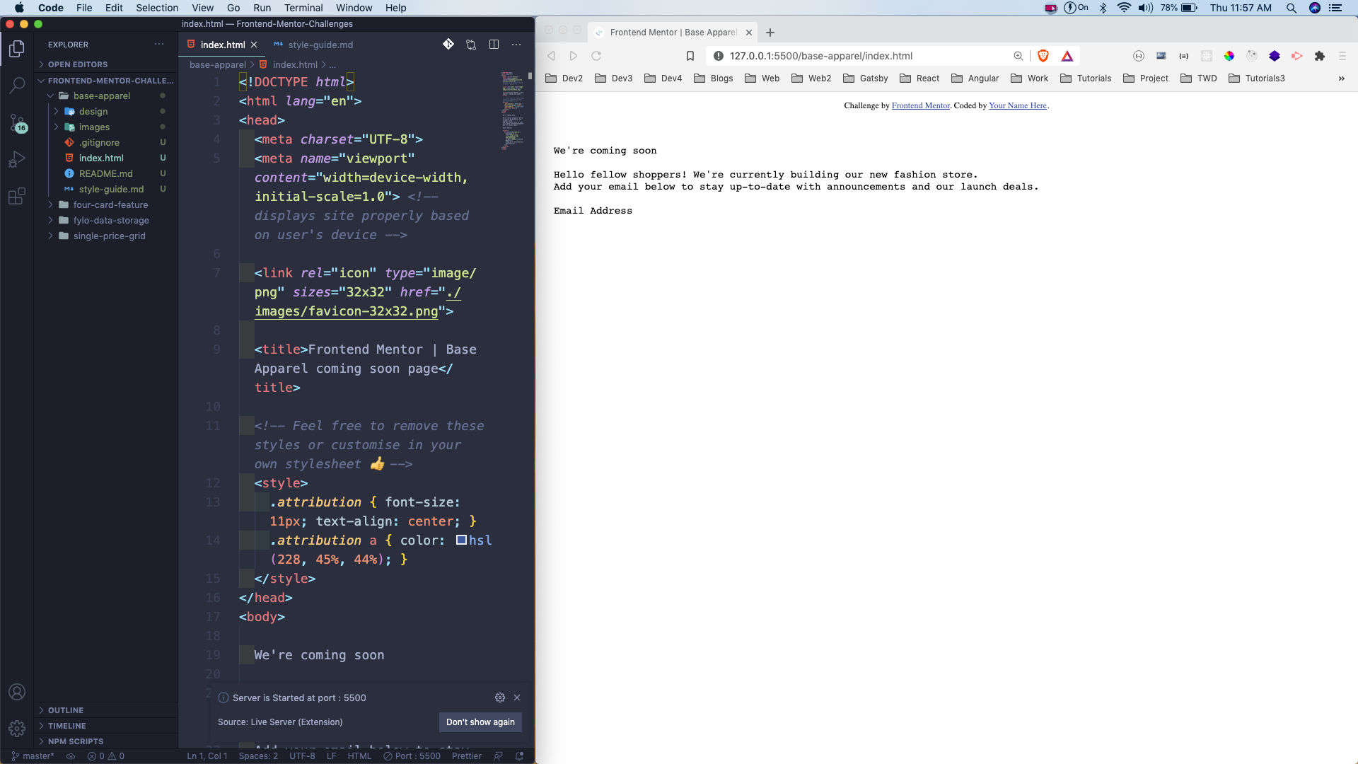 index.html
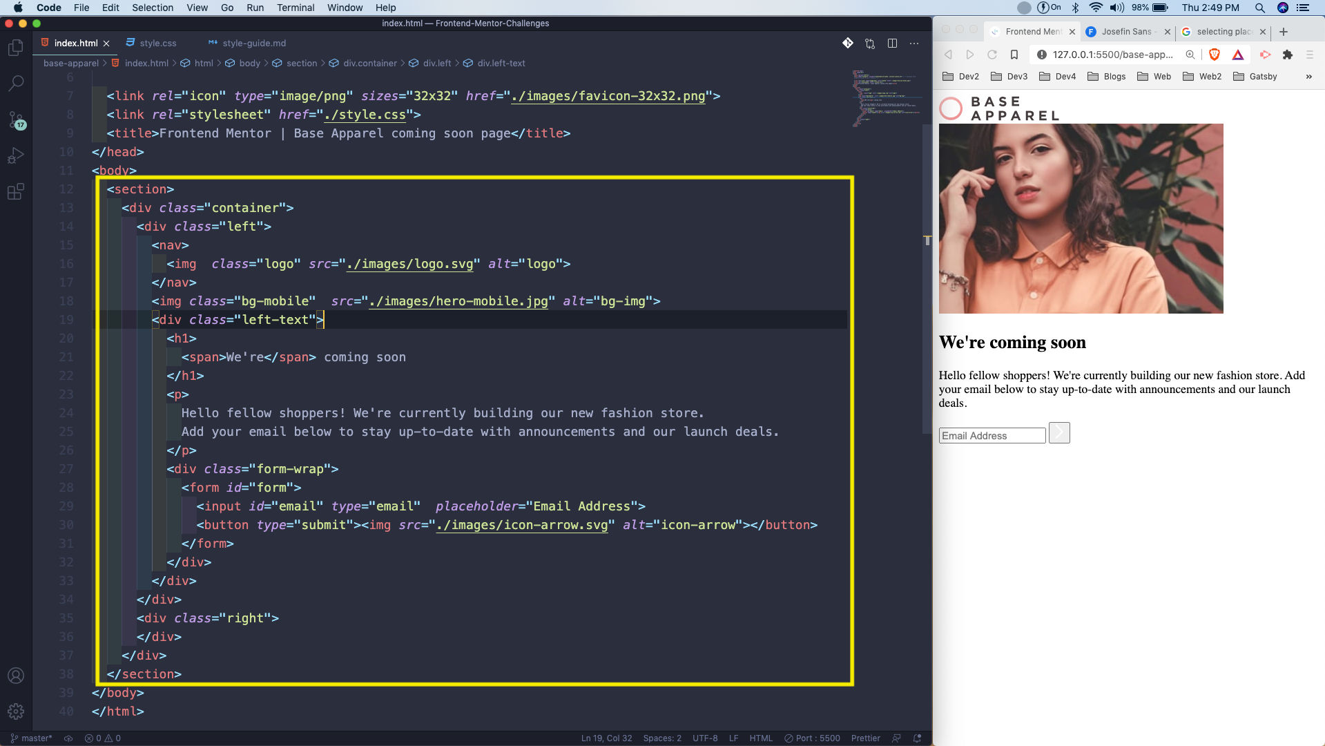
Next, we will add the required html tags. Here, everything is wrapped in a container, with left and right part.
In the left part, we have a logo first, after that the mobile site image. Then inside the left-text, h1 the paragraph and the form containing the input and the button. All of the images, we are getting from the images folder which was provided to us.
 index.html
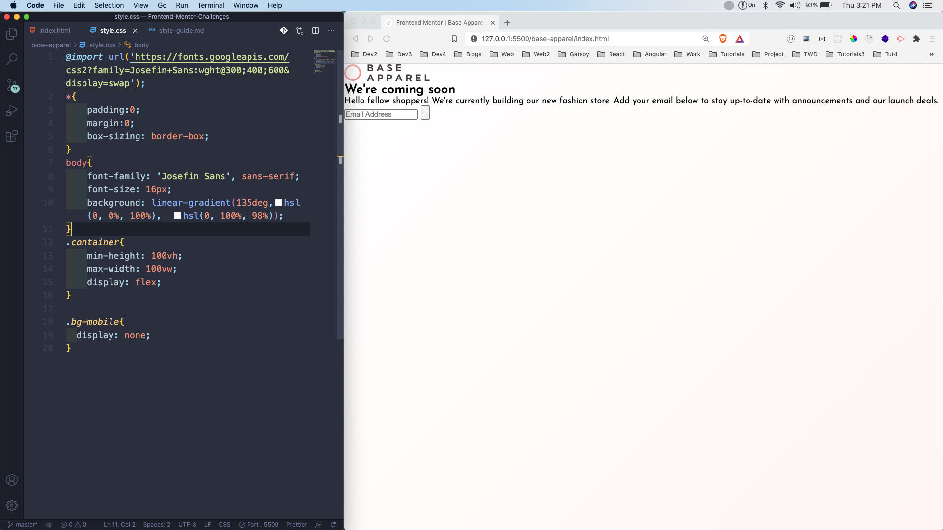
Next, we will move to our style.css and put the basic CSS. Here, also we got the linear-gradient and the font from the style-guide.md file.
We are also making the container as flex and hiding the mobile image.
 style.css
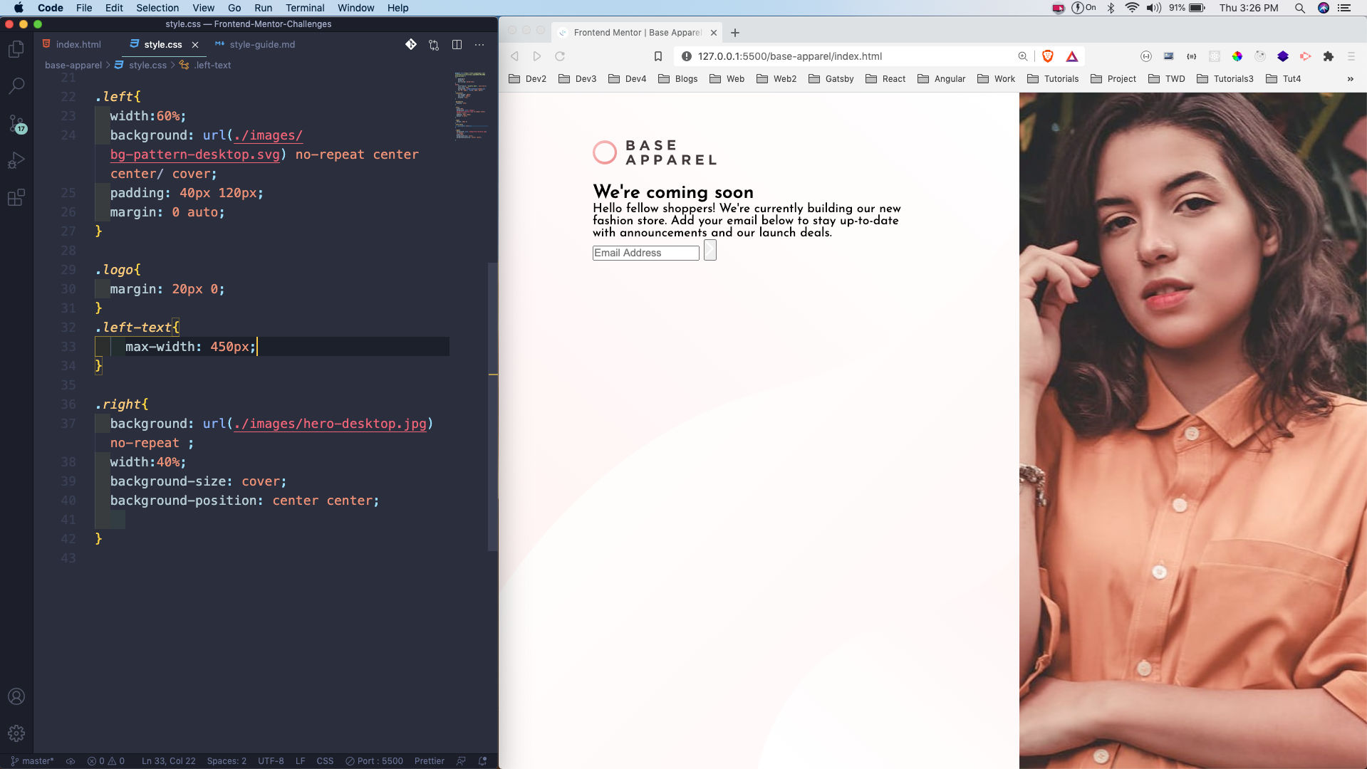
After that we are left and the right sections. In the left section, we are showing the provided pattern as background. Also, in the right we are displaying the image of the provided model.
We are also centring the left-text by giving it a max-width and also having the left with margin: 0 auto.
 style.css
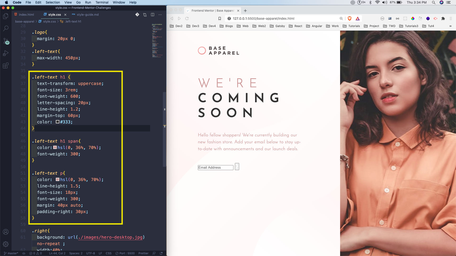
Now, it’s time to add the styles of h1, span and the p. So, we are doing that by eye-balling from the provided screenshot by frontend mentors.
 style.css
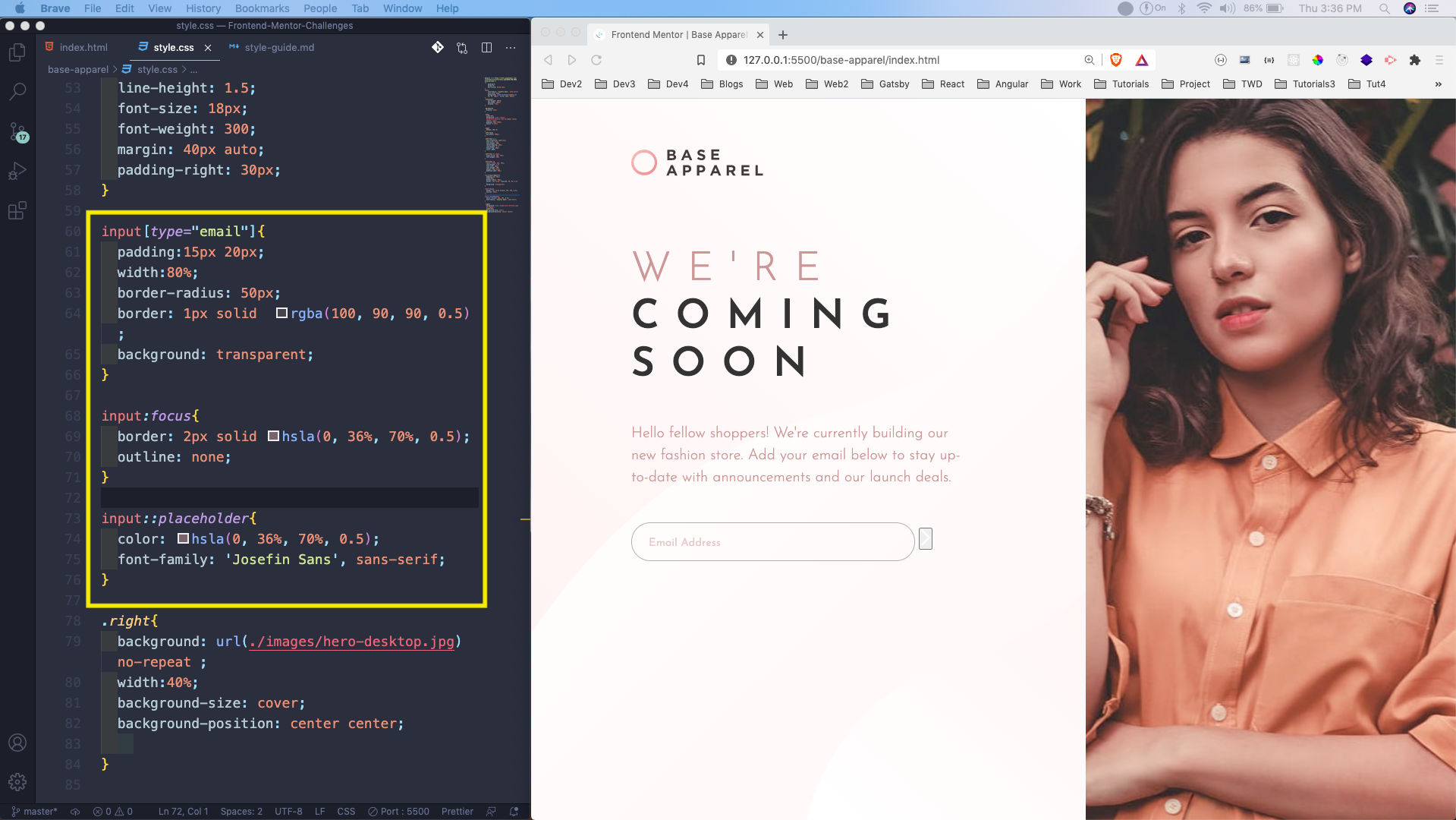
Next, we will write the styles for the input box. Again most of the colors are provided to us and rest is eye-balling.
 style.css
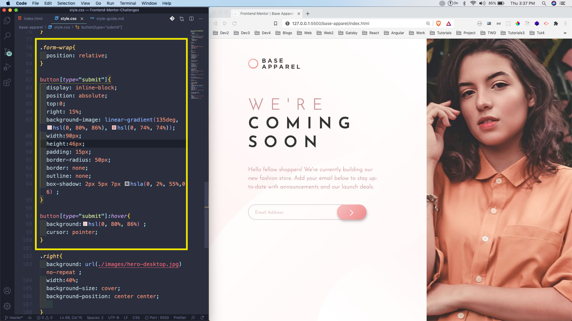
Now, it’s time to style our button. For this we are using position: absolute in it, as we want to move it. We also have to make the parent ie form-wrap a position: relative for it.
This completes our desktop styles.
 style.css
Now, we need to complete our mobile styles. For this we will write it in media query. The main thing which we are doing is making the flex-direction as column. We are also setting many thing as unset, which will set it to the initial value. We are also decreasing the font-size in h1 and p.
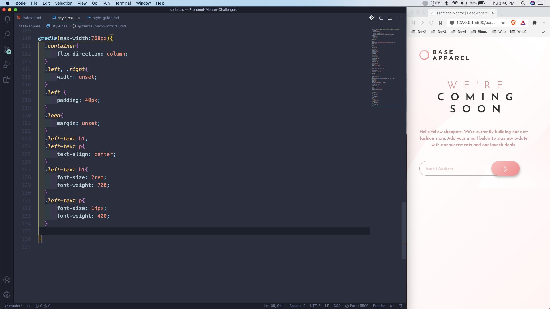 style.css
We will complete our project by making bg-mobile as block. Also, making the input width 100%.
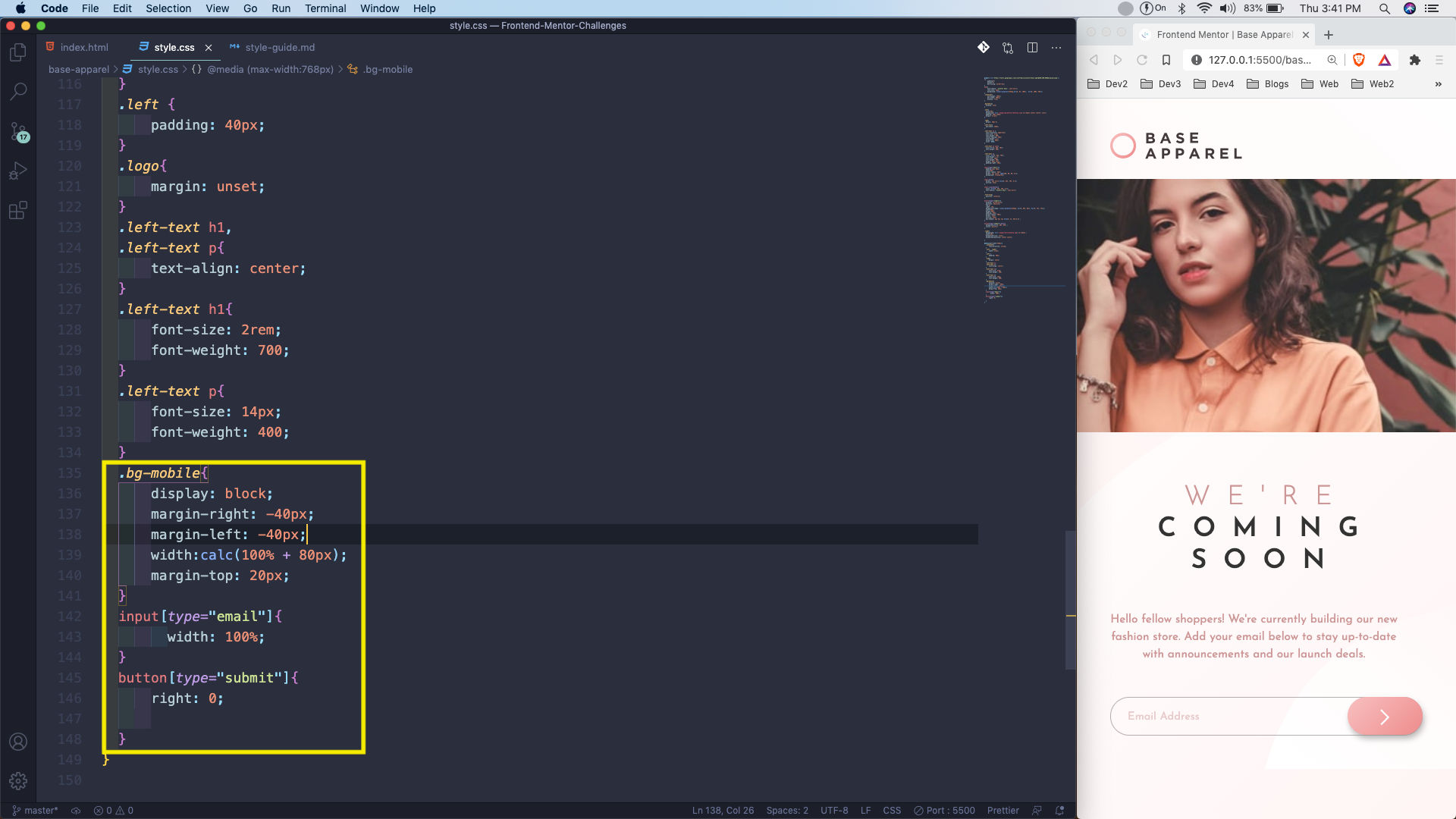 style.css
This completes our fourth Frontend mentor challenge. You can find the code for the same in this github link.