Conquering Frontend Mentor -6
by Nabendu Biswas / January 26th, 2021
#css #beginners #webdev
Series: Frontend-Mentor
Welcome to the part-6 of the series. We will continue with the next frontend master challenge which is Social Proof Section Challenge.
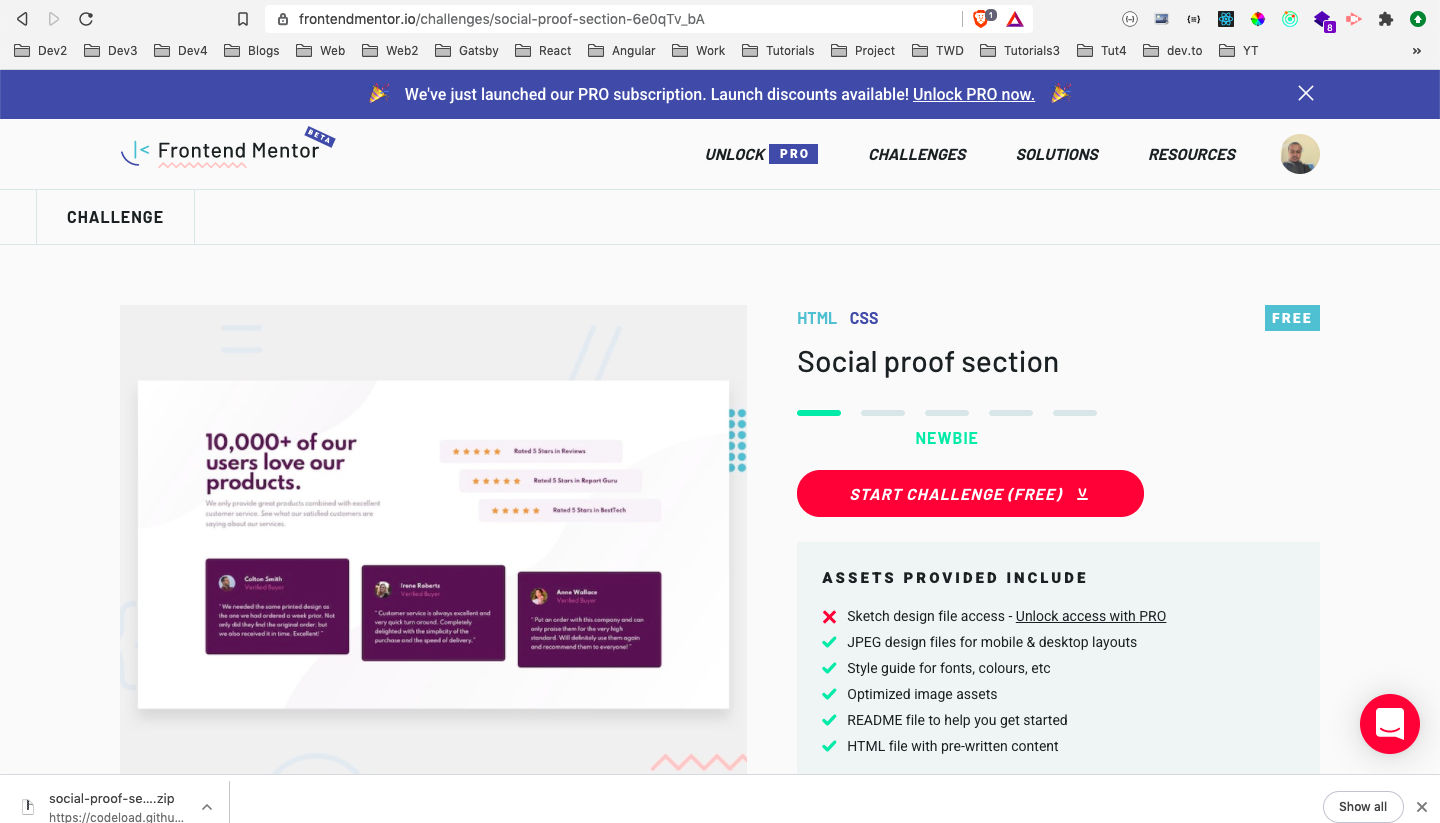 Social Proof
After downloading the resources, I had extracted the zip file and copied it in the Frontend-mentor-challenges folder. After that opened the index.html file with Live Server.
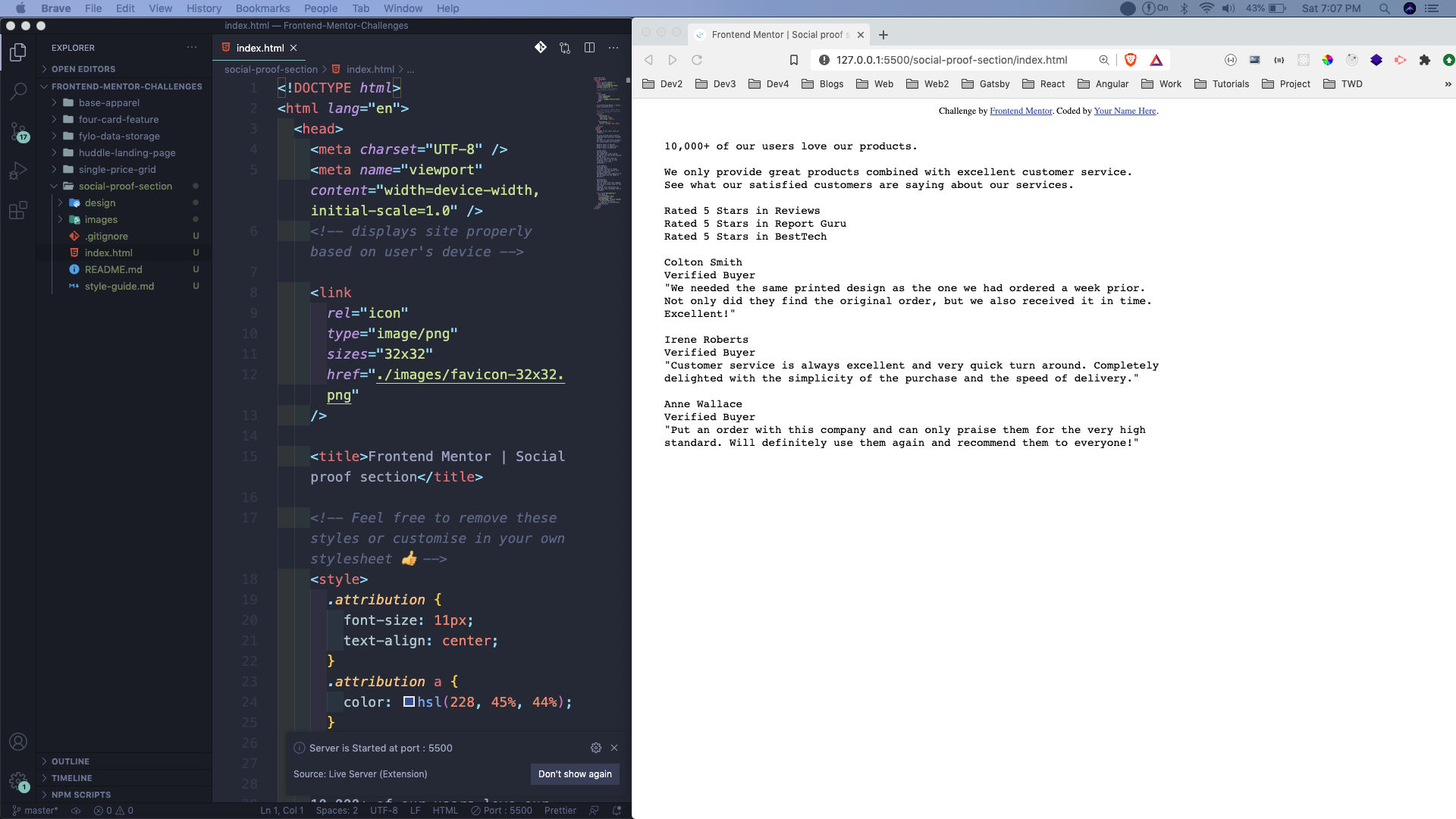 Live Server
Next, we will add the required html tags. Here, everything is wrapped in a container, with a primary__grid. Inside the primary__grid, we have top__grid and bottom__grid.
We have been also provided with the image of the star and three users.
    <!DOCTYPE html>
    <html lang="en">
      <head>
        <meta charset="UTF-8" />
        <meta name="viewport" content="width=device-width, initial-scale=1.0" />
        <link
          rel="icon"
          type="image/png"
          sizes="32x32"
          href="./images/favicon-32x32.png"
        />
        <link rel="stylesheet" href="style.css">
        <title>Frontend Mentor | Social proof section</title>
      </head>
      <body>
        <div class="container">
          <div class="primary__grid">
            <div class="top__grid">
              <div class="primary__content">
                <h1>10,000+ of our users love our products.</h1>
                <p>
                  We only provide great products combined with excellent customer service.
                  See what our satisfied customers are saying about our services.
                </p>
              </div>
              <div class="ratings">
                <div class="rating">
                  <div class="stars">
                    <img src="./images/icon-star.svg" alt="star">
                    <img src="./images/icon-star.svg" alt="star">
                    <img src="./images/icon-star.svg" alt="star">
                    <img src="./images/icon-star.svg" alt="star">
                    <img src="./images/icon-star.svg" alt="star">
                  </div>
                  <p>Rated 5 Stars in Reviews</p>
                </div>
                <div class="rating">
                  <div class="stars">
                    <img src="./images/icon-star.svg" alt="star">
                    <img src="./images/icon-star.svg" alt="star">
                    <img src="./images/icon-star.svg" alt="star">
                    <img src="./images/icon-star.svg" alt="star">
                    <img src="./images/icon-star.svg" alt="star">
                  </div>
                  <p>Rated 5 Stars in Report Guru</p>
                </div>
                <div class="rating">
                  <div class="stars">
                    <img src="./images/icon-star.svg" alt="star">
                    <img src="./images/icon-star.svg" alt="star">
                    <img src="./images/icon-star.svg" alt="star">
                    <img src="./images/icon-star.svg" alt="star">
                    <img src="./images/icon-star.svg" alt="star">
                  </div>
                  <p>Rated 5 Stars in BestTech</p>
                </div>
              </div>
            </div>

    <div class="bottom__grid">
              <div class="user__review">
                <div class="user__details">
                  <img src="./images/image-colton.jpg" alt="colton">
                  <div class="info">
                    <h5>Colton Smith</h5>
                    <span class="verified">Verified Buyer</span>
                  </div>
                </div>
                <p>
                  "We needed the same printed design as the one we had ordered a week prior.
                  Not only did they find the original order, but we also received it in time.
                  Excellent!"
                </p>
              </div>
              <div class="user__review">
                <div class="user__details">
                  <img src="./images/image-irene.jpg" alt="colton">
                  <div class="info">
                    <h5>Irene Roberts </h5>
                    <span class="verified">Verified Buyer</span>
                  </div>
                </div>
                <p>
                  "Customer service is always excellent and very quick turn around. Completely
                  delighted with the simplicity of the purchase and the speed of delivery."
                </p>
              </div>
              <div class="user__review">
                <div class="user__details">
                  <img src="./images/image-anne.jpg" alt="colton">
                  <div class="info">
                    <h5>Anne Wallace </h5>
                    <span class="verified">Verified Buyer</span>
                  </div>
                </div>
                <p>
                  "Put an order with this company and can only praise them for the very high
                  standard. Will definitely use them again and recommend them to everyone!"
                </p>
              </div>
            </div>
          </div>
        </div>
      </body>
    </html>
Now, our page will look like below.
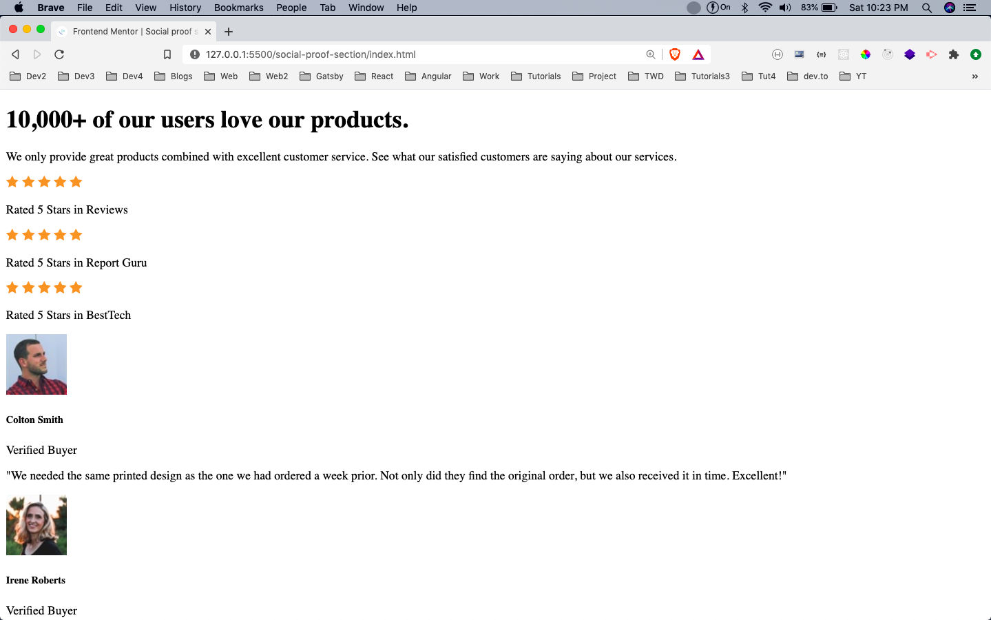 index.html
Next, we will start to style our project in style.css. Here, we are first importing the google font family, which is been asked in the style-guide.md file.
One important thing is that in body, we are using the two background images provided to us. One, we are placing at the left top and the other at right bottom.
We are also making the container max-width as 80% and centering it.
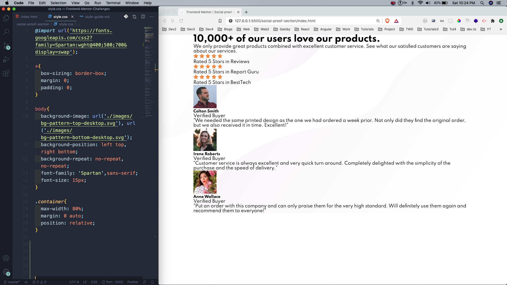 basic styles
Next, we are making the class primary__grid as grid, with two rows of 300px each.
After that making the class top__grid also a grid, with two columns of 300px and 400px. We also have a significant column gap between the items. Also, styling the h1 and p in it.
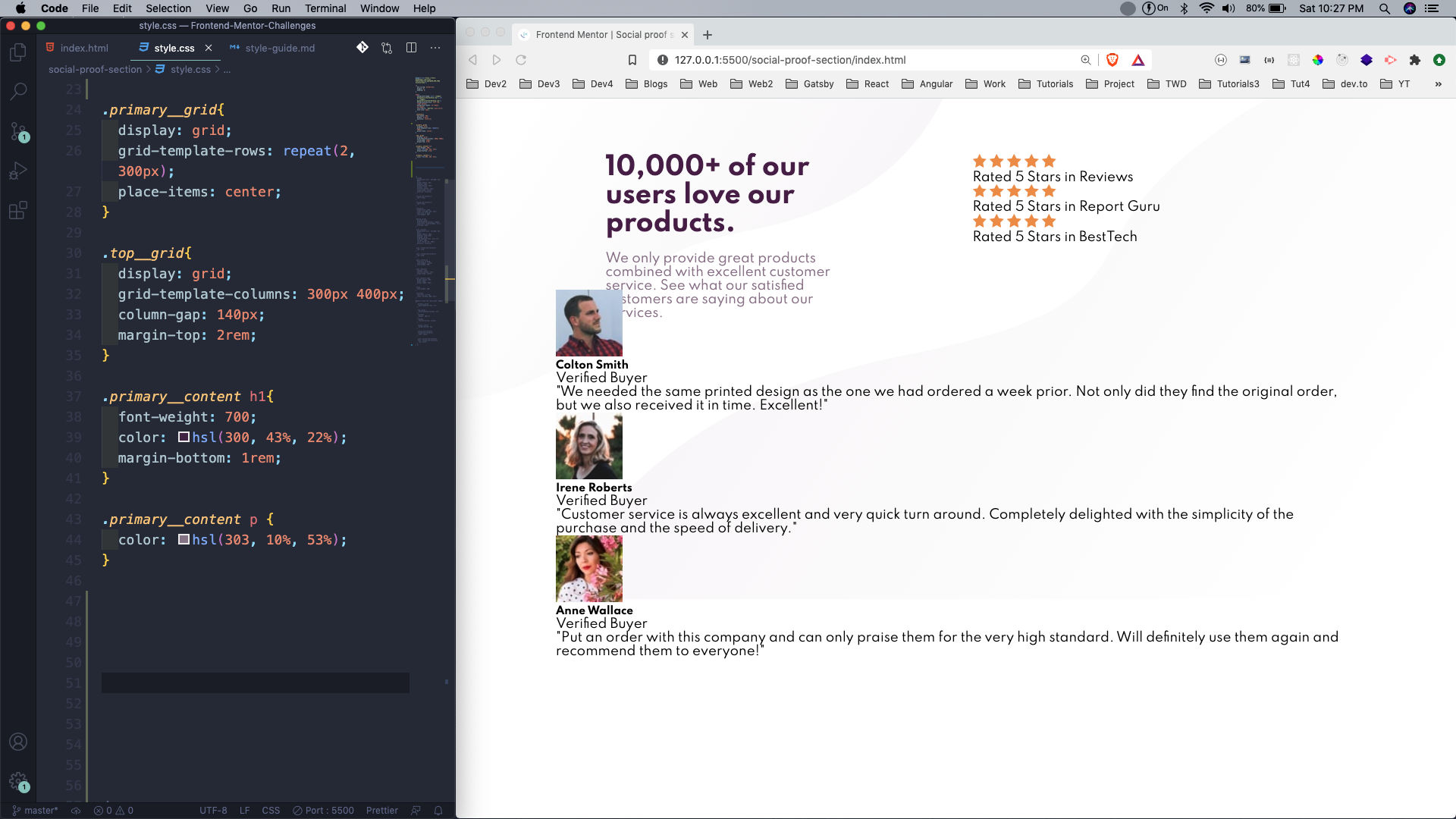 primary__grid
Next, we will create the styles for the rating. We are using flex to center it. We had also made the rating as position: relative. This is done, because we are moving the 2nd and 3rd rating by 2rem.
We have also written the styles for bottom__grid and used the grid-template-columns: repeat(auto-fill, minmax(280px, 1fr)). This is a very property in grid and reduces the use of media queries a lot. Here, each grid item will be 280px wide and if it doesn’t gets that space it will be in a column. You can read more about it in my article here.
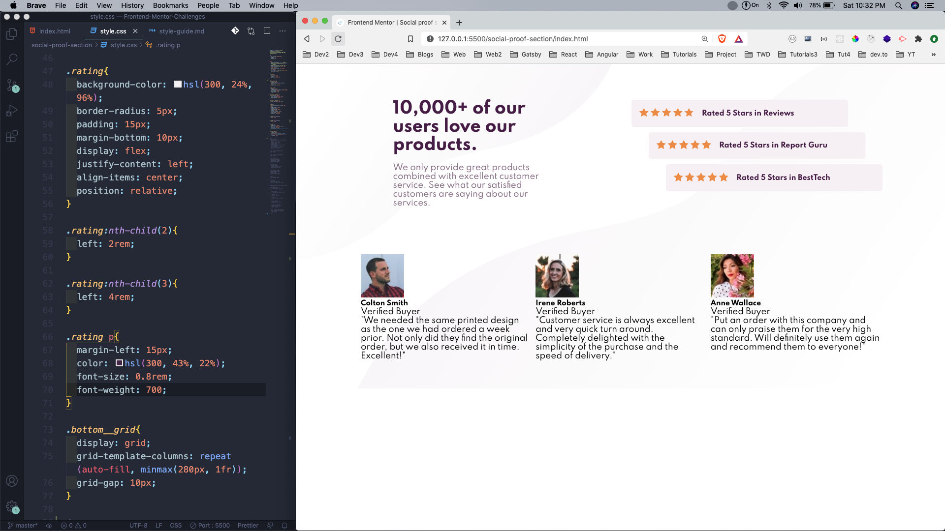 display: grid
We will now complete our style for the class *user__review. *We are again taking help of grid, flexbox both to style. We are again using position: relative and top to move the 2nd and 3rd box down.
This completes our desktop styles.
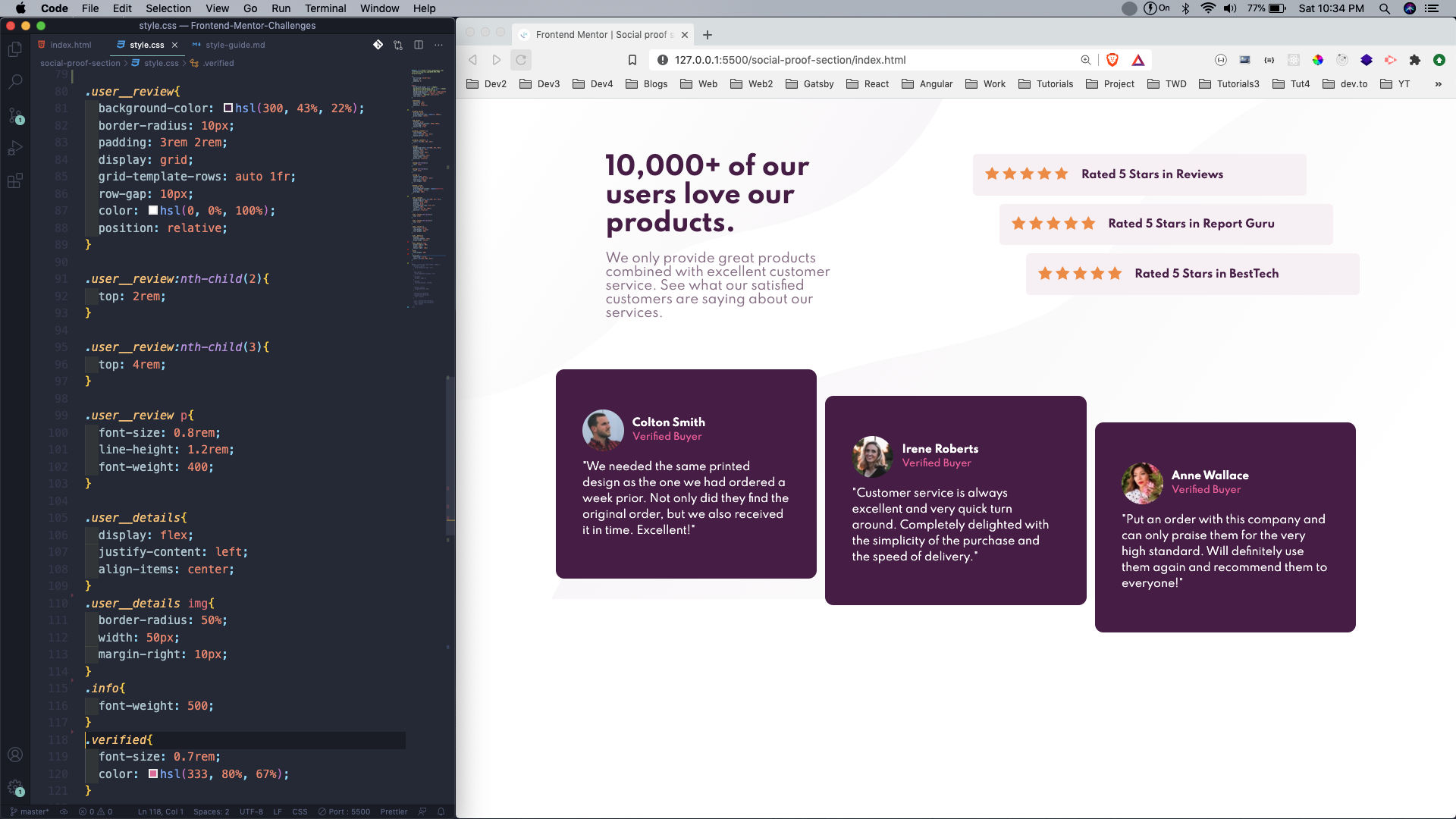 grid and flex
Now, our mobile style is very simple, because we had properly use grid. As told earlier our bottom__grid, was already done. We are just making the rows of primary__grid as 1 and also top__grid column as 1.
We are also unsetting the left and top, which we have used to move the box for rating and user review.
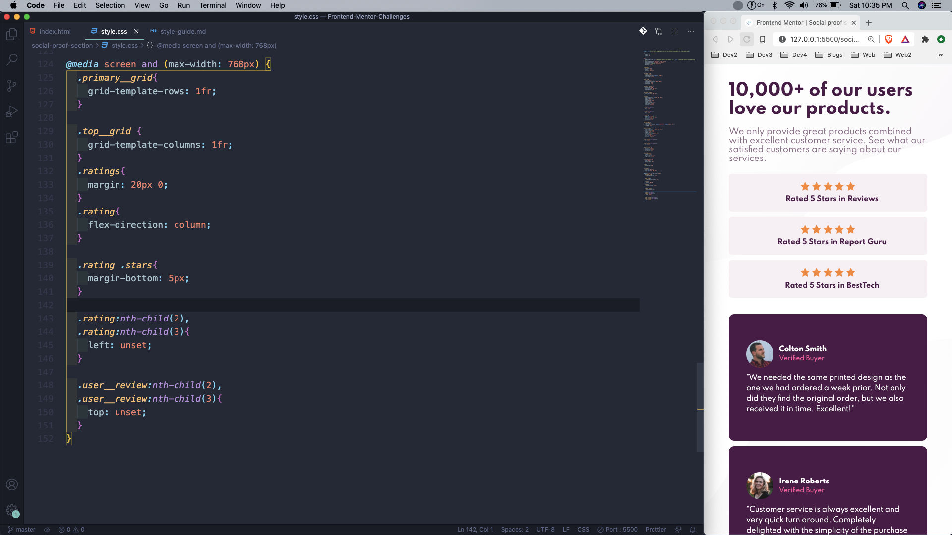 mobile styles
This completes our sixth Frontend mentor challenge. You can find the code for the same in this github link.