Conquering Frontend Mentor -7
by Nabendu Biswas / January 27th, 2021
#css #beginners #webdev
Series: Frontend-Mentor
Welcome to the part-7 of the series. We will continue with the next frontend master challenge which is Article Preview Component Challenge.
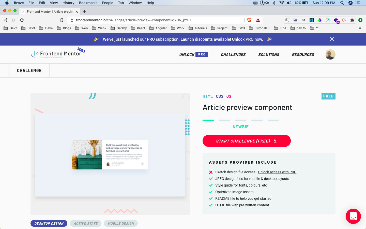 Article Preview Component
After downloading the resources, I had extracted the zip file and copied it in the Frontend-mentor-challenges folder. After that opened the index.html file with Live Server.
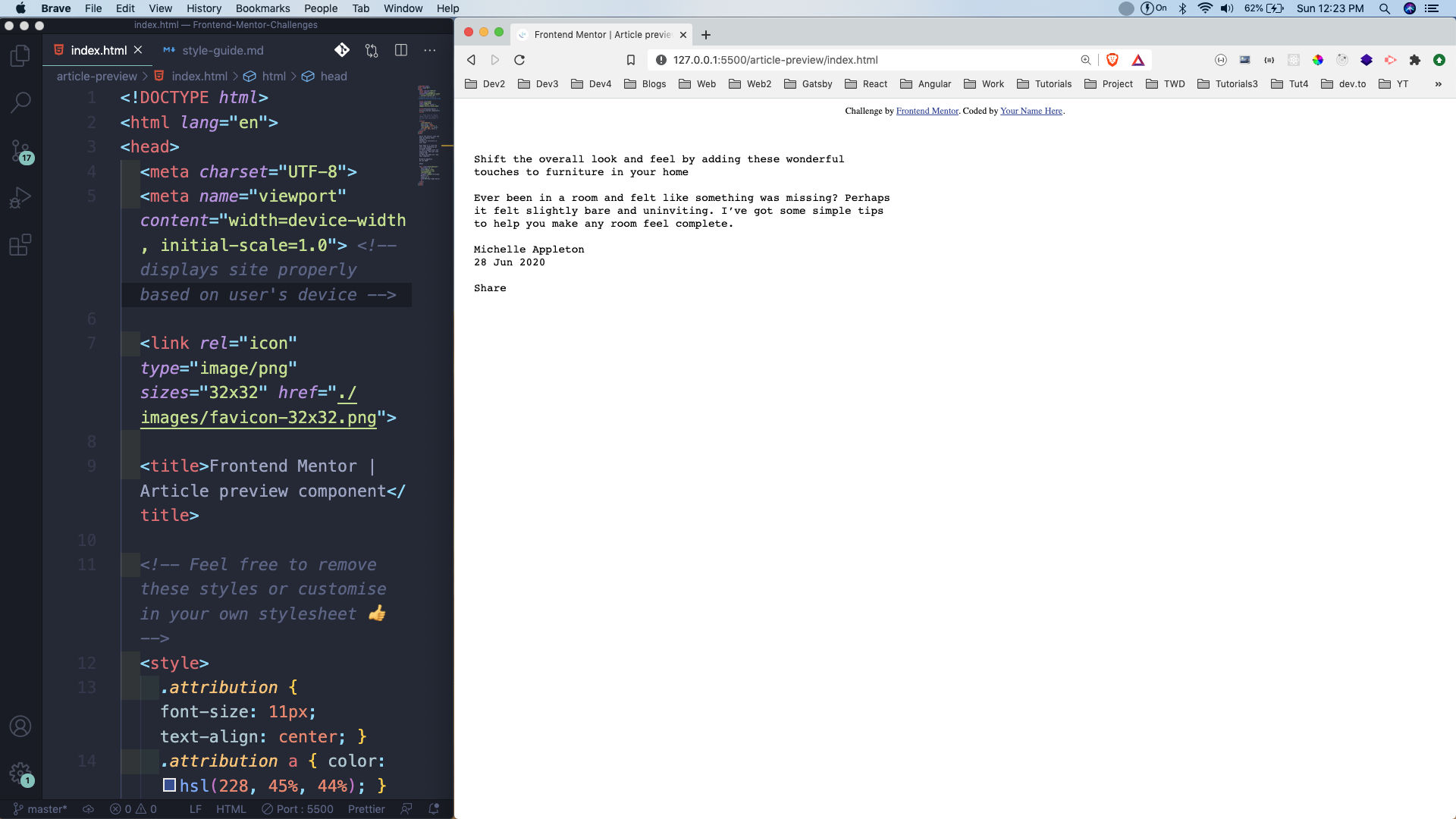 Basic file
Next, we will add the required html tags. Here, everything is wrapped in a container, with a left and right section. The left will only contain an image which we will add through the css.
The right contains all the data, with h3, p and the author section containing image and user data. Also, notice that we have a share__box, which contains our social icons. We are going to hide it from CSS and show once we click on the arrow button.
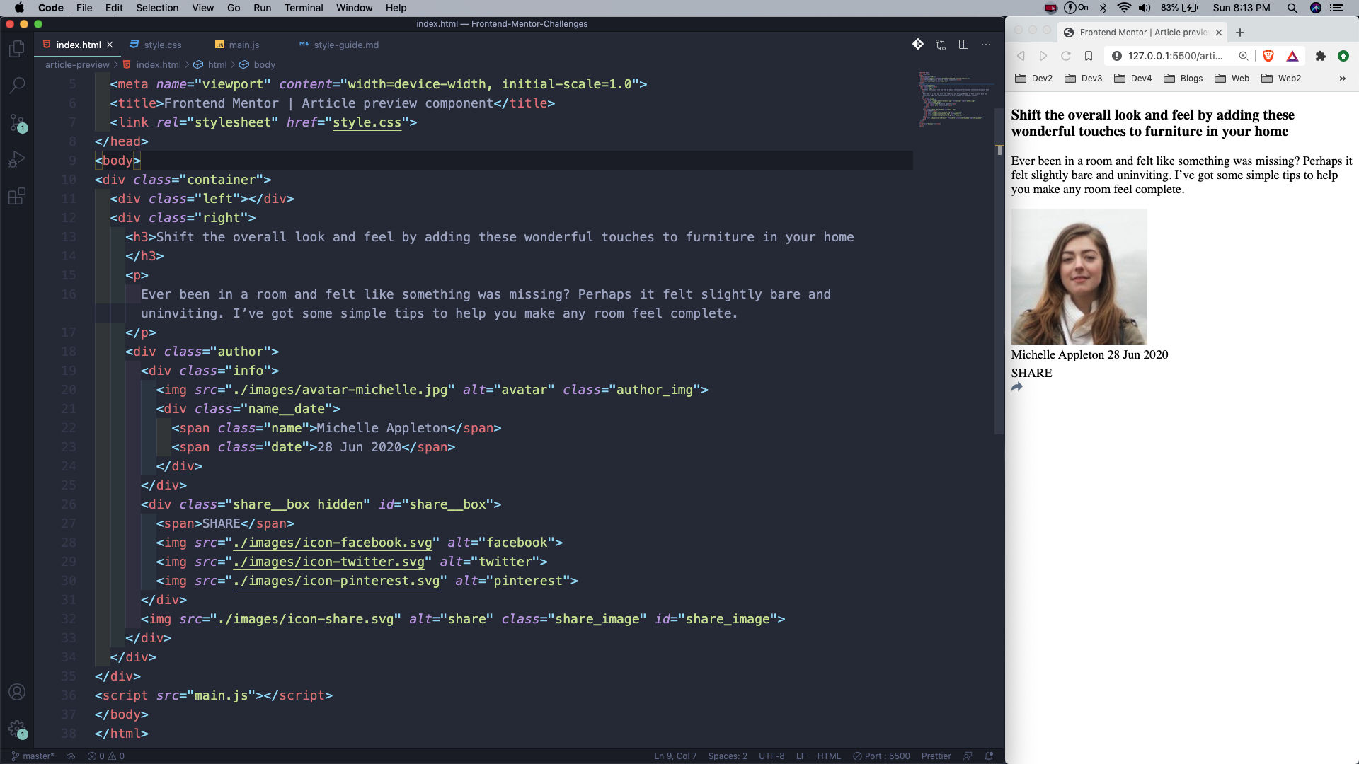 index.html
Now, we will create our desktop view first. So, head over to style.css and add the google font first. After that in the body, using the font and centring everything using grid.
After that making the container as grid with two columns of 280px and 450px. Also, making a row of 300px.
After that using the left id to show our image of drawer. Also, making the top left and bottom left radius as rounded corners.
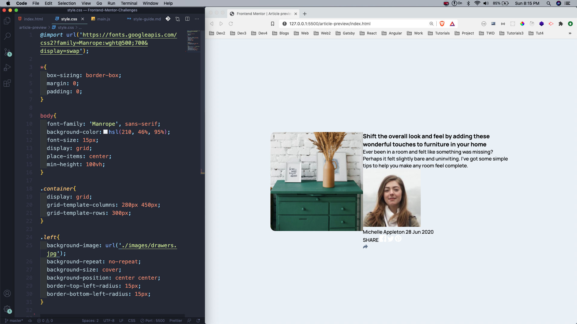 style.css
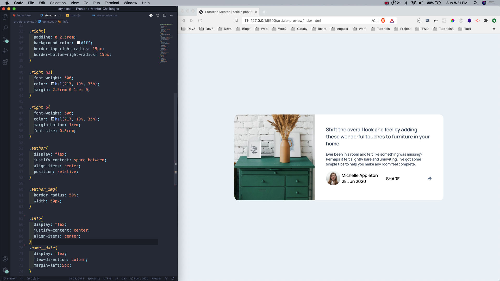
Next, we will start styling our right part. The styles for right, h3 and p are straight-forward.
After that we are making the author class as flex, which contains our author image, name, date and the share image.
We also have the share__box inside it, which we are soon going to hide. The info and the name__date class are also made flex.
 style.css
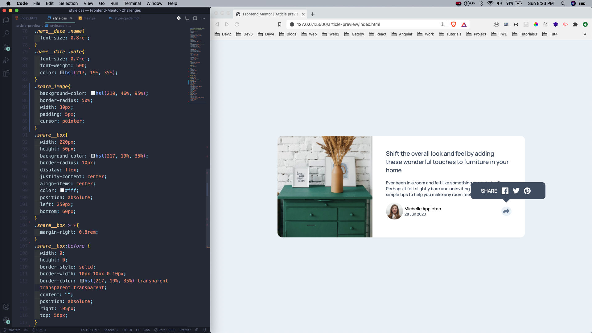
Next, we will style the name, date and the share_image, which is the share icon.
After that we are making the share__box, containing the Share text and three social icon. Also, notice that we are using position: absolute to move it in the correct position.
We are showing the inverted triangle at the bottom in the :before pseudo tag. Again we are using position: absolute to move it in the correct position.
 style.css
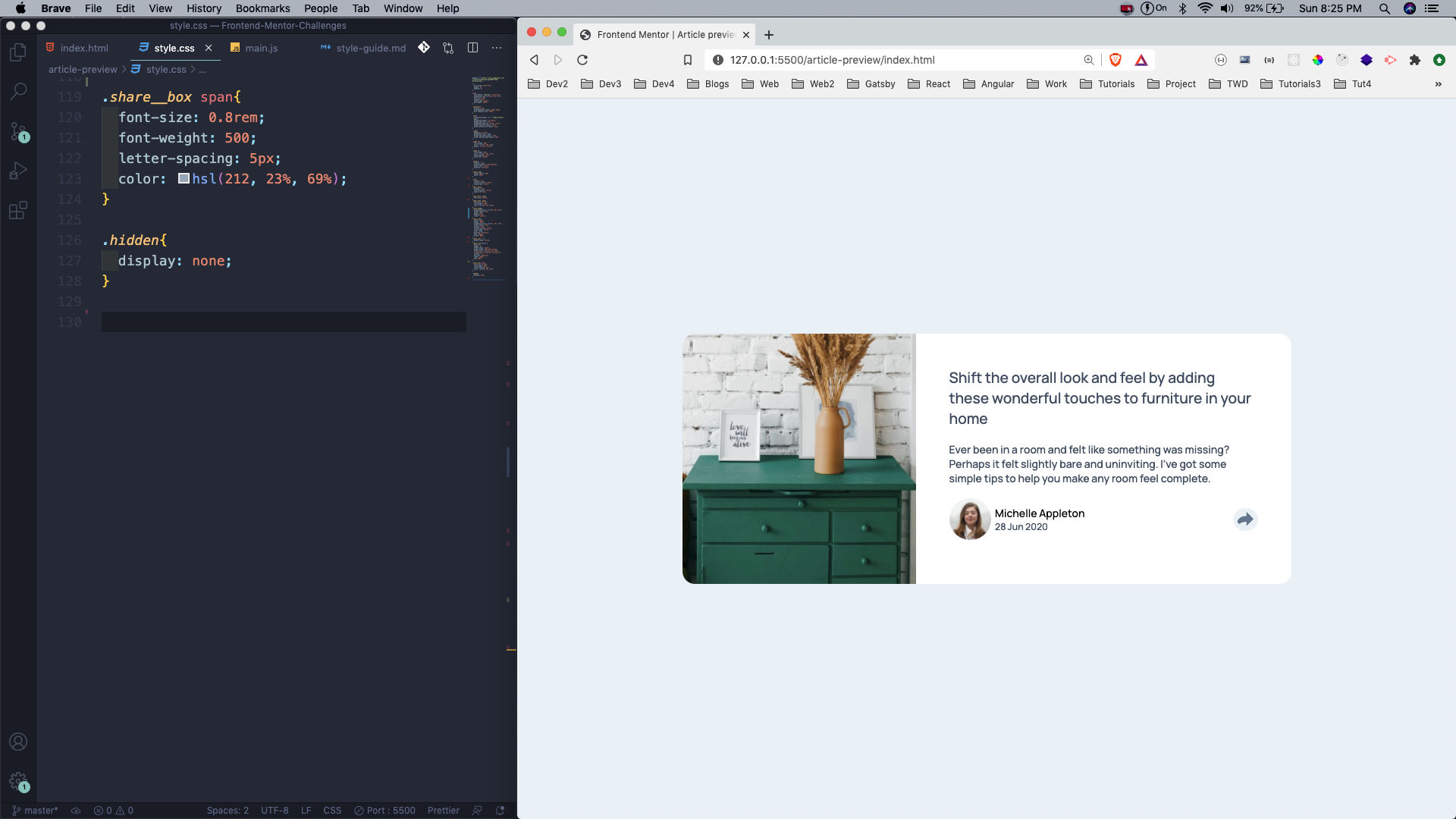
After that we are doing just a bit of style for the Share text and hiding the whole box, by giving the hidden class a display: none. Notice that we have this class in the share__box div in the html.
 span
span
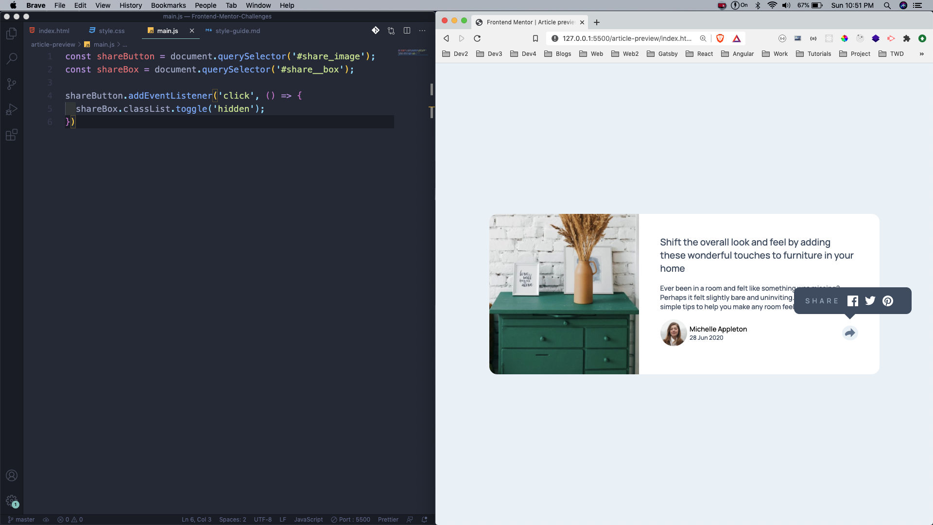
Now, we will add our tiny logic in main.js file. Here, we are selecting the share_image and the share__box. After that in the event listener of the share button, we are toggling the hidden class.
 main.js
Now, our desktop view is complete so we will create our mobile view. The main change is to do the grid-template-columns: 1fr for the container.
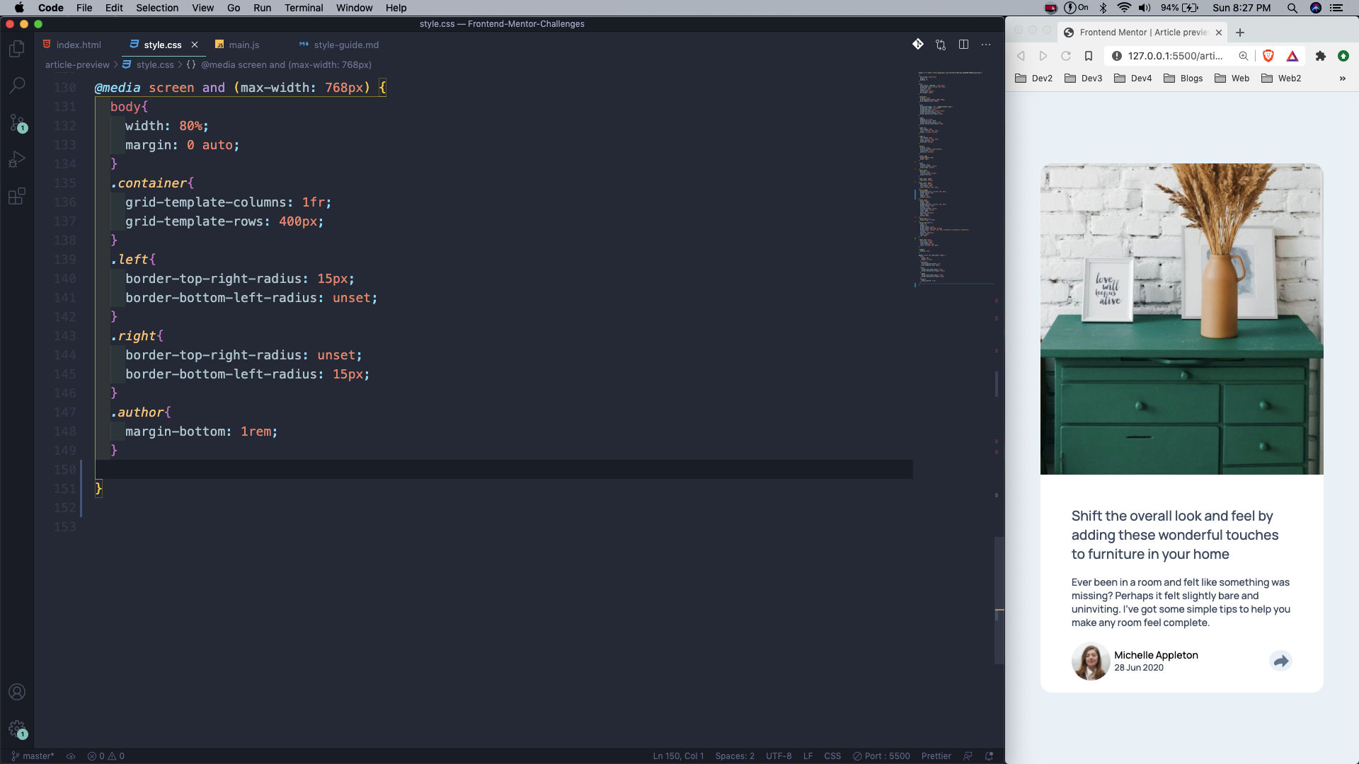 mobile view
The share button is also different, as per the design provided. We are changing the whole *share__box *style, including it’s position.
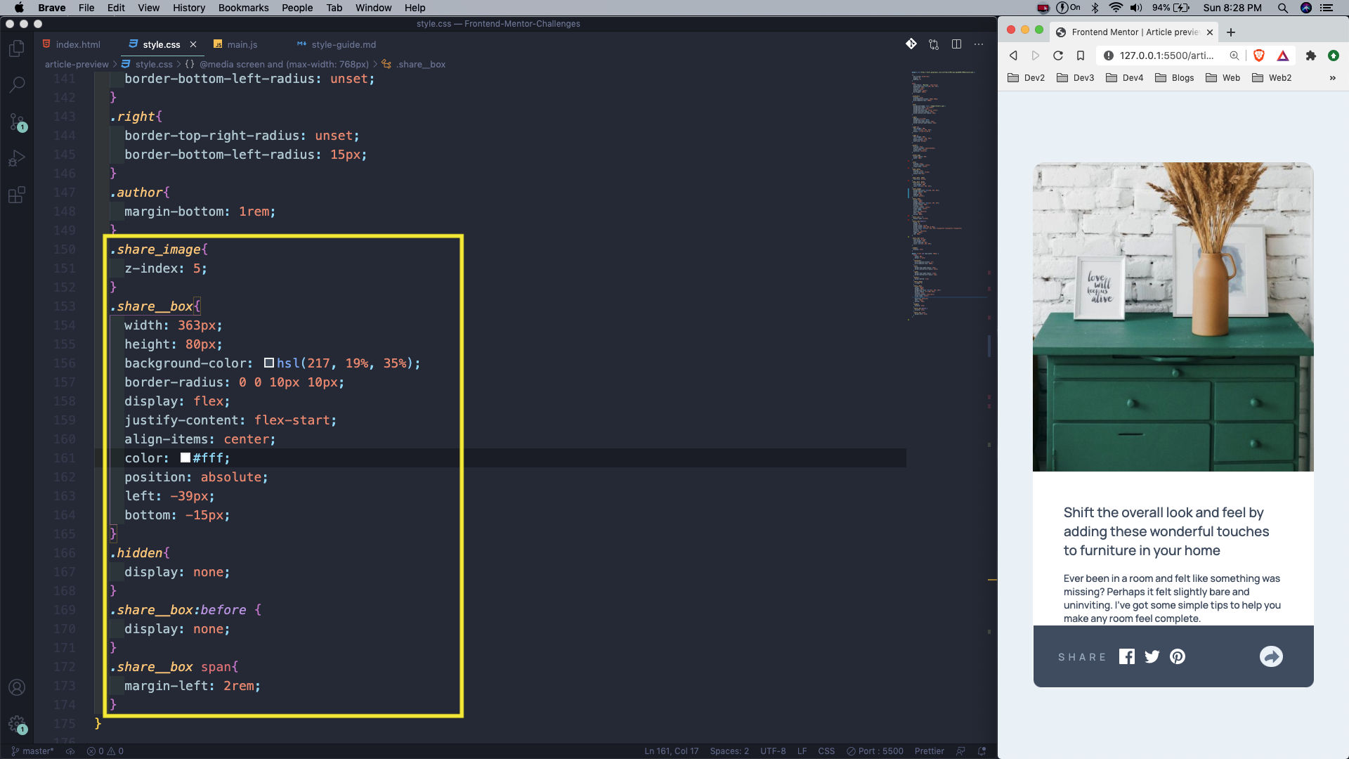 mobile view
This completes our seventh Frontend mentor challenge. You can find the code for the same in this github link.