In this same demo, we will learn about NextJS image optimization. NextJS is know for it’s image optimization which is a pain point in any web-app, because images slows down websites. This post have taken reference form this awesome youtube video.
So, we have created a simple NextJS app with the familiar command
 Terminal
Next, we have created a folder red-example in the public folder and added three images of 800px, 1200px and 1600px in it.
Also, created a srcset.js file in the pages folder. Here, we are using the normal img tag and src in it. But the magic happens with the srcSet attribute in it. The src tag is still required if you plan to support old browsers like IE11.
Now, in the srcSet attribute, we are giving our three images and also mentioning the width in which they should be downloaded.
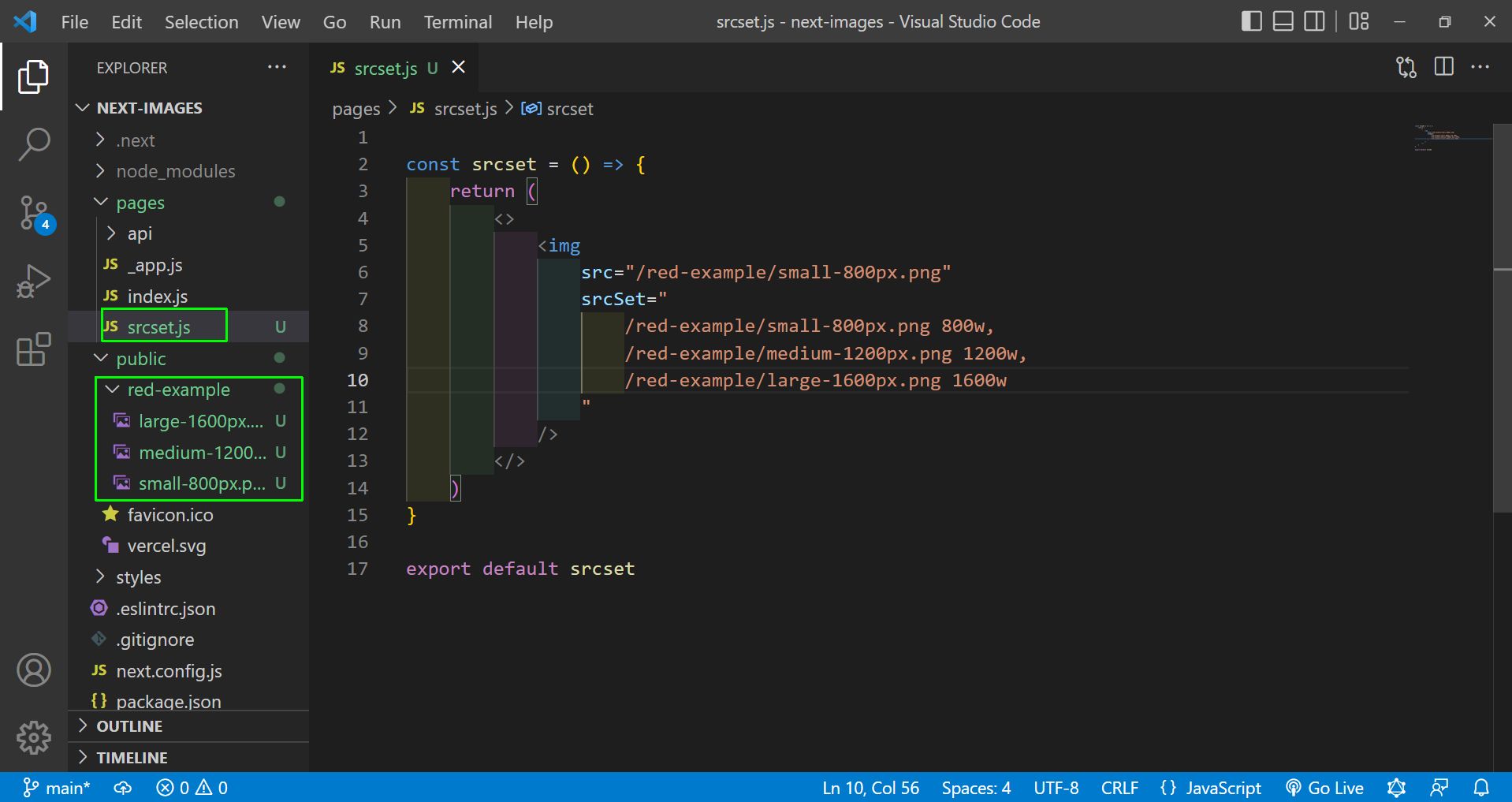 srcset.js
Now, go to http://localhost:3000/srcset and also open the developer tools. Here, in the mobile view we are getting the small image. In the Network tag, we can also see it been downloaded.
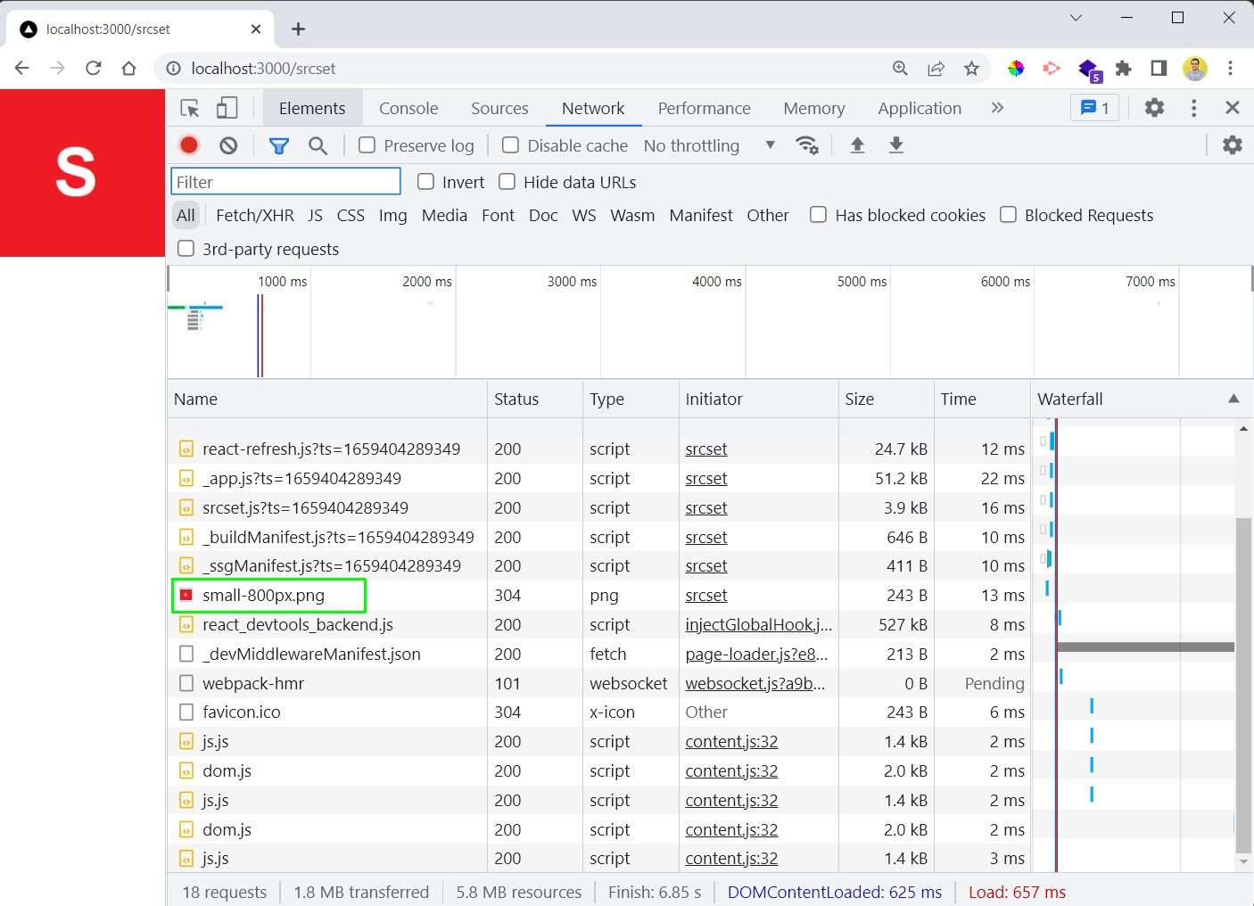 small
small
Now, in the tablet view which is 1200w, the medium image is downloaded and shown.
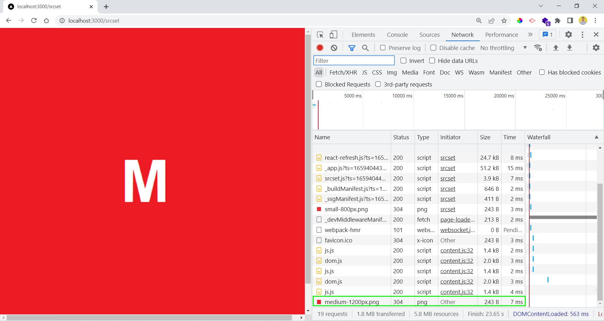 Medium
Lastly, in the desktop view which is 1600w, the large image is also downloaded and shown.
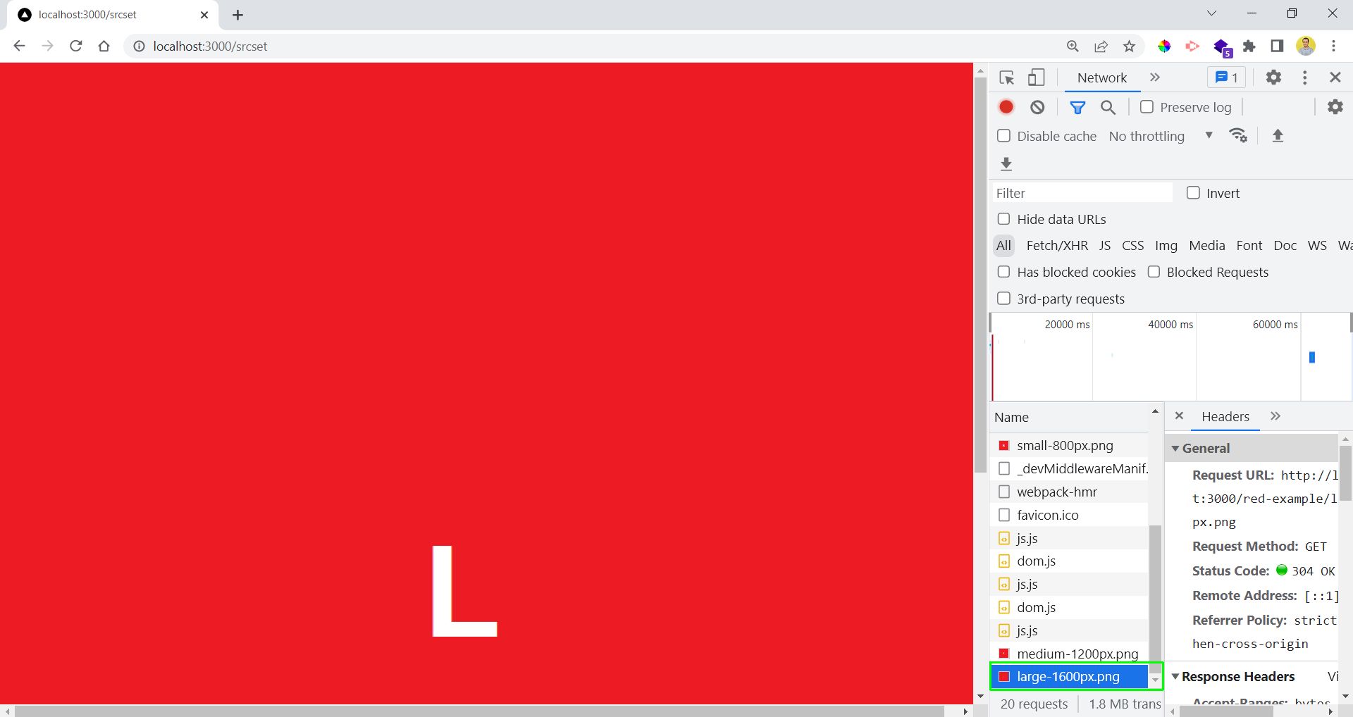 Large
Large
Now, we will check the famous Image element in NextJS. For this first add a photos folder in the public folder. Here, we have added some pictures.
Next, we have created the photos.js file, in the root directory. Here, we are giving details of all the images in an Array of object.
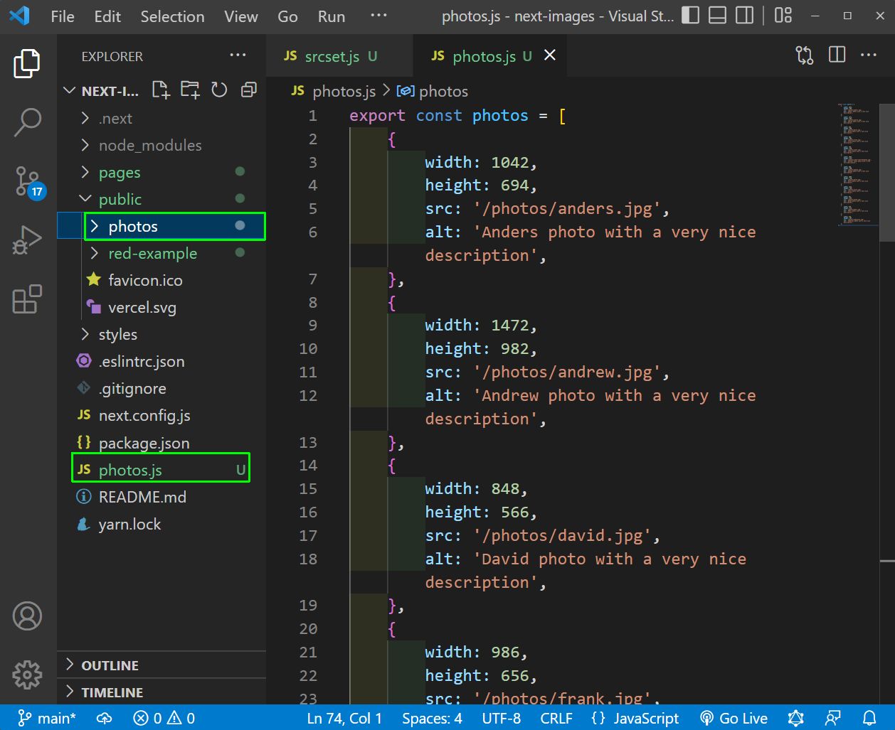 photos.js
Now, create a new file normal.js inside the pages folder. Here, we are looping through the photos array and showing them through a HTML img tag.
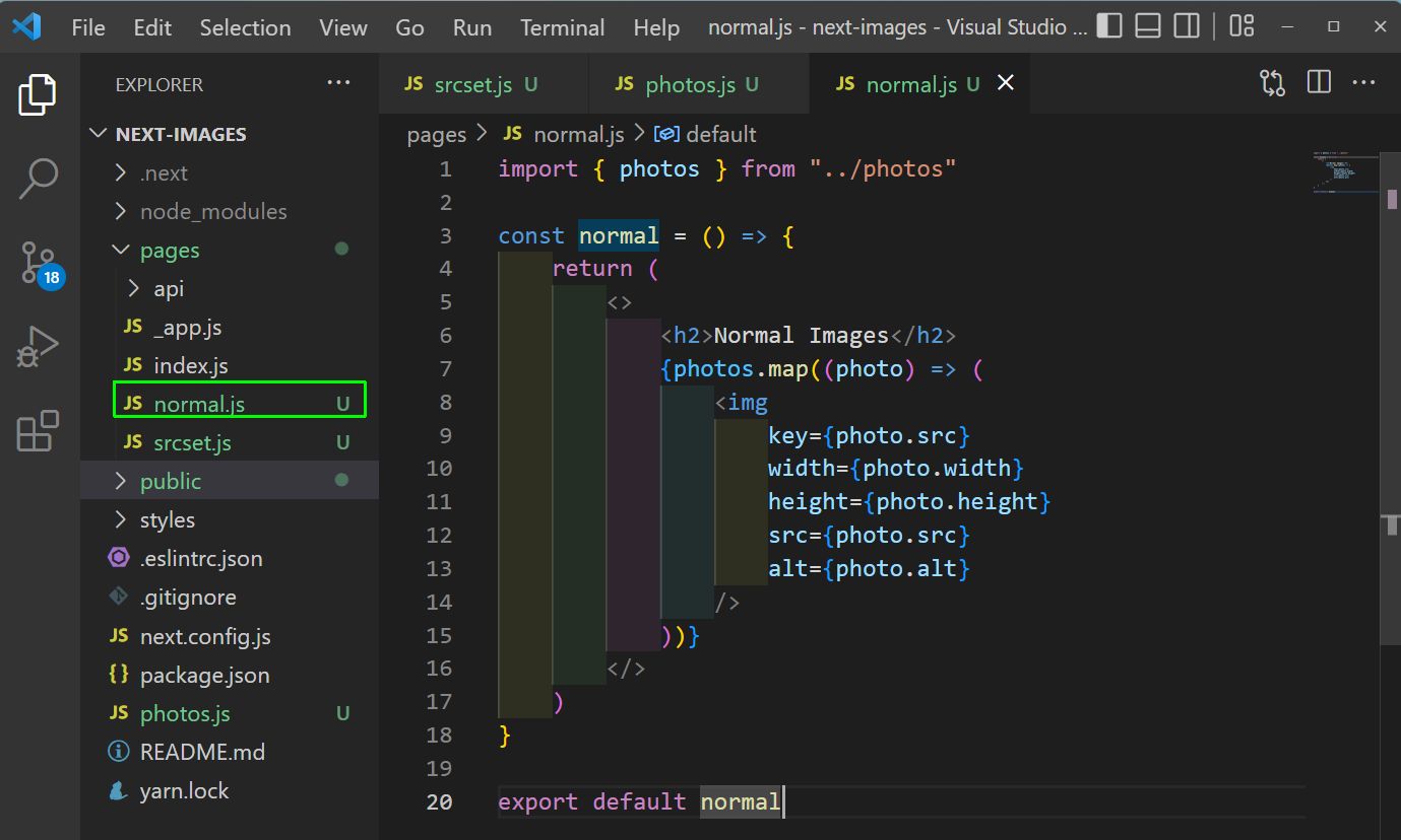 normal.js
Now, in http://localhost:3000/normal we will see the normal images which are not optimized or responsive.
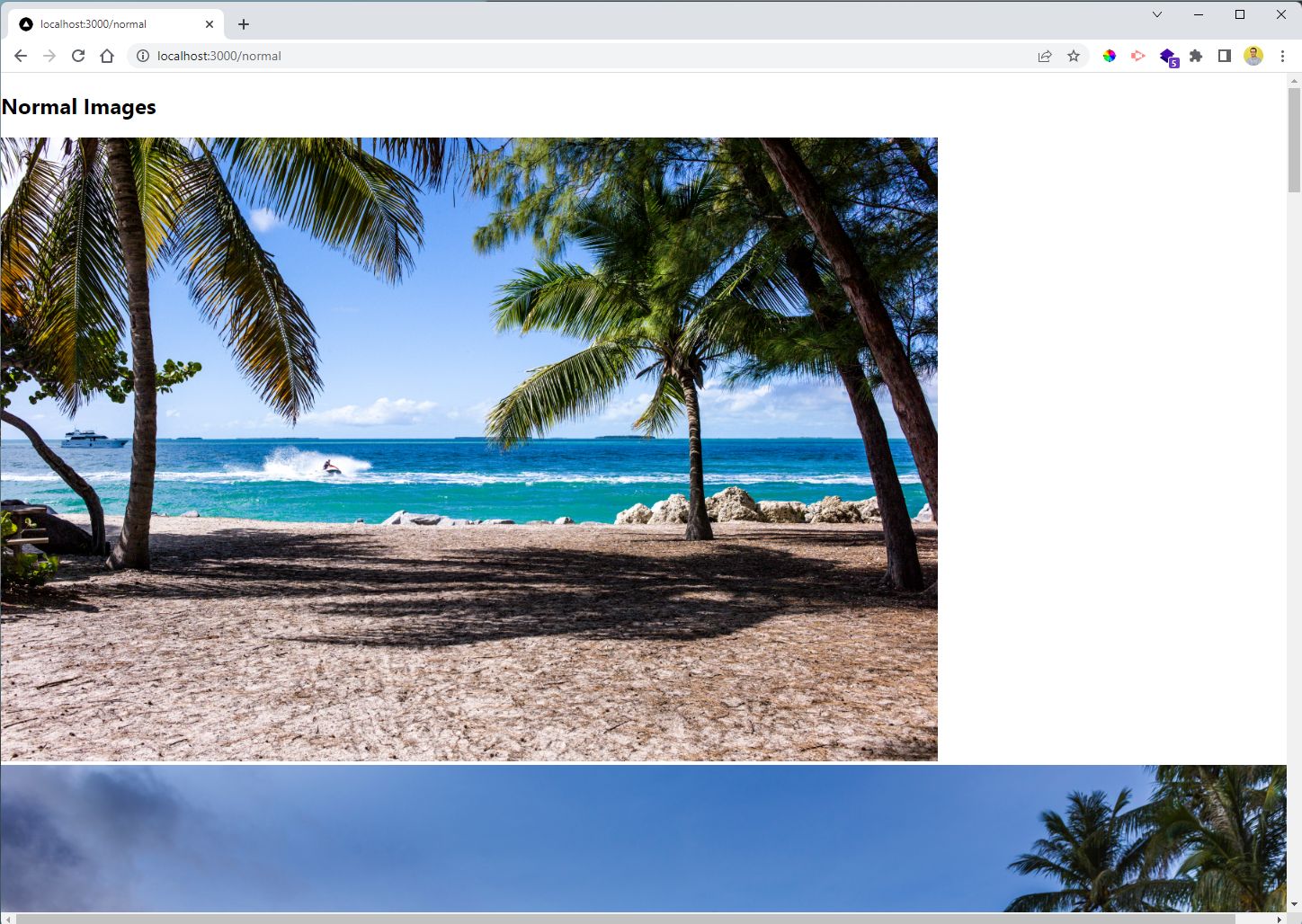 localhost
To change it to Next images, we just need to use the Image tag from next. We are also using an attribute of layout for responsiveness.
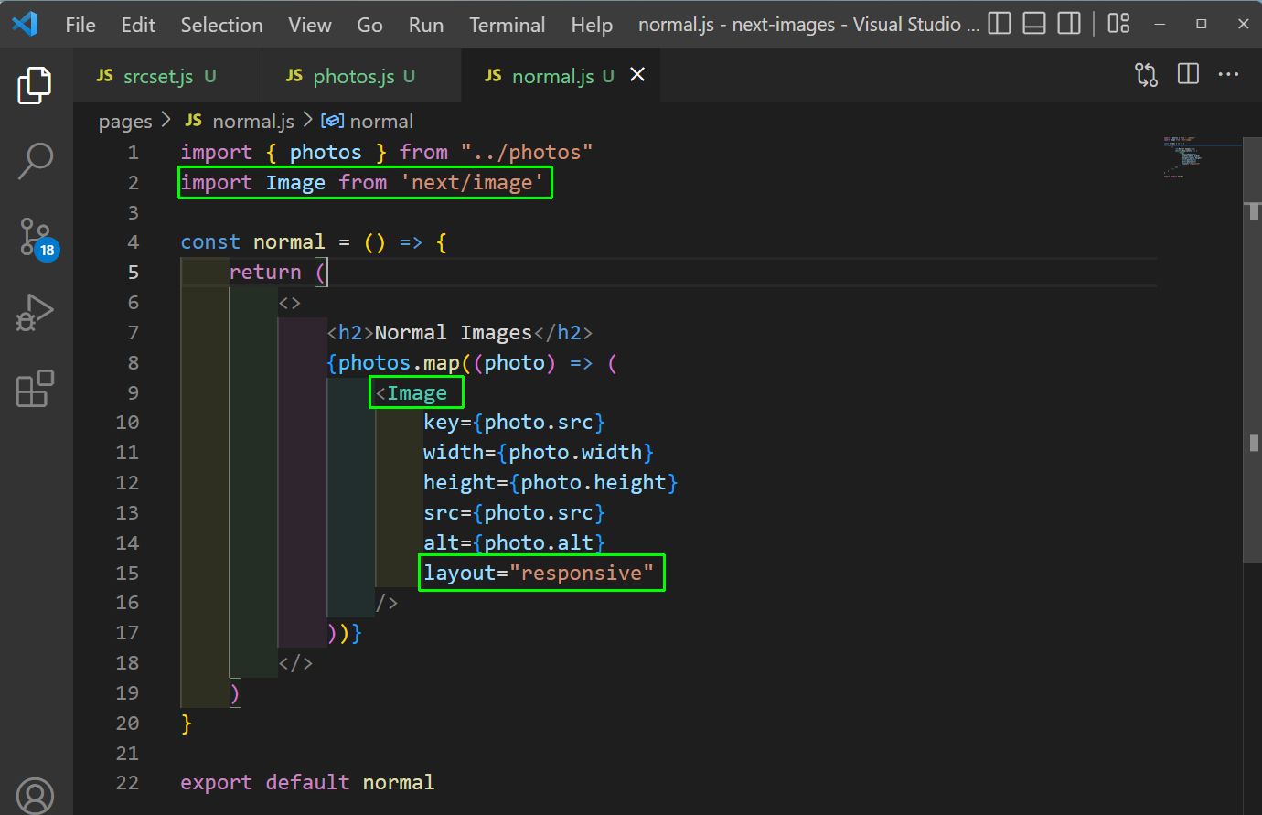 normal.js
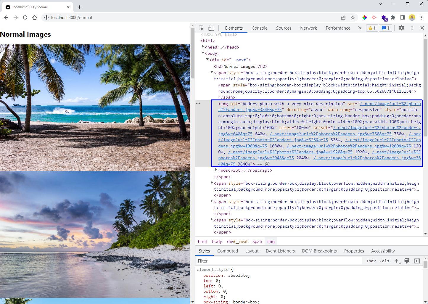
Now, our images are completely responsive and also optimized. Notice the srcset in the img in develper tool. Different size of images are available for different screen size.
Also, all images are not loaded at once. When we scroll the new images will be loaded and hence we achive lazy loading.
 localhost
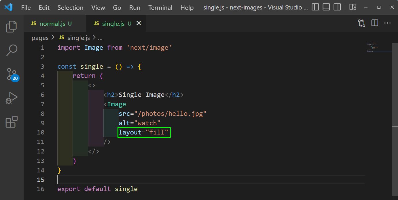
We will see two more properties of Image. For this we will create a file single.js inside the pages folder. Here, we are showing a single image, with image tag. We have the attribute layout equal to fill.
 single.js
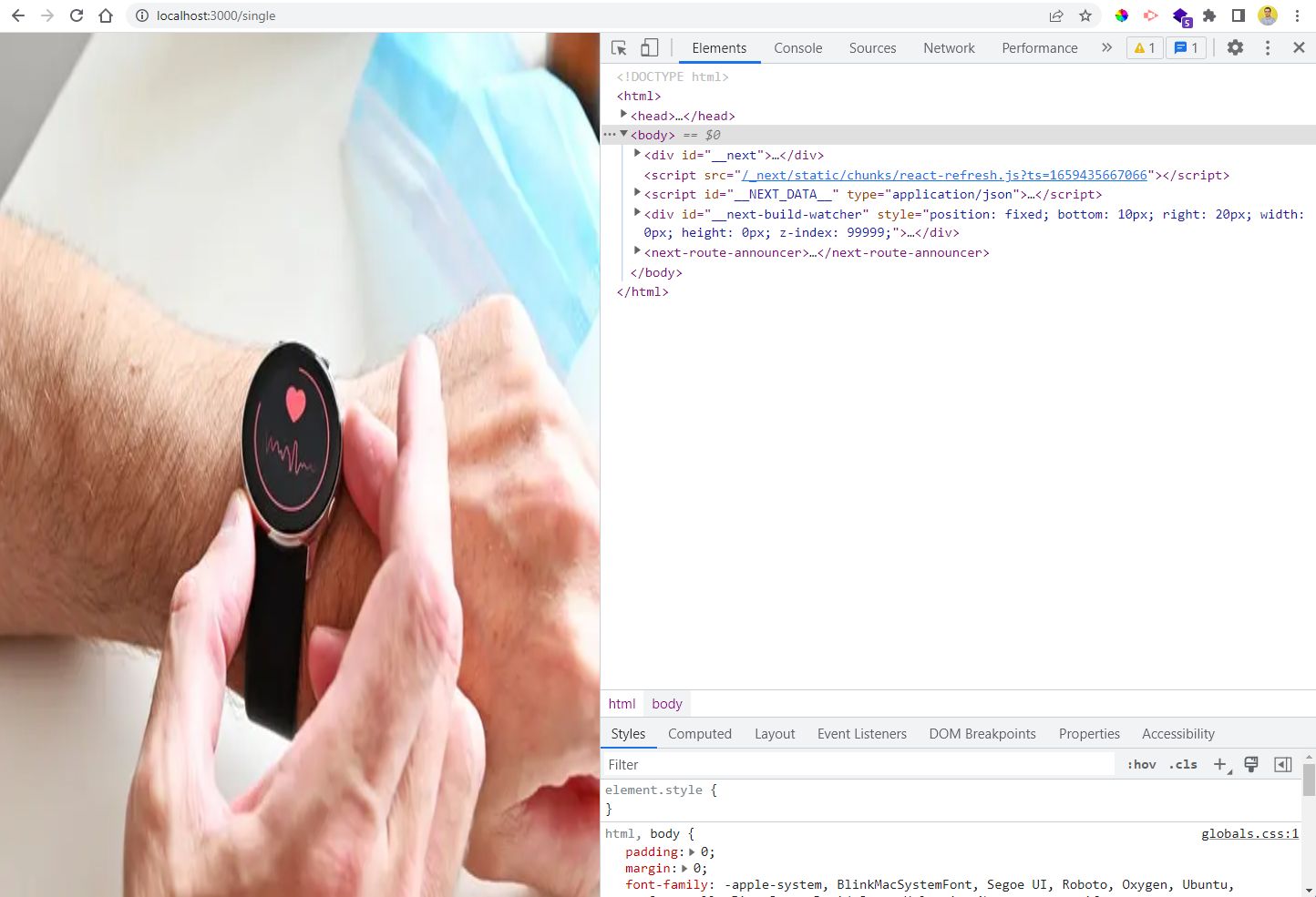
Now, when we have gone to http://localhost:3000/single we see a distorted image. It is because our image was of a lower resolution(640x427) and it was stretched.
 Distorted
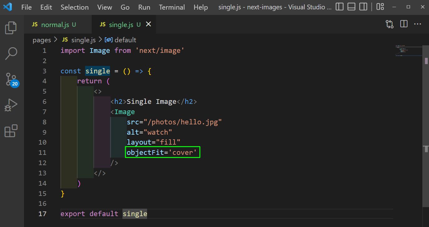
In Next Image we also have the attribute of object-fit like in img tag. And here, also we need to set it to cover.
 single.js
Now, in localhost we can see the image been made responsive and looking fine.
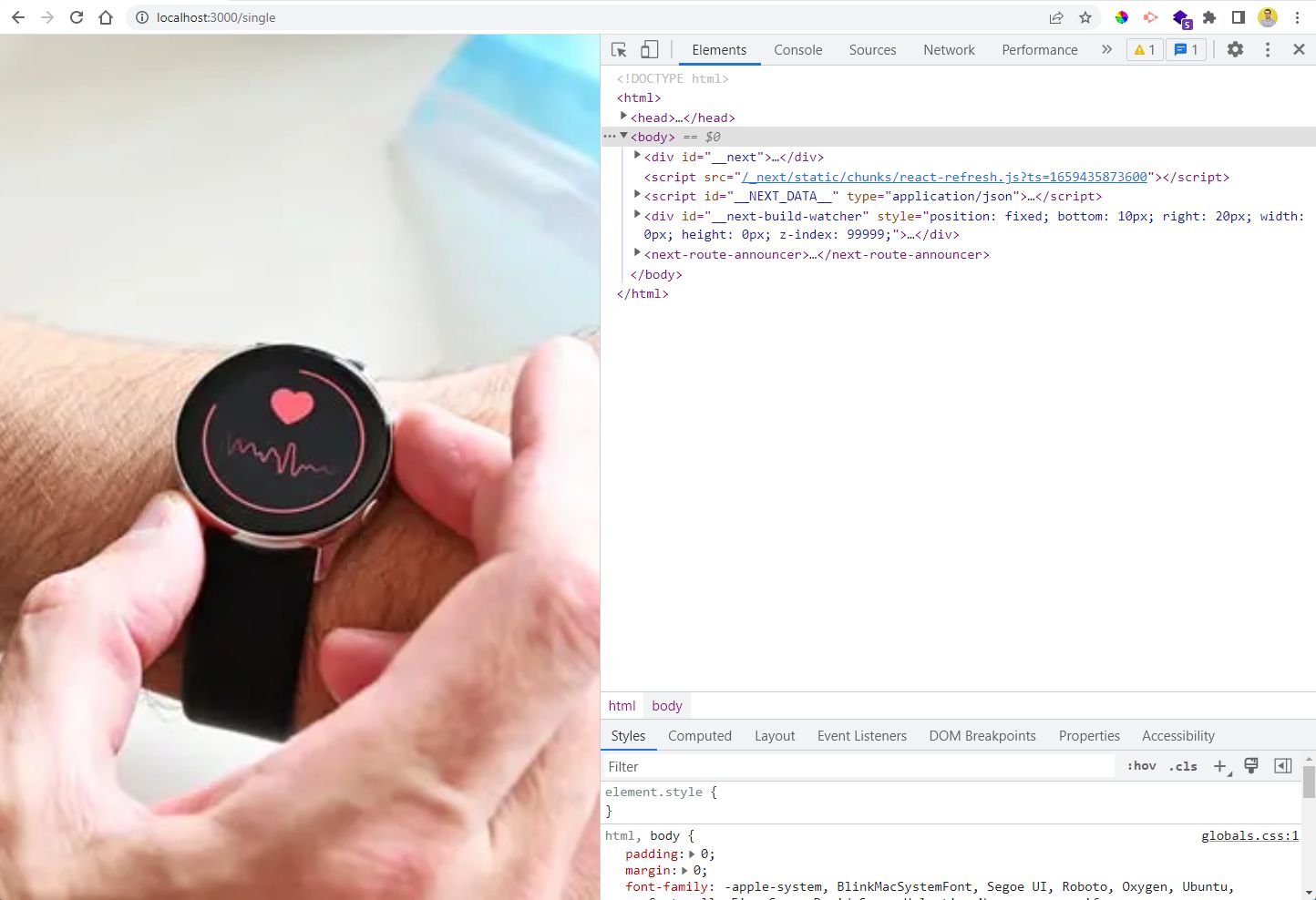 Fixed
Fixed
This completes our small NextJS image topic. You can find the code for the same here.