Build Mobile-First Website using CSS Grid -1
by Nabendu Biswas / August 2nd, 2020
#css #grid #html
Series: Mobile-grid
We will create a website with CSS Grid and we will be using the mobile first approach. The mobile first approach is the approach in which we write the code for mobile screen first and after that move to larger screens.
We will first create a new folder and then two files index.html and style.css inside it. Now, we will open it in Visual Studio Code. I did all from terminal, but the same can be done manually also.
 index.html
Next, we will add basic html to the index.html file. We will also add an assets folder, containing all our images. You can get all the images from the github link at the end of this post.
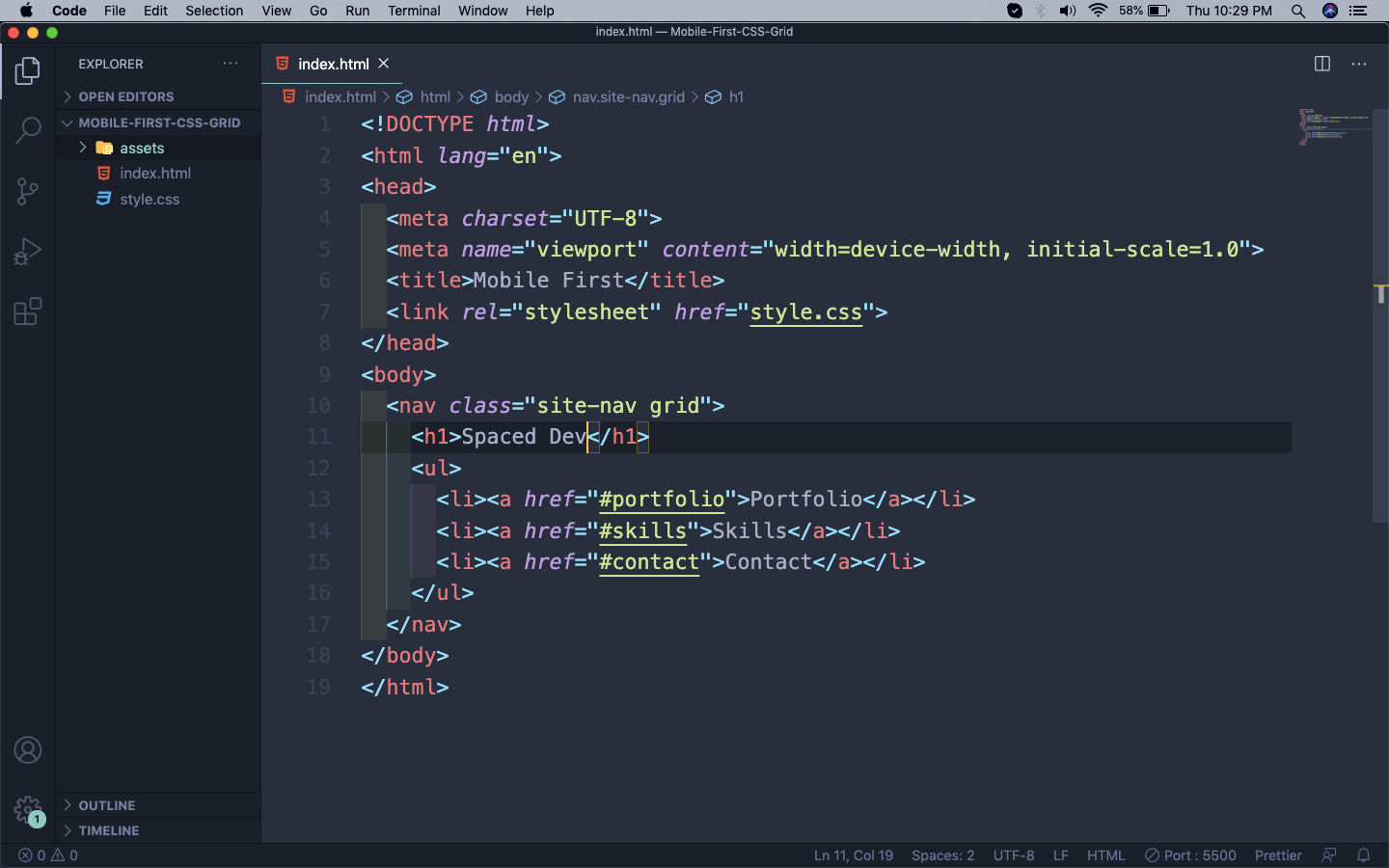 assets
I am using a VS Code extension called Live Server. So, our basic html with navbar shows like below on the browser on http://127.0.0.1:5500/index.html
 Navbar
Next, we will add the next two sections to our html. First one contains basic details along with an image.
Second one contains our three portfolio projects along with images.
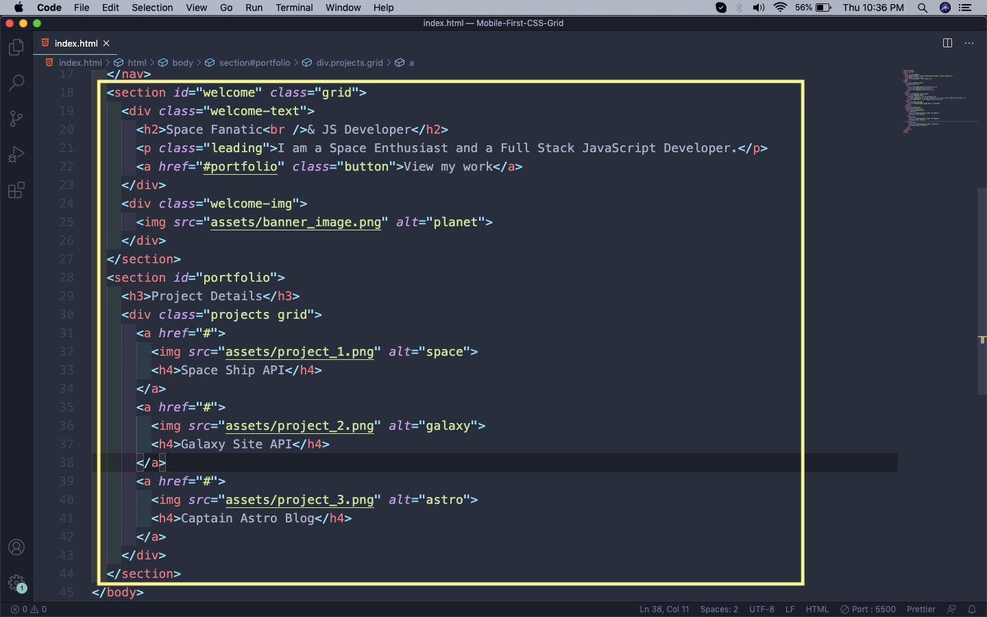 Welcome
So, our first section looks like below.
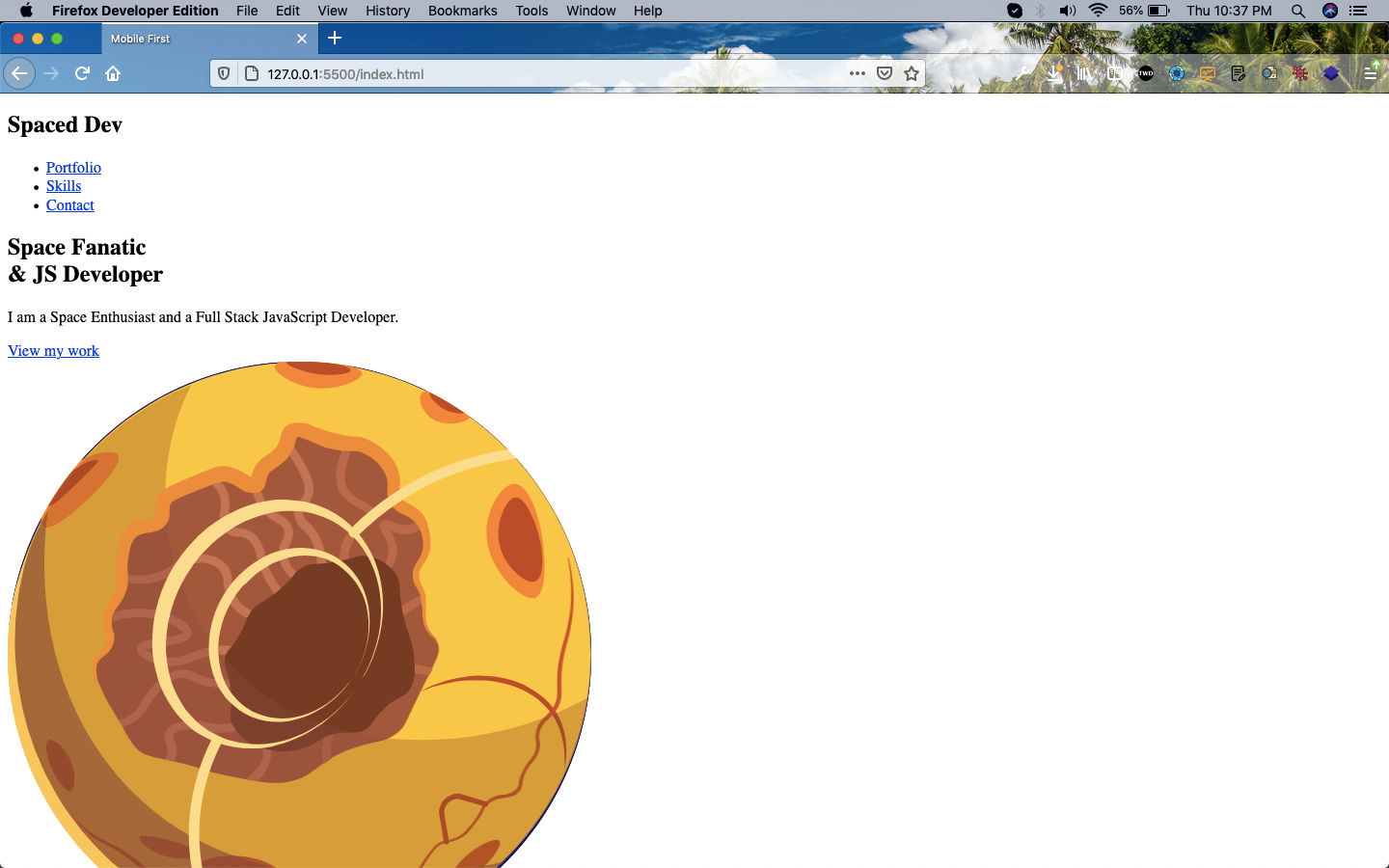 Section
And our second section looks like below.
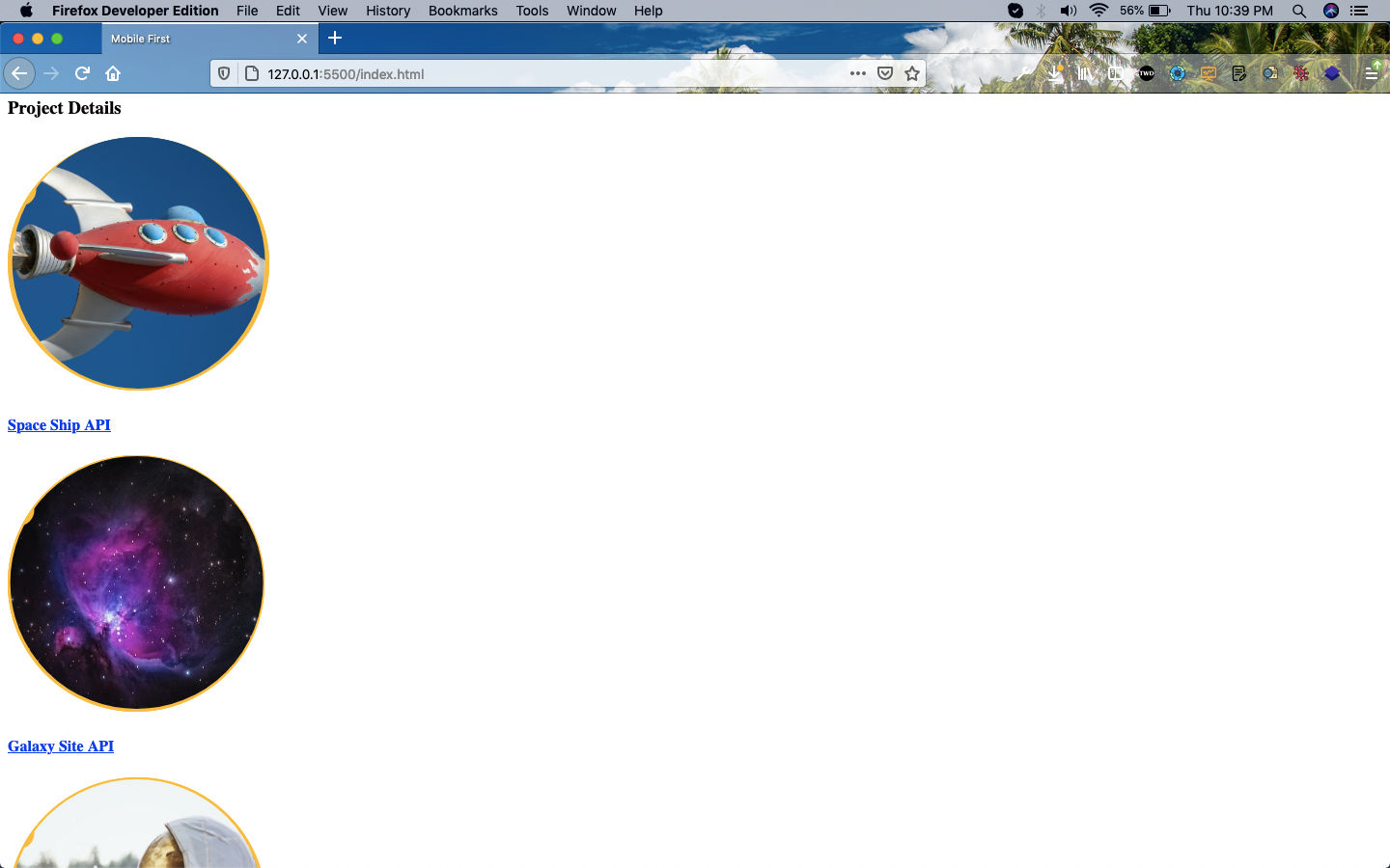 Section
Next, we will write html code for the skills section.
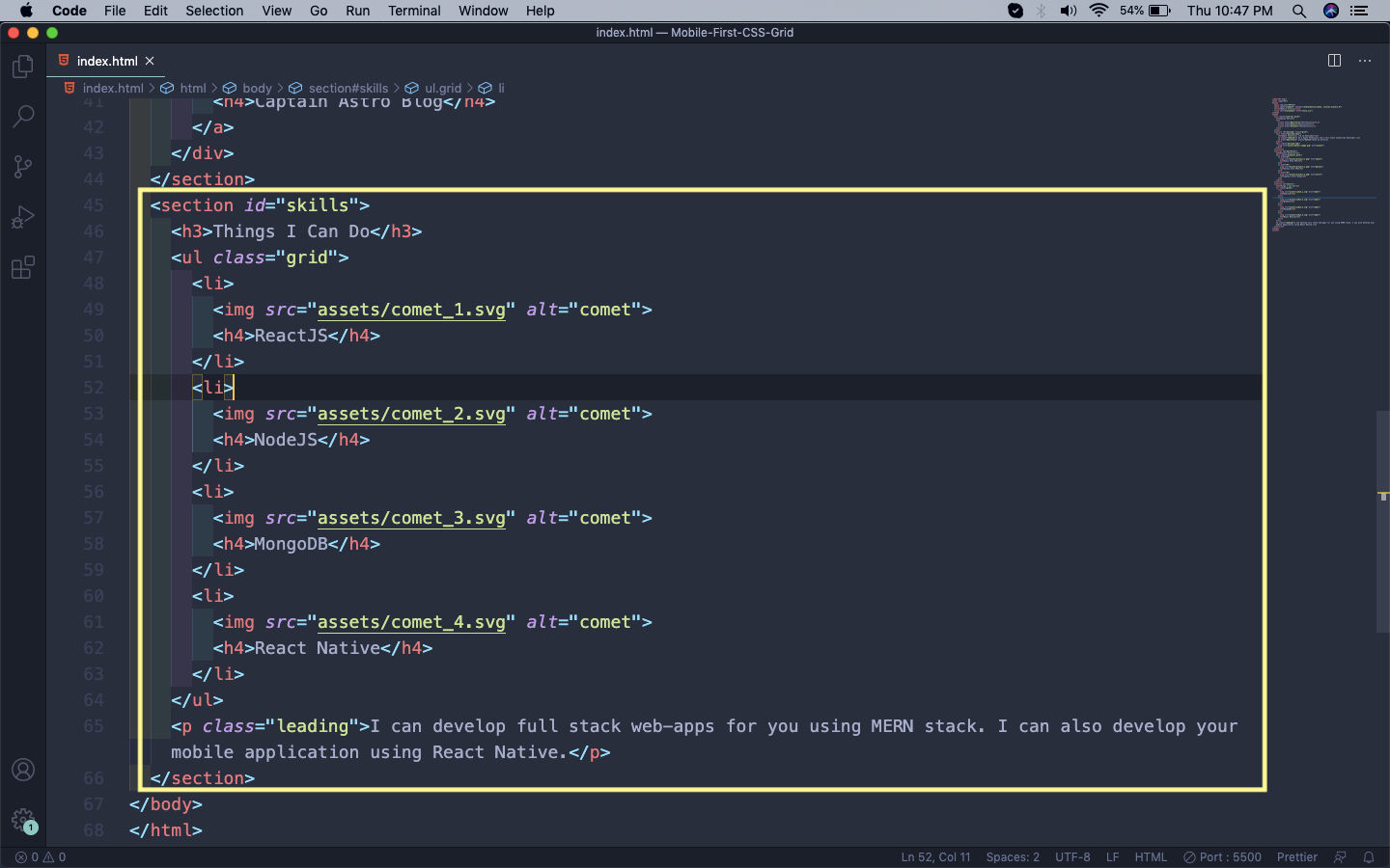 skills
Now, our skill section will look like below.
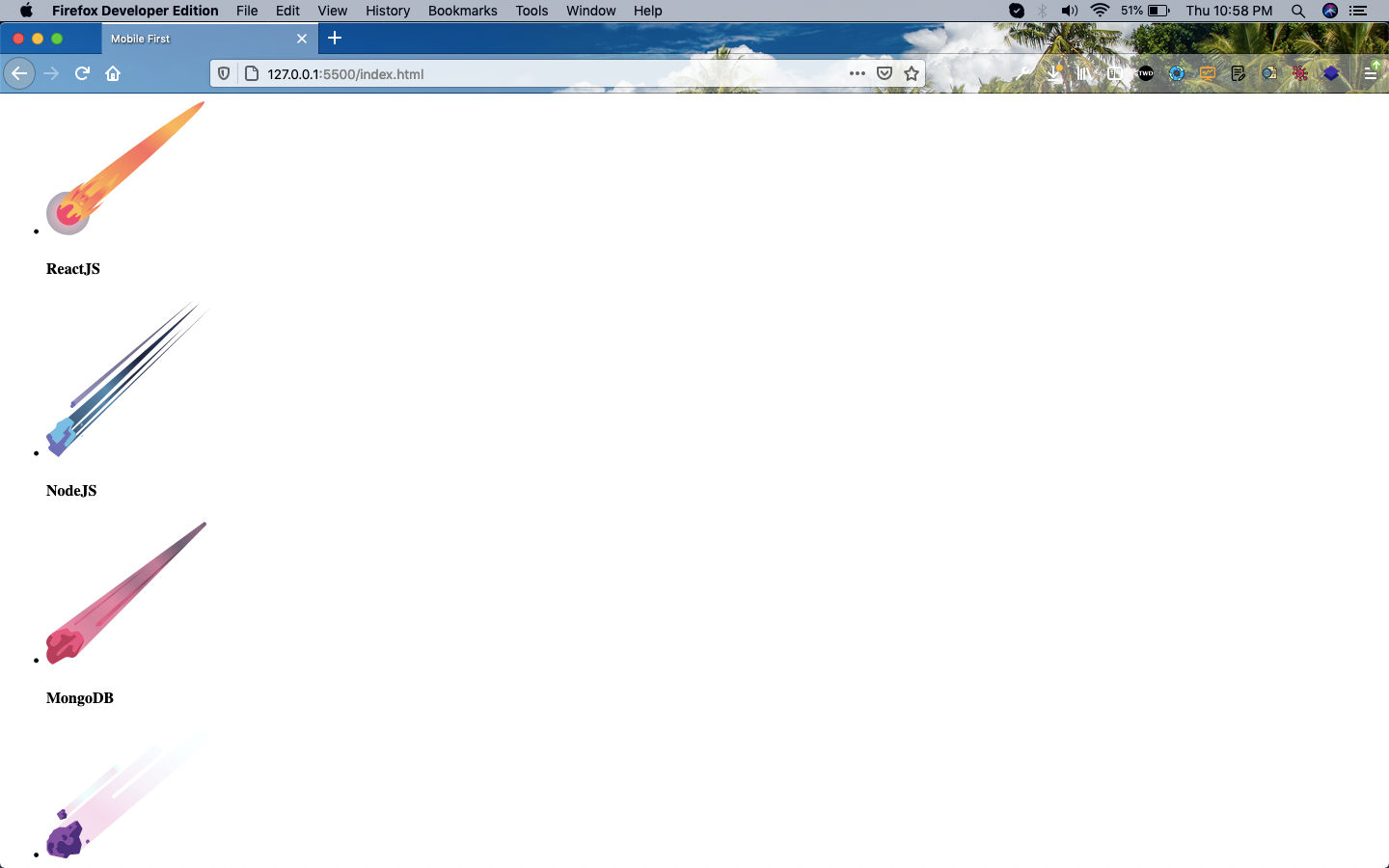 Skill section
Lastly, we will create our contact and footer in index.html.
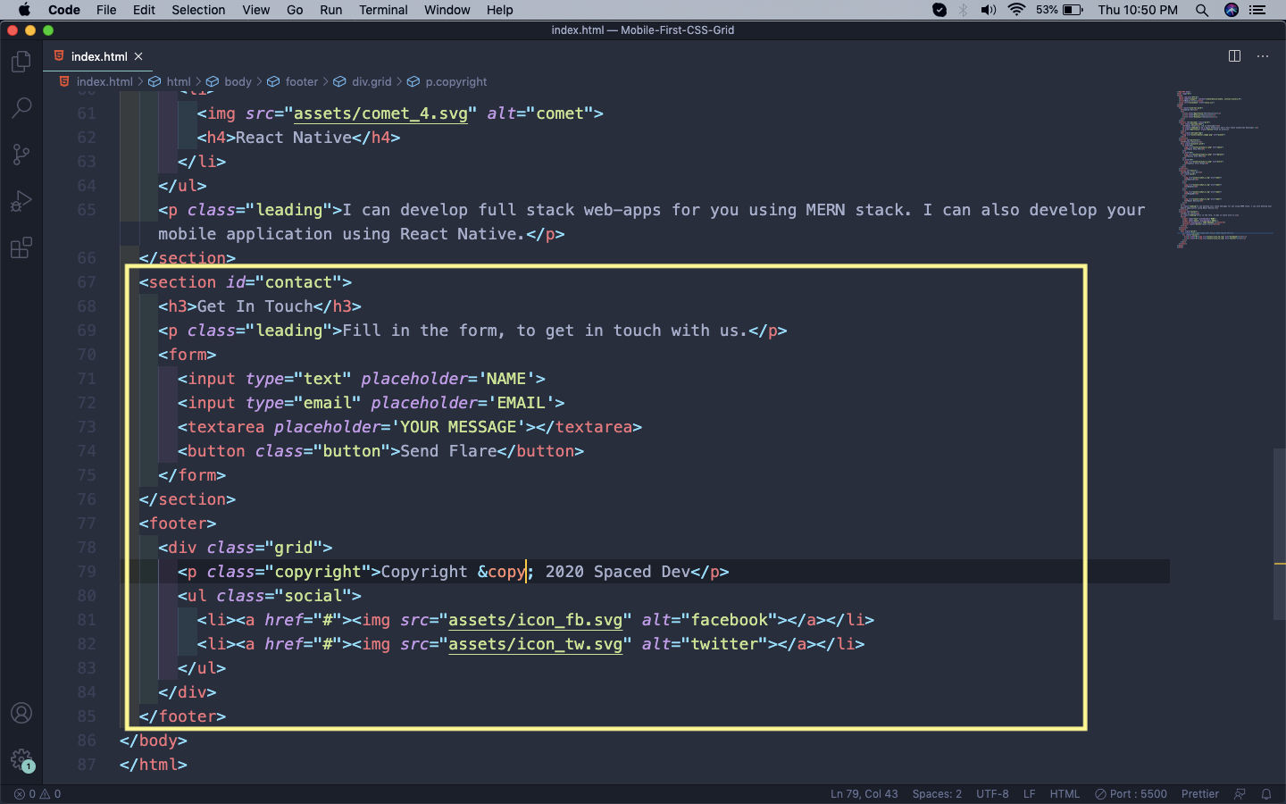 Contact
So, our Contact and footer look like below.
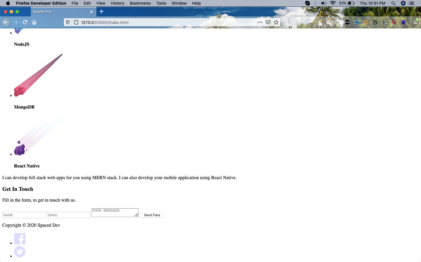 Footer
We are done with all our html and will start to style the project in the next part.
You can find the code for the same in this github link.