Build Mobile-First Website using CSS Grid -3
by Nabendu Biswas / August 4th, 2020
#css #grid #html
Series: Mobile-grid
Welcome to part-3 of the series.
We will start using CSS grid in this part. First we will add styles for the common grid class, which we have in every section. Here, we are creating an eight column grid layout. Also, notice that i am using a new layout which shows the mobile layout, along with the VS code.
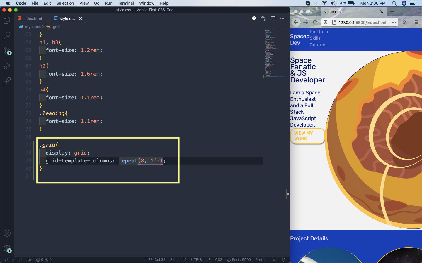 Grid Layout
Next, we will add styles for our nav. Here, we are hiding the ul which contains our nav links. Also, we are making the grid item h1 to take four columns.
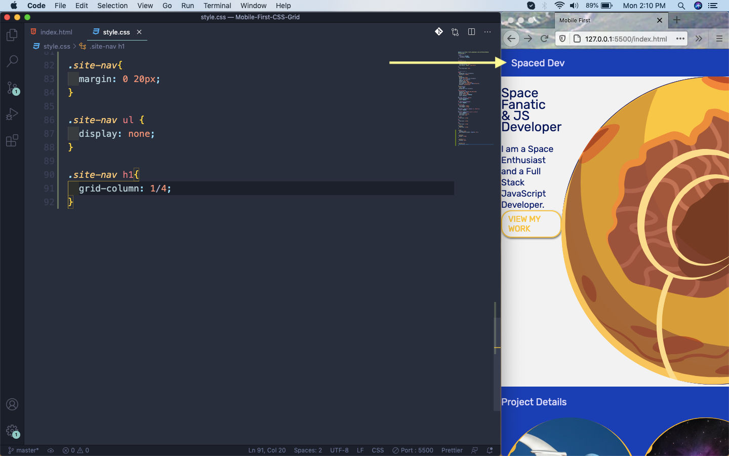 Nav
Nav
We will next style the welcome section. Here again one of the main thing which we are doing is making the grid item welcome-text to expand to from column 1 to 6. The next grid item i.e. welcome-img, we are expanding from 6 to 9.
Rest of the styles are mainly margins and paddings.
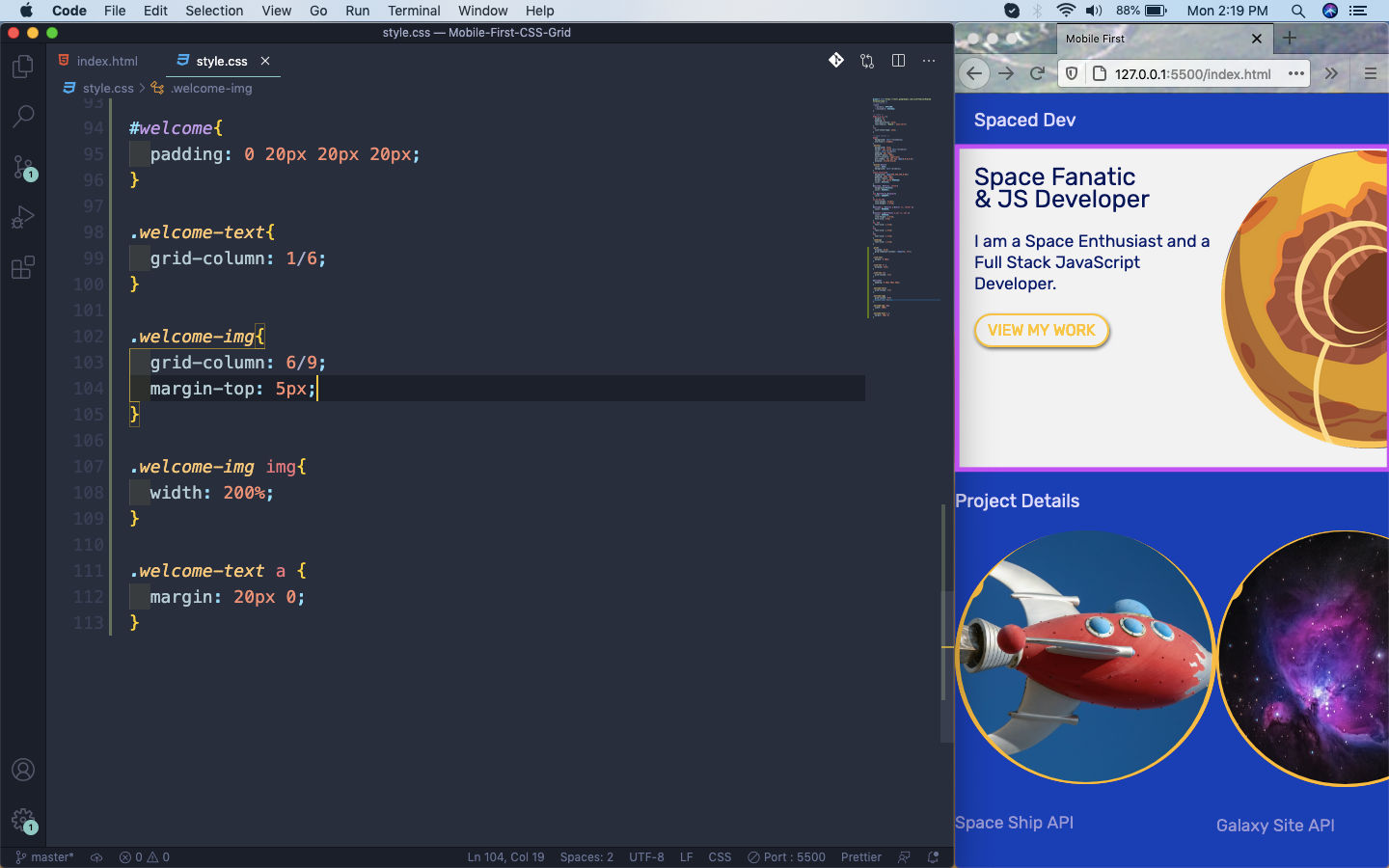 welcome
Next, we will write styles for the portfolio section. Here, the a tag containing the img and h4 is our grid item. We are expanding it completely to take all 8 columns.
After that a bit of margin and text properties.
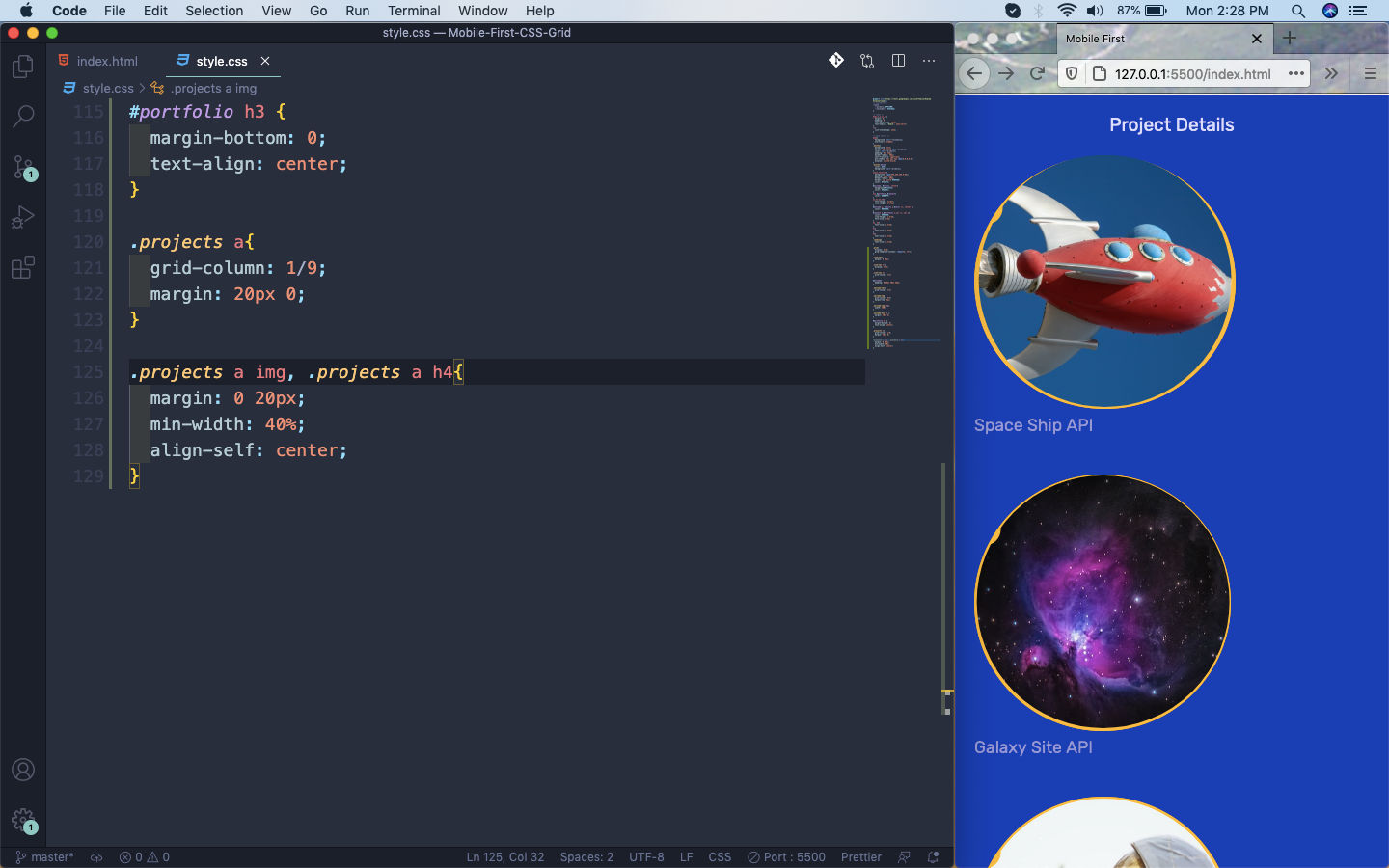 portfolio.
We want the image and the text to be next to each other. For that we just need to make it a flex.
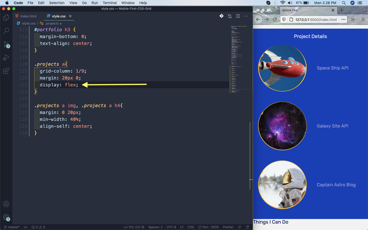 flex
flex
We will now style the next section which is skills. Here, the grid item is the li tag. We are using another grid property of span here by spanning each one to 4 columns.
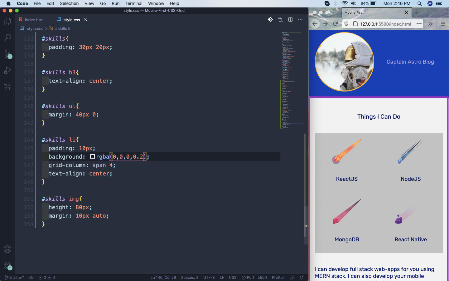 Spanning
Now, in the above we have a background for the whole li. It will be nice to have them separated. So, just move to the top and in the grid give a gap of 10px and we will have the gap.
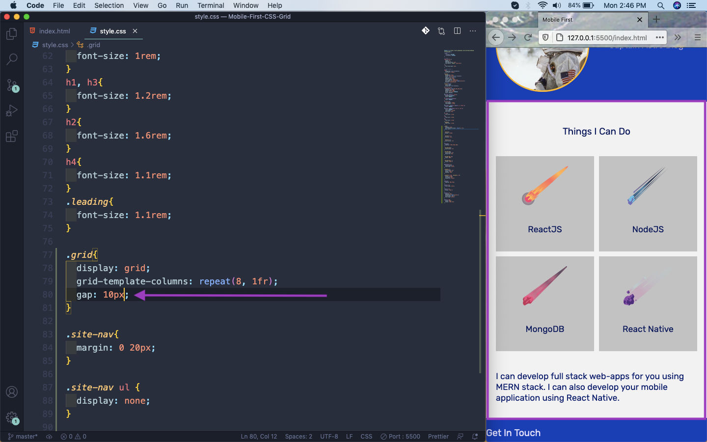 gap
gap
This completes part-3 of the series.
You can find the code for the same in this github link.