Build Mobile-First Website using CSS Grid -4
by Nabendu Biswas / August 6th, 2020
#css #grid #html
Series: Mobile-grid
Welcome to part-4 of the series.
We will start where we had left and start with the Contact form. We are not using any grid here and the styles are mainly paddings and margins.
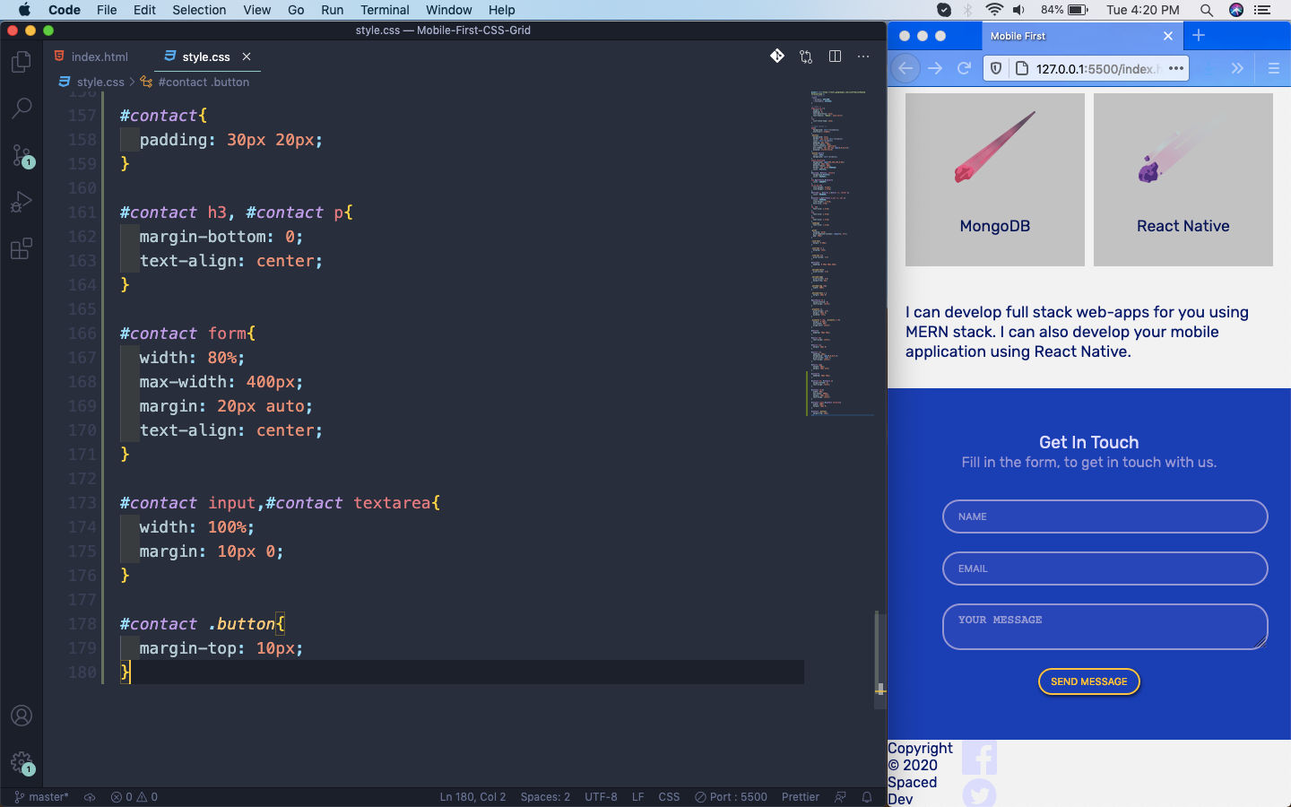 Contact Form
Next, the thing which is remaining is our footer. Here, copyright and social are our two grid items. We are again using the grid-column property to expand them.
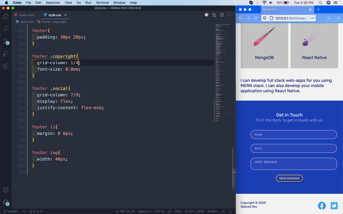 Footer
Now, we will extend this for larger size devices. We will first target the large tablets or small laptops. So, we will write media queries for 960px.
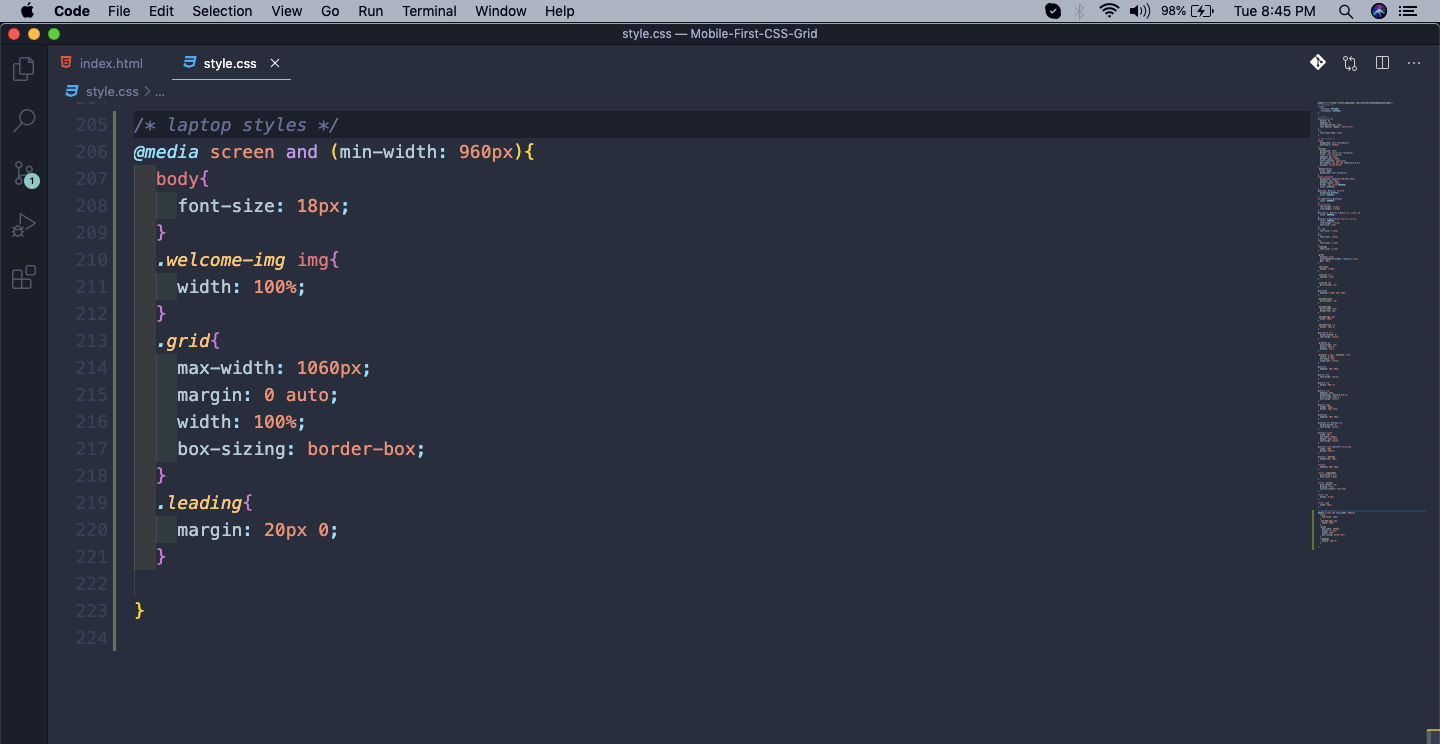 media query
And our webpage will look like below. Here, we are changing the styles for the grid by giving it a max-width.
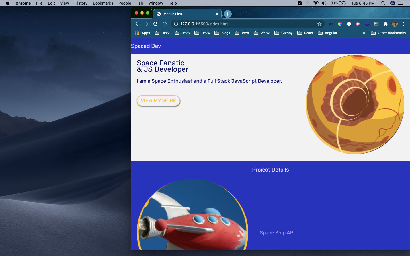 max-width
Next, we will change the style for our navbar. Here, we are also showing our Menu items.
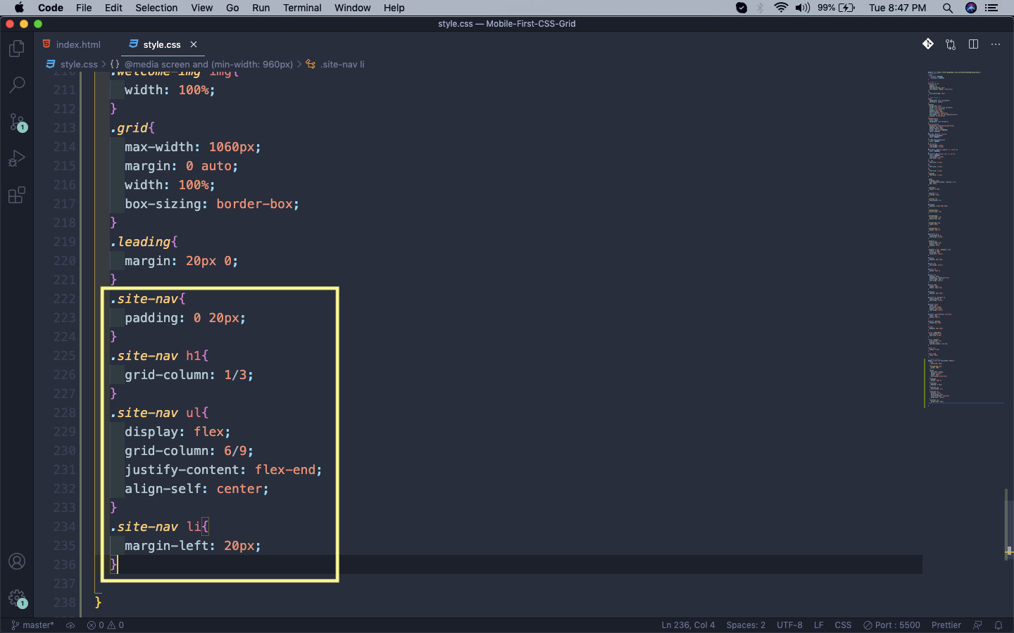 Menu items
Now our Navbar will look like below on webpage.
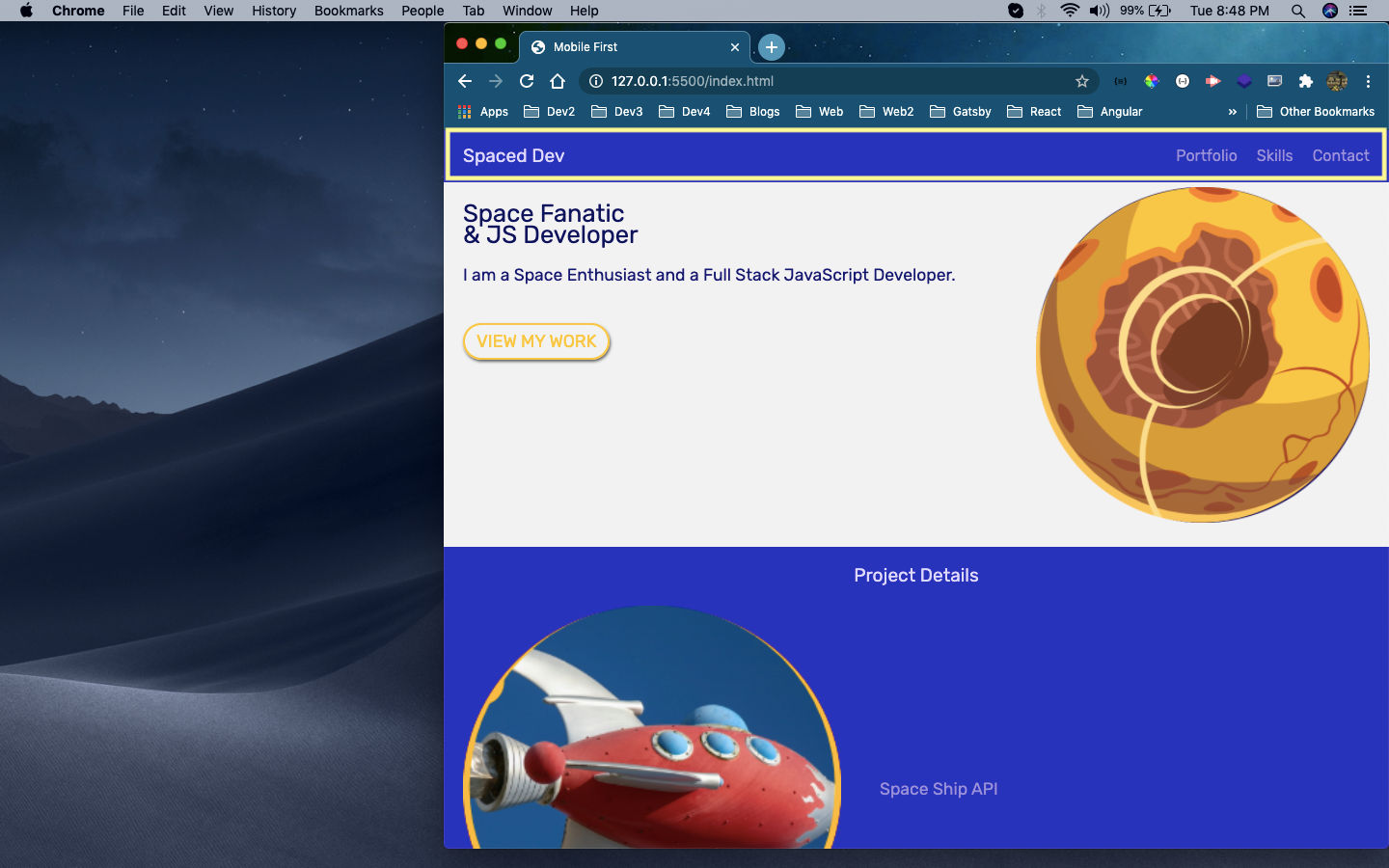 Navbar
Next, we will change the style for our welcome section. Here, again we are targeting the grid item welcome-text and changing the grid-column.
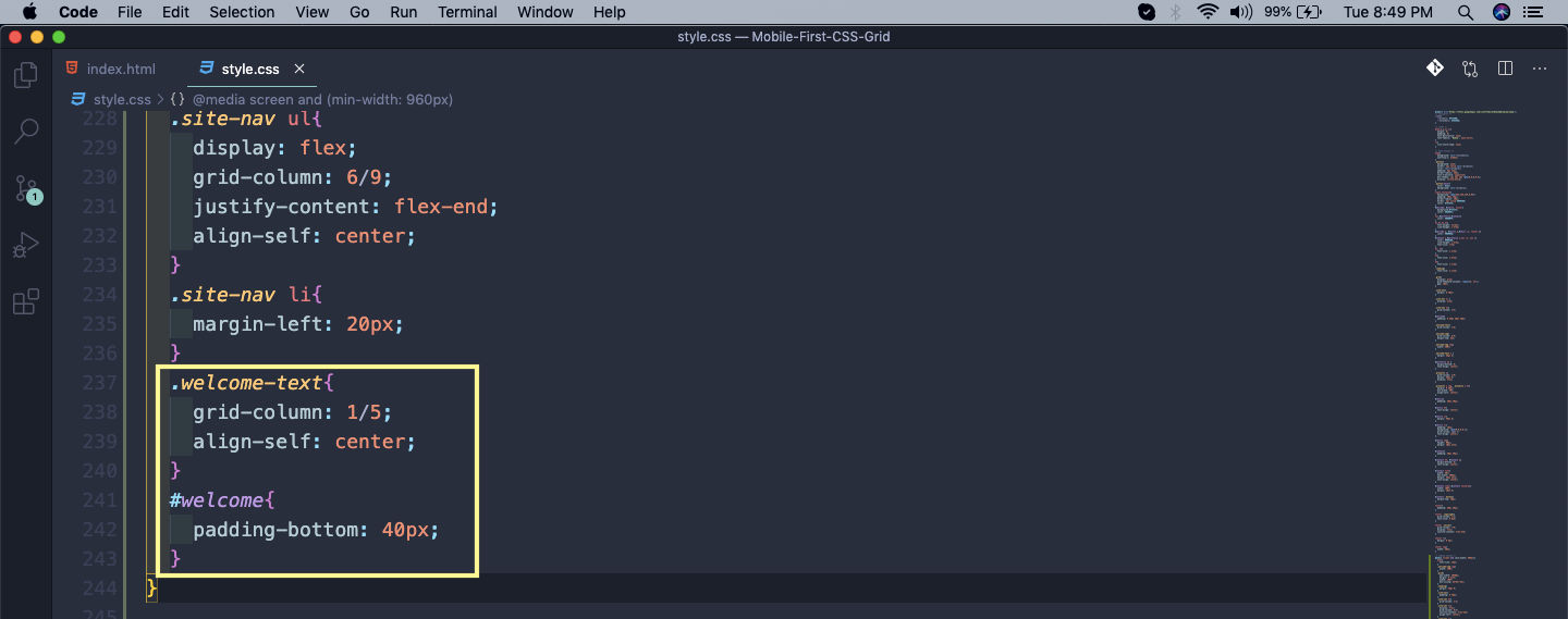 welcome
Our welcome section will now look perfect.
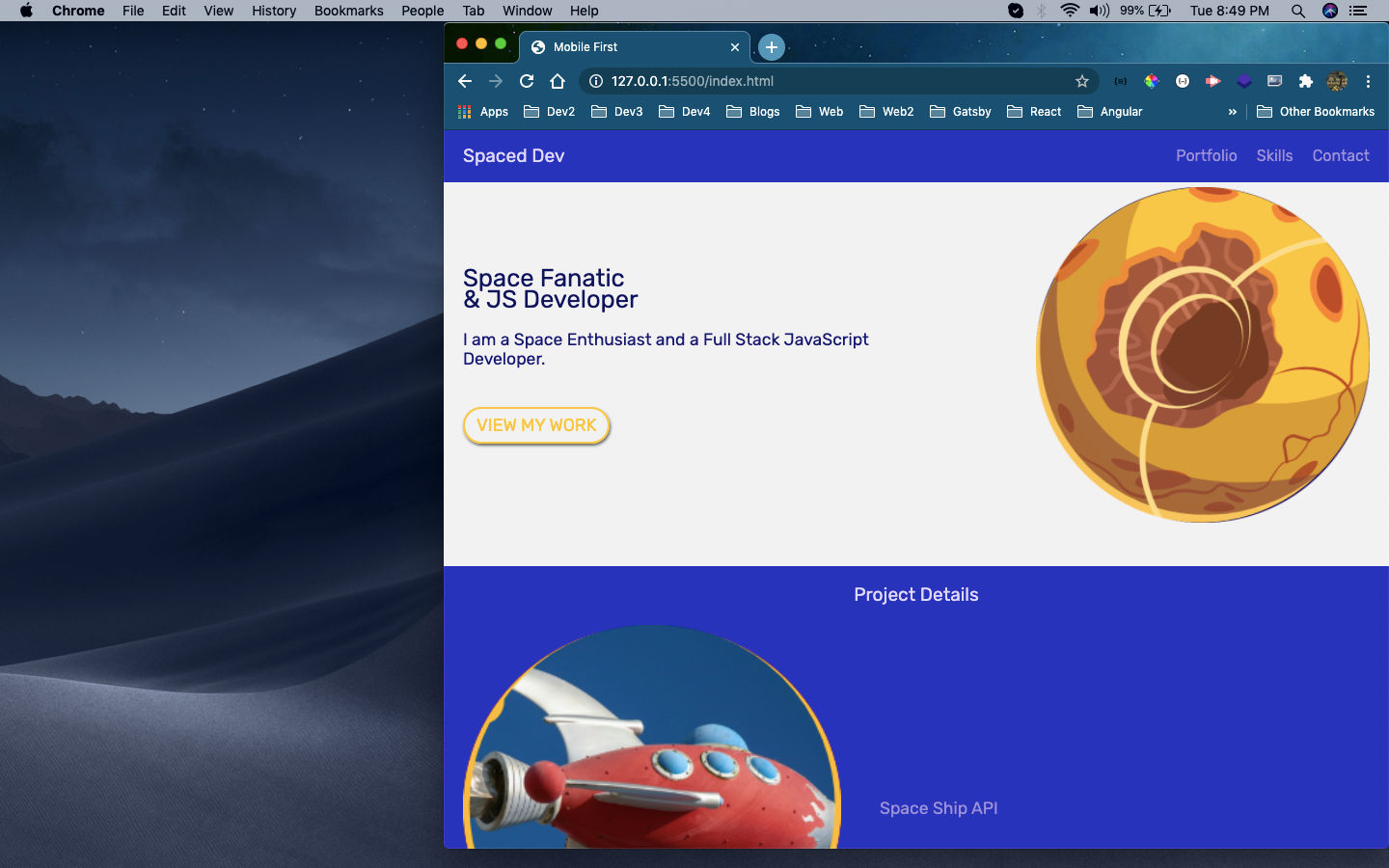 welcome section
Now, we will style the projects section. Here, we are making each grid item projects a span four columns. We are also making the third projects a spanning from column 3 to 7.
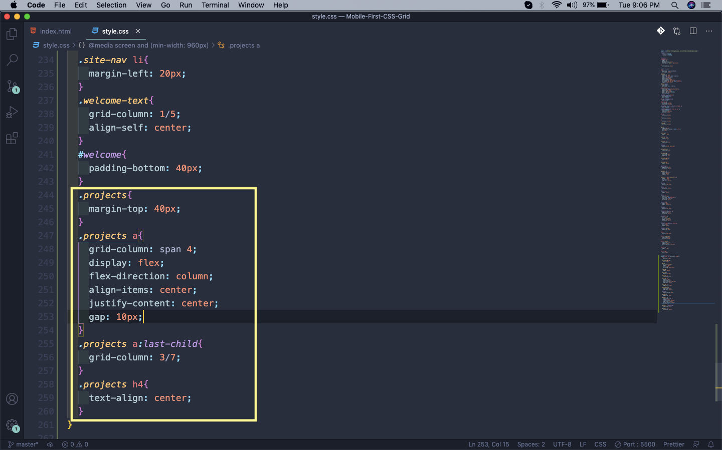 Project
It will give this cool effect in our project detail section.
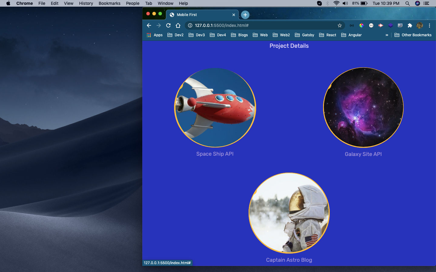 Project details
Now, on the larger desktop screen we just need to make the grid’s max-width 100% and it will fix everything.
 grid
grid
Now, our webpage will look perfect on the desktop view.
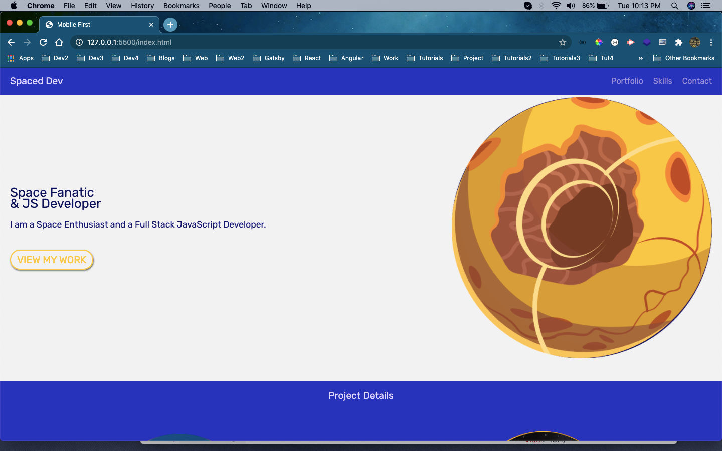 Desktop view
This completes final part of the series.
You can find the code for the same in this github link.