Pluralsight Login Clone - CSS Flexbox - 2
by Nabendu Biswas / July 26th, 2020
#css #beginners #webdev
Series: Pluralsight-Clone
Welcome to part-2 of the series. We will start by making the secondary button in left side to 80%, which we missed in part-1.
After that we will add code for showcase, which is used in right side to wrap all the three images.
The code which we had written so far is mainly targeted at tab size. Here, we will make the larger image display: none to hide it.
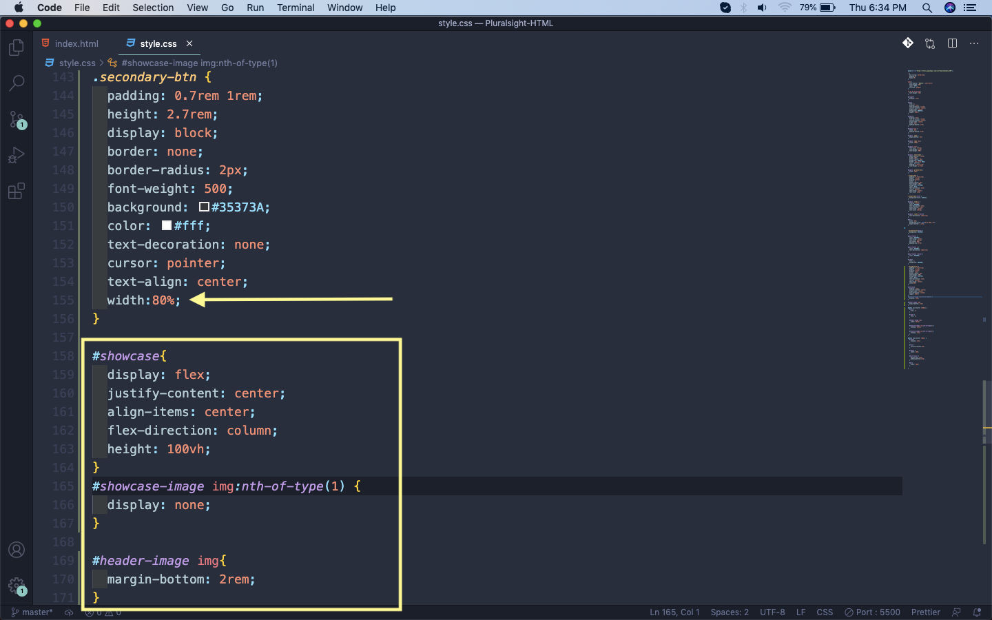 display: none
After that we are adding a media query for large screens, which includes desktops. Here, we are first making the left side 40% and the right side 60%, by using the flex property. Our header text is also an image, so increasing the size of it.
After that displaying the first larger image and hiding the smaller one.
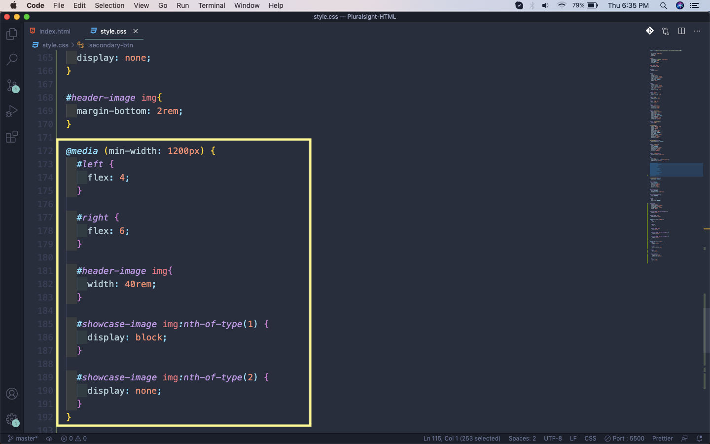 Desktop
So, our two layouts are complete. This is how our login page will show on desktop.
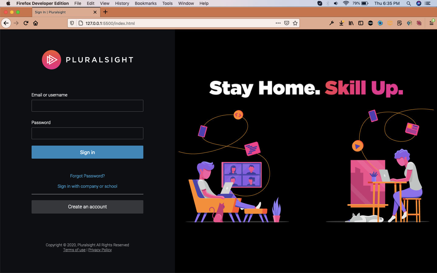 Desktop
And below is how it will show on tablets.
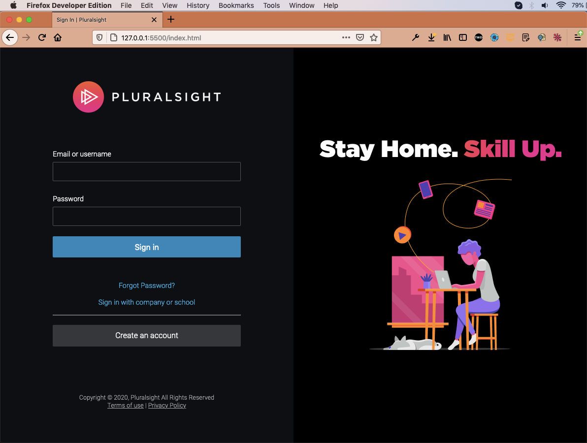 Tablets
Now, we will add media queries for mobile screen. Here, we are hiding all of right side. The left part we are making justify-content: end , instead of justify-content: center.
We are also making some margin and padding adjustments.
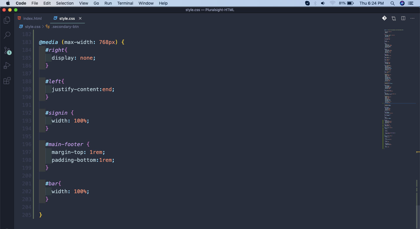 Mobile view
This will show our perfect mobile view.
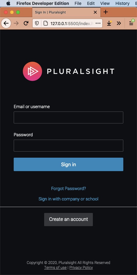 Mobile view
This completes our Pluralsight clone series. Hope you liked the series.