React Tutorials - A beginners Guide - 6
by Rajat Negi / August 7th, 2020
#react #beginners #javascript
Series: React-tutorials
Setting Styles Dynamically
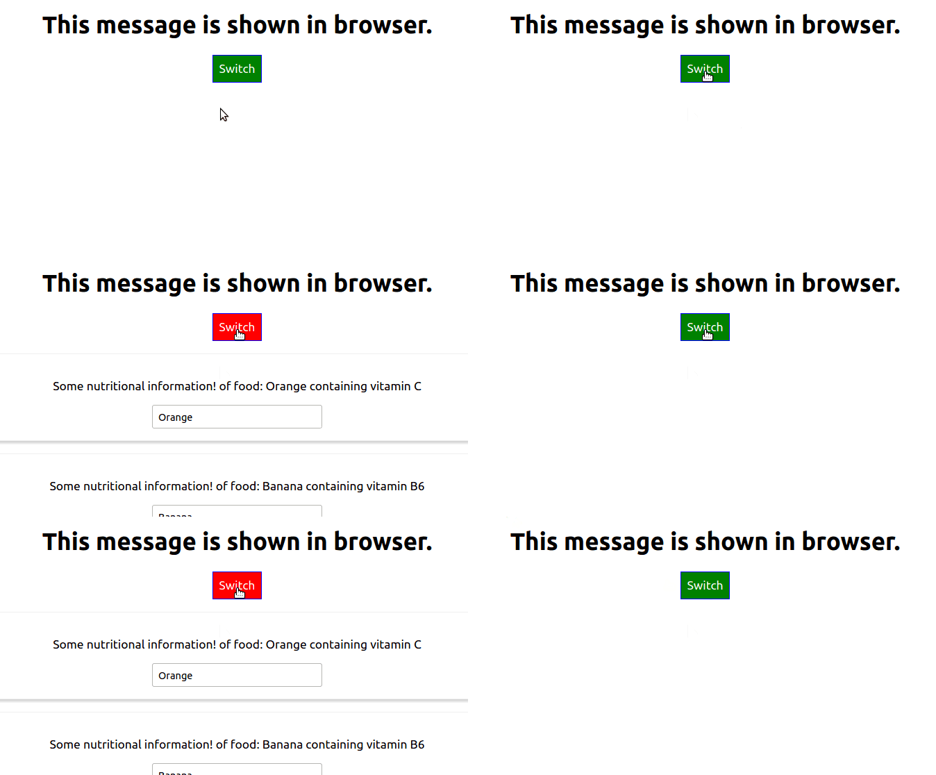
Let's change some css or style dynamically. So far, we have defined some css for in const style. It was used for styling button.Now lets say we want to change its color depending on whether food elements are visible or not. For this we will simply add style.backgroundColor = 'red'; inside the if condition component visibility is checked.
So now, if they are visible button turns red and green when they are invisible.
code change:
    if(this.state.showFoods)
    {
      /* other code */
+     style.backgroundColor = 'red';// setting style dynamically using js
    }
Output:

Setting Classes Dynamically
We can even change the class name dynamically so that different css gets activated for different event.
Plan
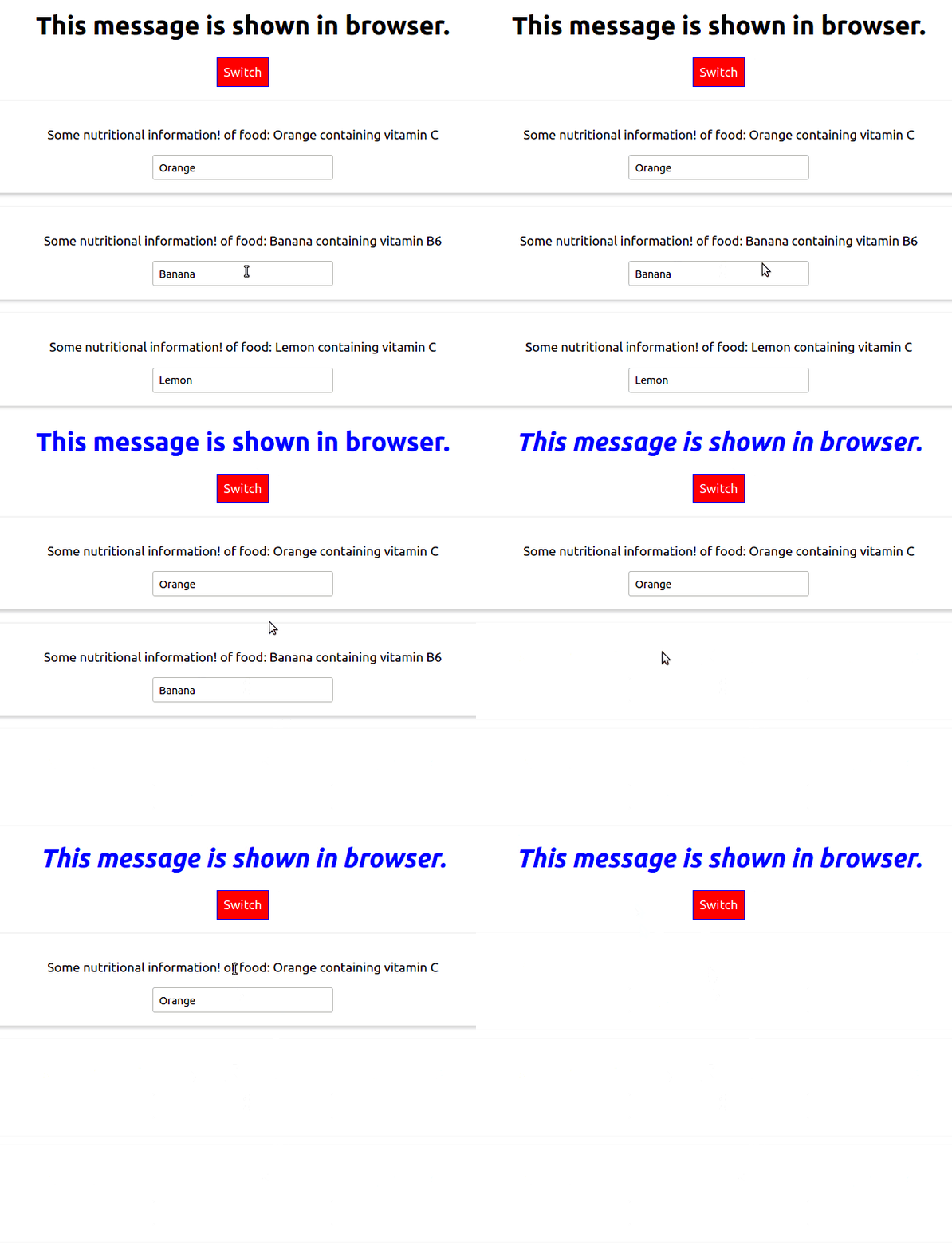
Lets try and do this. We will change the Styling of our H1 tag that contains This message is shown in Browser. Let say when there are 2 or less than 2 food components visible it is blue in color and when 1 or less than 1, it is becomes italic.
Execution
For this firstly we update our App.css with two new blocks. Red and Blue.
.blue{
  color: blue;
}
.italic{
  font-style: italic;
}
Now in App.js inside render() we create an empty string classes. We will push class names to this array as needed and when they are two classes to be used together we will use join(' ') to join them. This array of strings is passed to our H1 tag.
+    const classes = [];
+    if(this.state.food.length<=2){
+      classes.push('blue');
+    }
+    if(this.state.food.length <=1){
+      classes.push('italic');
+    }

    return (
      <div className="App">
+       <h1 className={classes.join(' ')}>This message is shown in browser. </h1>
        <button
          style = {style}
          onClick={this.toggleFoodHandler}>Switch </button>
          {foods}
      </div>
    );
output:

Adding and using Radium
Now let's try and use pseudo selectors like hover. But this can't be done be default in inline styling. For this we will use third party Radium for this.
To install Radium, in the same directory of project run:
npm install --save radium
Now to use radium we first import it in our App.js file. Also we need to export it. For exporting we use export default Radium( App ). This is called a higher order component. We are wrapping one component inside another component. In other words adding some functionality.
Plan
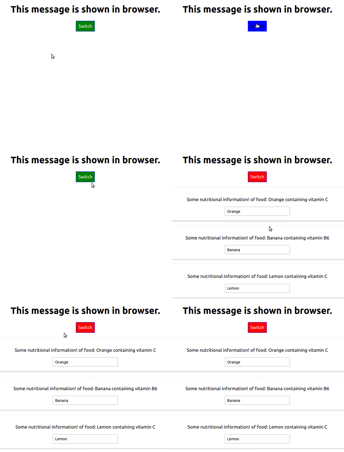
We want our button to change color when we hover over it. Styling should be different when components are visible or not visible.
Execution
We define hover in our inline styling. Notice the syntax difference.
code change:
+  import Radium from 'radium';
    ...
    // inside render()
    const style = {
      backgroundColor: 'green',// default color
      color: 'white',
      font: 'inherit',
      border: '1px solid blue',
      padding: '8px',
      cursor: 'pointer',
+     ':hover': {
+        backgroundColor: 'blue',
+        color: 'black'
+      }
    };

    if(this.state.showFoods)
    {
      foods =(
        <div>
          {this.state.food.map(( food , index)=>{
            return <Food
              click = {()=>this.deleteFoodHandler(index)}
              name={food.name}
              vitamin={food.vitamin}
              key = {food.id}
              changed = {(event) => this.nameChangedHandler(event, food.id)}/>
          })}
        </div>
      );
      style.backgroundColor = 'red';// setting style dynamically using js
+      style[':hover']={
+        backgroundColor:'salmon',
+        color:'black'
+      }
    }


+  export default Radium( App );

Using Radium for Media Querries
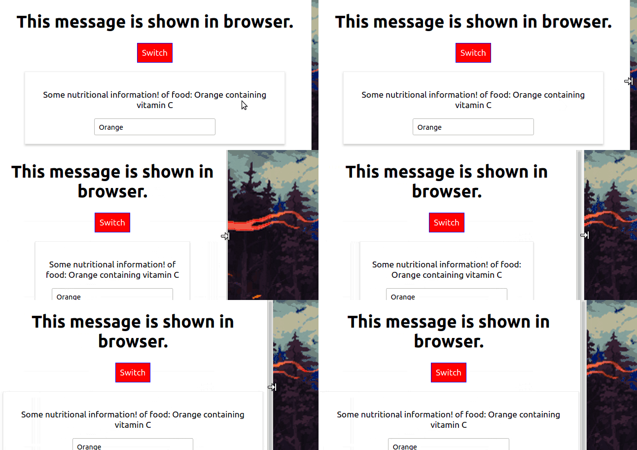
We can even use media queries and keyframes using Radium. However for using them we need another component. StyleRoot. This can be imported from Radium only. Also we need to wrap our App div in StyleRoot tag in App.js.
  // Food.js
  import Radium from 'radium';

  const food = (props)=>{
+    const style={
+      '@media (min-width: 500px)':{
+        width: '450px'
+      }
    };
    return(
+      <div className="Food" style={style}>
       ...

+  export default Radium(food);
  // App.js
  //inside render()
+      <StyleRoot>
        <div className="App">
          <h1 className={classes.join(' ')}>This message is shown in browser. </h1>
          <button
            style = {style}
            onClick={this.toggleFoodHandler}>Switch </button>
            {foods}
        </div>
+      </StyleRoot>
Output:

Using CSS Modules
To use CSS in our app, Radium isn't the only option. We can use CSS Modules as well. CSS Modules are a great feature if we want to scope our CSS locally and prevent naming clashes especially in medium to large projects.
To Start using CSS modules, first we need to remove Radium from our project. Remove every trace of it.
Now, using CSS modules has become easier after react-scripts@2.0.0 or higher. All we need to do is rename our css file that we want to be used as module from [filename].css to [filename].module.css. We can now use it in our App. We will now use it such that the App has same styling as before(excluding the hover which was implemented with Radium)
Refer to the CSS here.
    //App.js
+    import moduleClass from './App.module.css'; // import name can be anything

    //inside render()
    const classes = [];
    if(this.state.food.length<=2){
+      classes.push(moduleClass.blue);
    }
    if(this.state.food.length <=1){
+      classes.push(moduleClass.italic);
    }
    return (
+        <div className={moduleClass.App}>
          <h1 className={classes.join(' ')}>This message is shown in browser. </h1>
          <button
            style = {style}
            onClick={this.toggleFoodHandler}>Switch </button>
            {foods}
        </div>
    // Food.js
+  import moduleClasses from './Food.module.css'

  const food = (props)=>{
    return(
+      <div className={ moduleClasses.Food }>
        <p onClick={props.click}>Some nutritional information! of food: {props.name} containing vitamin {props.vitamin} </p>
        <p>{props.children}</p>
        <input type="text" onChange={props.changed} value={props.name}/>
      </div>
    )
  };
What we learned:
- Styling components dynamically
- Adding and using Radium
- Using CSS modules