Refactoring ReactJS youtube player to use Grid
by Nabendu Biswas / May 28th, 2018
#react #javascript #grid
Series: Youtube-Player-React
The youtube player which we have created so far uses the usual bootstrap. Now i have learnt the hard way that if you want to be really good at frontend development, you have to ditch bootstrap and start using CSS.
Now the older float were really the great road-block for any developer learning CSS and they tends to go toward bootstrap. With the recent addition of flexbox and Grid, it now easy for anyone to ditch bootstrap.
Let’s refactor the youtube player which we created in the the Youtube player with react series. We will now clone the repo and do a npm install.
git clone https://github.com/nabendu82/youtube-player-selected.git youtube-player-advancedCSS
So, this is our bootstrap app look now -
 bootstap app
Now we will remove all the bootstrappy classes from our project. Only will keep some of the normal classes.
search_bar.js
<div className="search-bar">
<input value={this.state.term} onChange={this.onInputChange} /></div>
video_detail.js
<div>
    <div>
        <iframe className="frame__item" src={url} />
    </div>
    <div>
        <div>{video.snippet.title}</div>
        <div>{video.snippet.description}</div>
    </div>
</div>
video_list_item.js
    <li onClick={() => { onUserSelected(video), selectedByUser(currIndex)}}
        className="list-group-item"
        style={active ? styles.isactive : styles.inactive}
    >
        <div>
            <div>
                <img src={imageUrl} />
            </div>
            <div>
                <div>{video.snippet.title}</div>
            </div>
        </div>
    </li>
video_list.js
return <ul>{videoItems}</ul>;
app.js
    <div>
        <SearchBar onSearchTermChange={searchTerm => this.videoSearch(searchTerm)} />
        <div className="wrapper__container">
            <div className="grid__container">
                <VideoDetail video={this.state.selectedVideo} />
                <VideoList
                onVideoSelect={userSelected => this.setState({ selectedVideo: userSelected })}
                videos={this.state.videos} />
            </div>
        </div>
    </div>
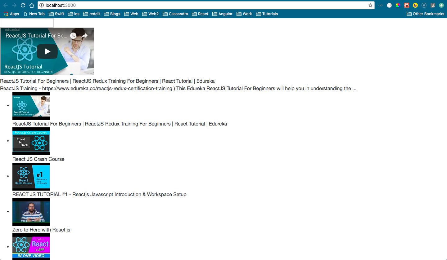
Now our app looks like this.
 Without any styling
In our index.css we will just add below. The most important part is the grid__container where we are setting a grid container. You can learn more about grid from the awesome free
.wrapper__container {
    margin: 20px;
}
.grid__container {
    display: grid;
    grid-template-columns: 700px 300px;
    justify-content: center;
    grid-column-gap: 20px;
}
.search-bar {
    margin: 20px;
    text-align: center;
}
.search-bar input {
    width: 75%;
}
.frame__item {
    width: 100%;
    height: 600px;
}
.list-item {
    cursor: pointer;
    list-style: none;
    border: 1px solid gray;
}
.list-item:hover {
    background-color: #eee;
}
And with this our site get’s fixed and we again get the layout.
 fixed layout with grid
You can get the github repo for this part here