In this project, we are going to build a simple Tailwind CSS landing page. We are not going to use any framework like my previous blogs here.
As always, there is some installation to be done before.
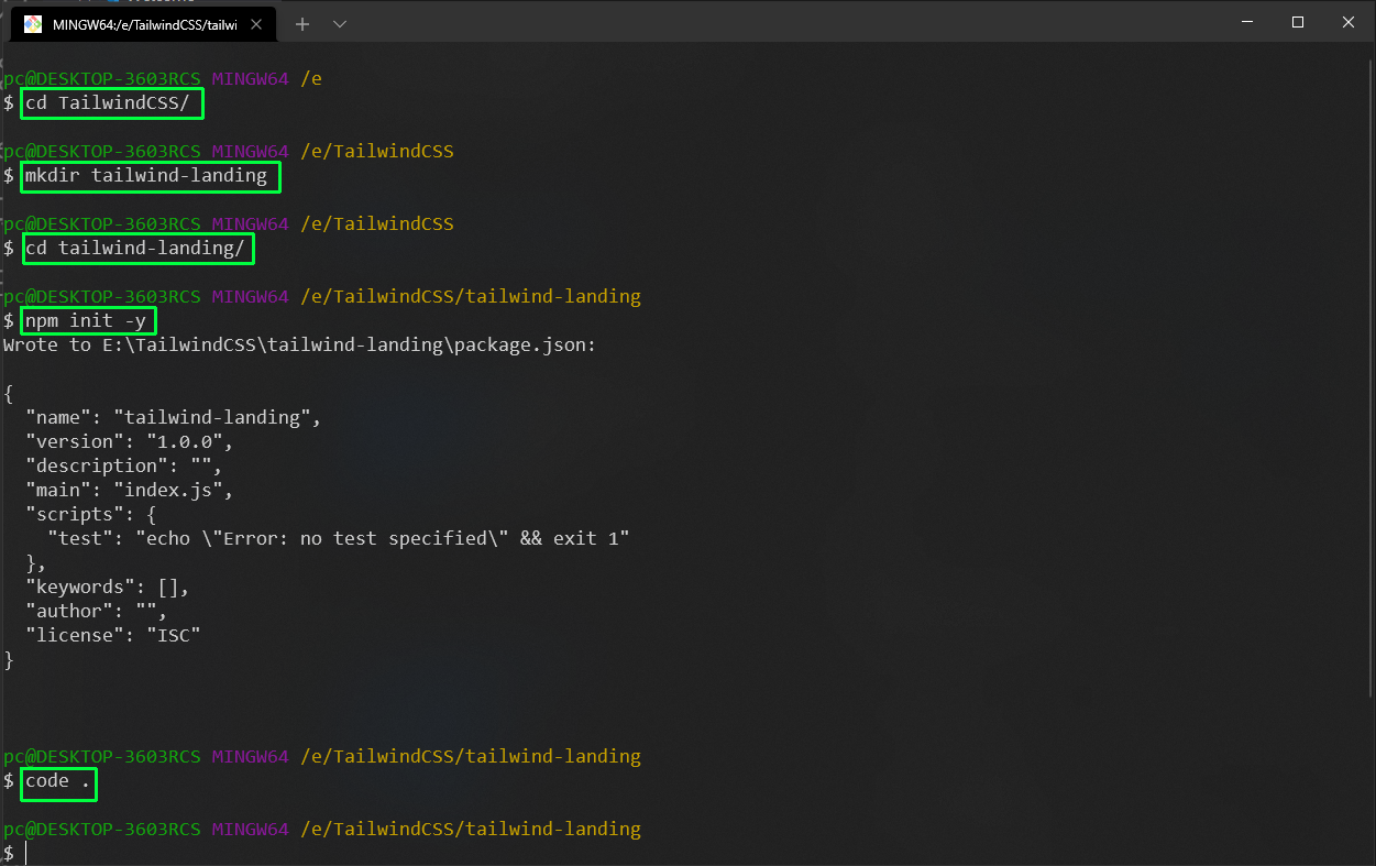
Let’s start with Tailwind CSS. So, open up the terminal and change to the desired directory, and create a new directory.
We need to install some packages for tailwind, so need to have a package.json file. For this we are giving the command npm init -y, to create an empty package.json file with default options.
After that, we are opening the folder in VS Code.
 VS Code
Now, the Tailwind installation process has changed a lot since it moved from version 1 to version 2. So, the best place to get the latest information is the Tailwind site. As per the installation instructions, we need to install the below dependencies using npm.
npm install -D tailwindcss@latest postcss@latest autoprefixer@latest
Now, we also have to initialize the config file by running the below command.
npx tailwindcss init
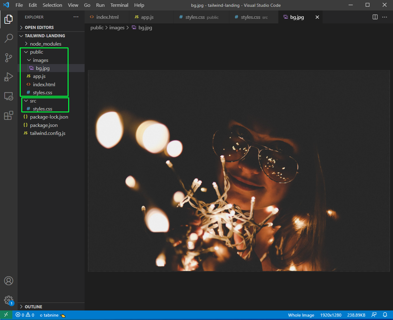
Next, we will create the basic structure of our project. We are creating two folders — public and src — in the root directory. Inside the public folder, we have app.js, index.html, and styles.css file.
Inside the src folder, we have the styles.css file. We also have an images folder inside the public folder and an image for the background in it. You can use any image, but make sure, it’s a dark image with a center character.
 Basic Structure
Now, as per the Tailwind installation, we need to add these in our styles.css file in the src folder:
    @tailwind base;
    @tailwind components;
    @tailwind utilities;
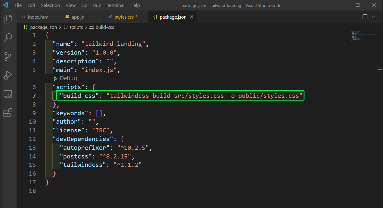
Now, we need to have a script to have Tailwind classes installed in our project. For that add a build-css script in the package.json file. It takes the commands from src styles.css and puts them into the public styles.css file.
 package.json
Now, run the command npm run build-css from the terminal and we will see the screen below, if everything is right.
 npm
npm
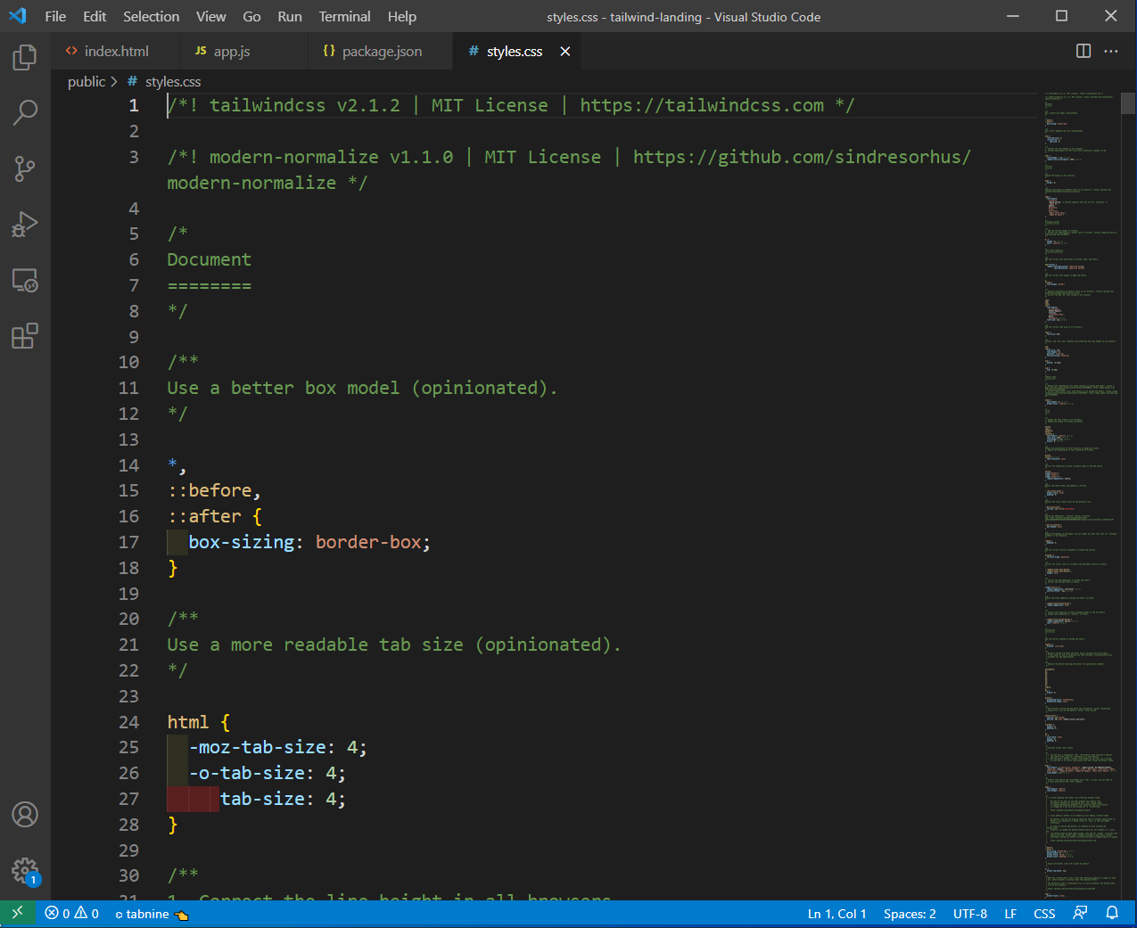
Now, if we go to our styles.css in the public folder, we will find a lot of CSS styles in it. Now, that is all of Tailwind CSS that we need.
 styles.css
Finally, we are done with the Tailwind installation and will start with the index.html of our project.
But before, that make sure you have two extensions, installed in your VS Code — Live Server by Ritwick Dey and Tailwind CSS IntelliSense by Brad Cornes.
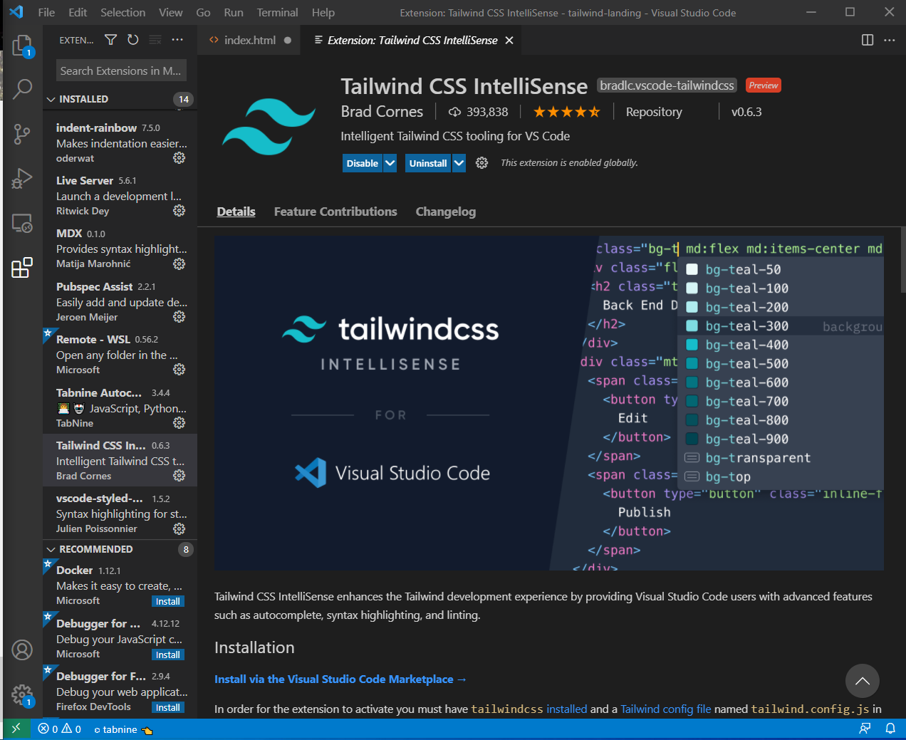 Tailwind CSS
Now, in the index.html file, add the basic code by ! and tab. After that also add the link for the style sheet and the JavaScript file. We have also added an h1 text, for the testing.
After that, right-click and then click on Open with Live Server link.
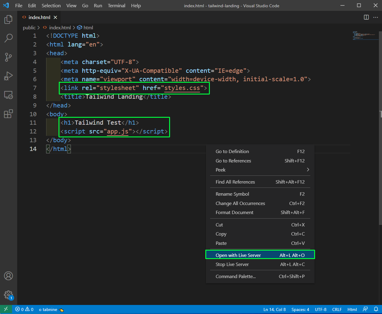 Live Server
Now, the code will open in http://127.0.0.1:5500/public/index.html and this is the best way to work on any HTML-CSS-JavaScript project, because we get live updates facilities.
 index.html
Now, we will start the real code and will add a nav, inside which we will add an anchor tag. The anchor tag has a class of pl-6, which as per the documentation gives a padding-left of 1.5rem.
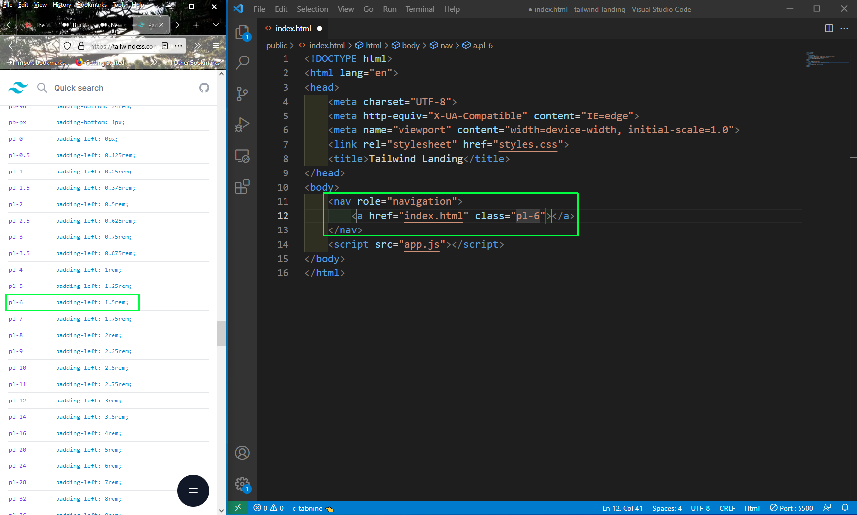 pl-6
pl-6
Next, we will add some more HTML to our file. There are two more important styles which we are using which are px-4 and p-4. What they both mean is shown below.
    p-4 - padding: 1rem;
    px-4 - padding-left: 1rem;
           padding-right: 1rem;
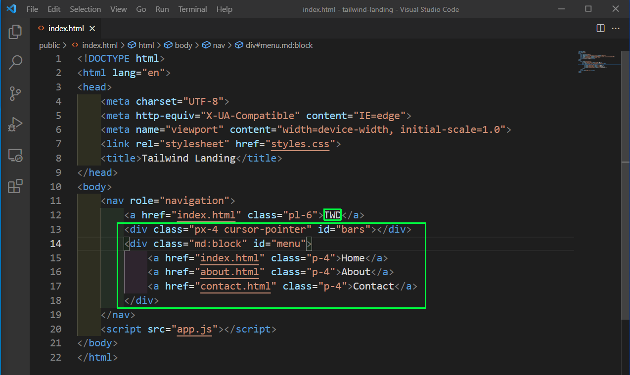 More Styles
Now, localhost looks like the below screen in desktop view.
 Desktop view
Next, we will add all the styles to our nav. The elements mean the following.
    **flex **- makes children flex items
    **justify-between** - justify-content: space-between;
    **items-center** - align-items: center;
    **h-16** - height: 4rem;
    **bg-gradient-to-r** - background-image: linear-gradient(to right, var(--tw-gradient-stops));
    **from-yellow-700** - Abovve gradient start value
    **to-yellow-600** - Gradient end value
    **text-white** - text color white
    **relative** - position: relative;
 navbar
Now, for the mobile view, we want to show a mobile bar. We can get nice icons from https://heroicons.dev. So, head over to it and search for ‘Menu’. You just need to click it and the SVG will get copied to the clipboard.
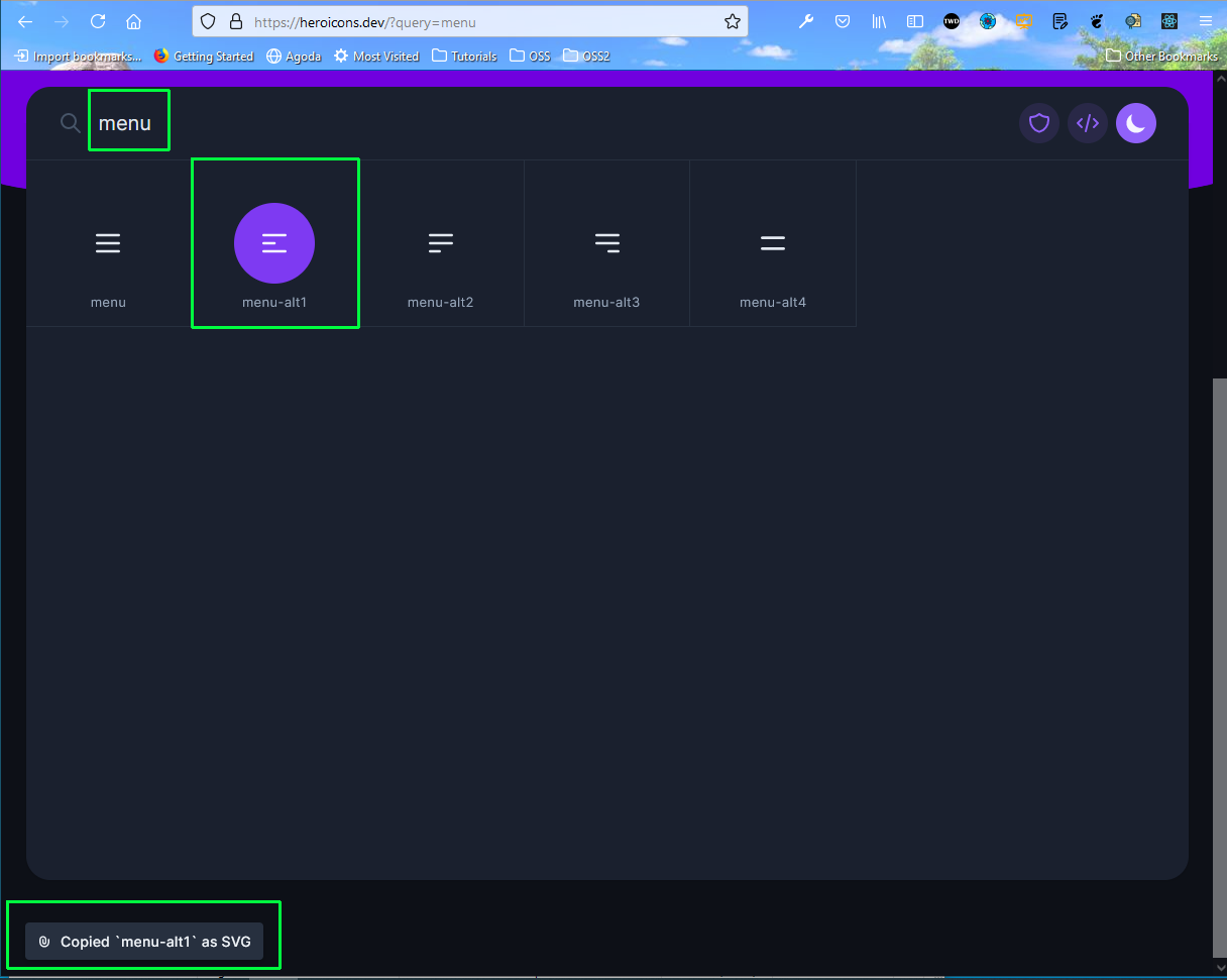 heroicons
Now, we have pasted the SVG in the bars div. Also, added md:hidden to the div, so it will not be shown on the desktop screen.
Similarly, our menu div is hidden. So, it will not be shown in mobile view, but only in desktop view.
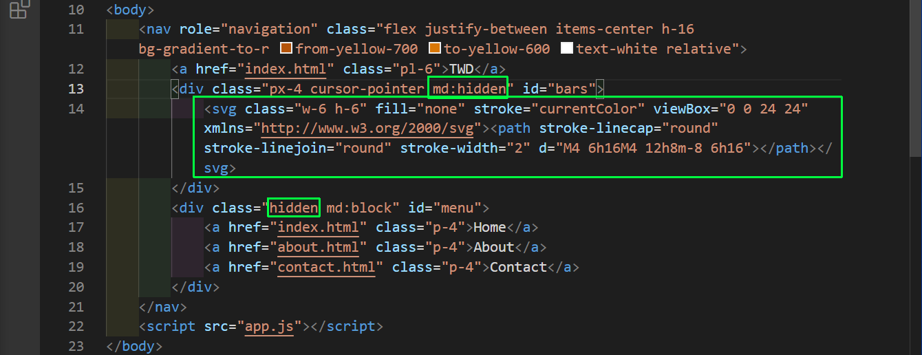 index.html
Now, our mobile view is showing perfectly.
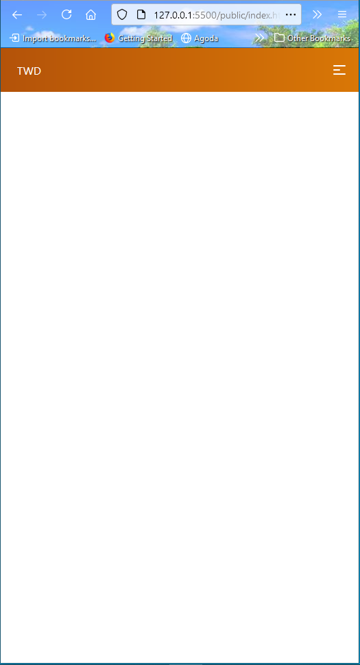 Mobile view
Now, we will start to show the background image on our site. For this, below the nav, create a div to show the image, which we have stored earlier. Here, the different element mean:
    **bg-no-repeat** - background-repeat: no-repeat;
    **h-screen** - height: 100vh;
    **bg-center** - background-position: center;
    **bg-cover** - background-size: cover;
    **flex**, **justify-center**, **items-center** - Explained earlier
    **background-image** - To give the image
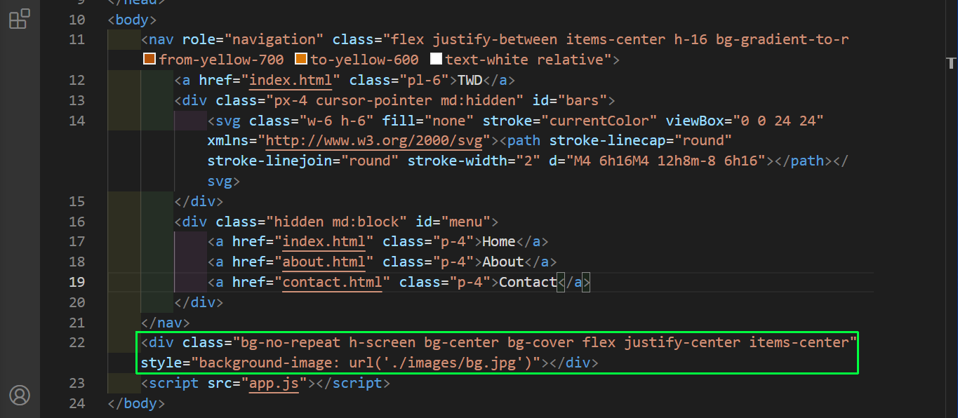 flex
flex
Now, the image is showing perfectly.
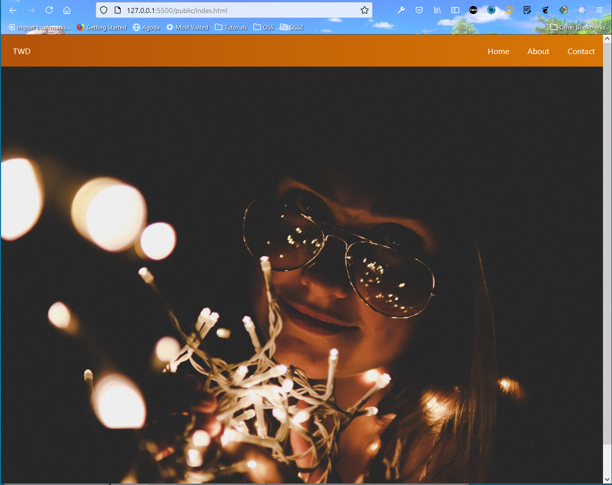 Background image
Now, we will put a text inside the image. So, in an h1 tag, add the following styles. We have three size of text, one for large screen, desktop screen and other for mobile screen. The styles mean: .
    **text-9xl** - font-size: 8rem;
         line-height: 1;
    **text-6xl** - font-size: 3.75rem;
         line-height: 1;
    **text-4xl** - font-size: 2.25rem;
         line-height: 2.5rem;
    **mb-10** - margin-bottom: 2.5rem;
    **text-yellow-600**, **hover:text-white duration-300** - self-explanatory
 h1
h1
And our text is showing like the below screen in desktop view.
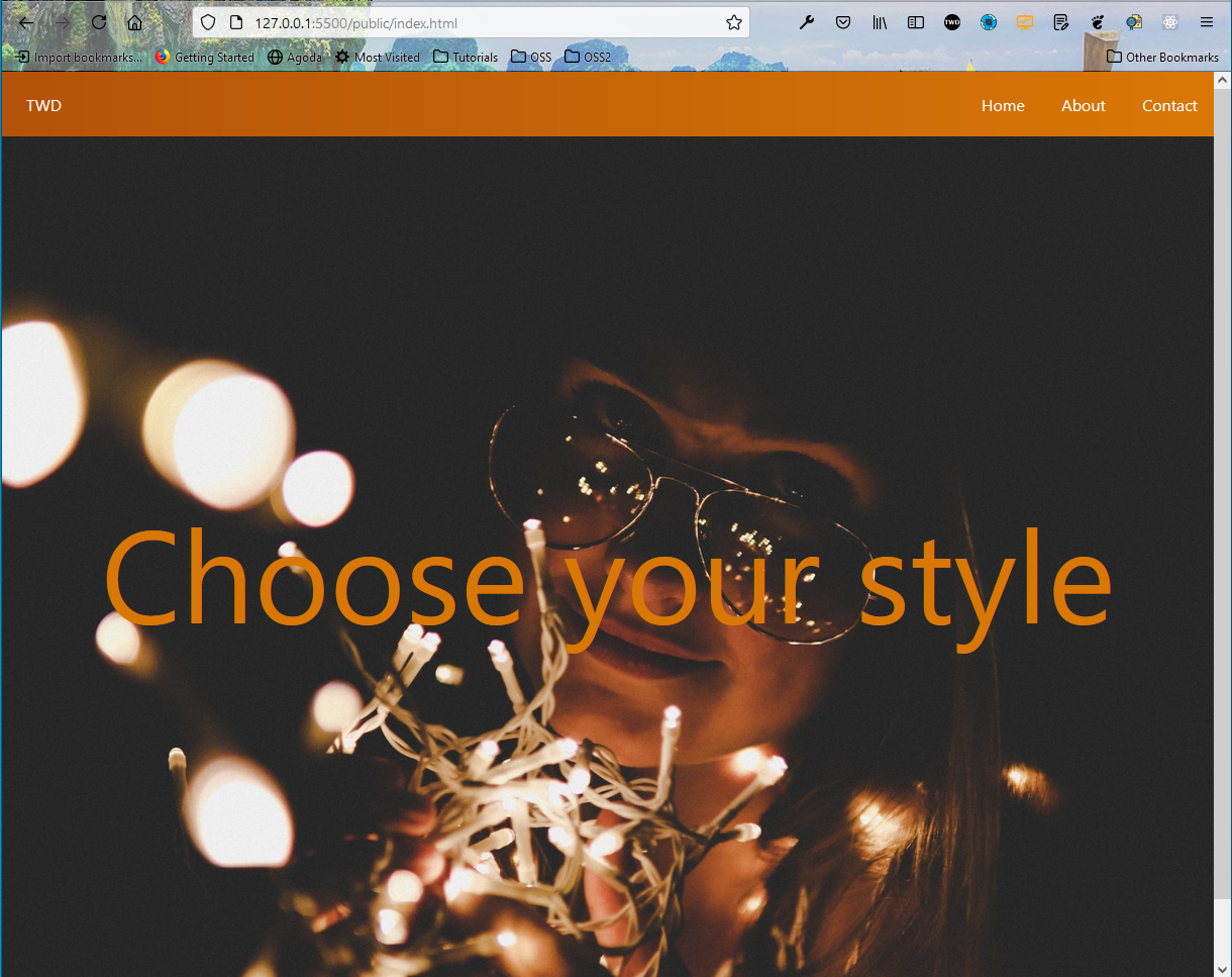 localhost
Next, we will add an anchor tag below our h1. It contains the word Explore and an SVG for arrow, which we again got from the heroicons.dev site. We have also wrapped the h1 and anchor tag, with a div used to center everything and make it bold.
All the styles used in the anchor tags have been used earlier and the transform changes the scale, once we hover over it.
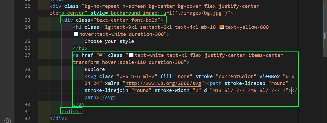 anchor tag
Now, our desktop site is complete and is looking like:
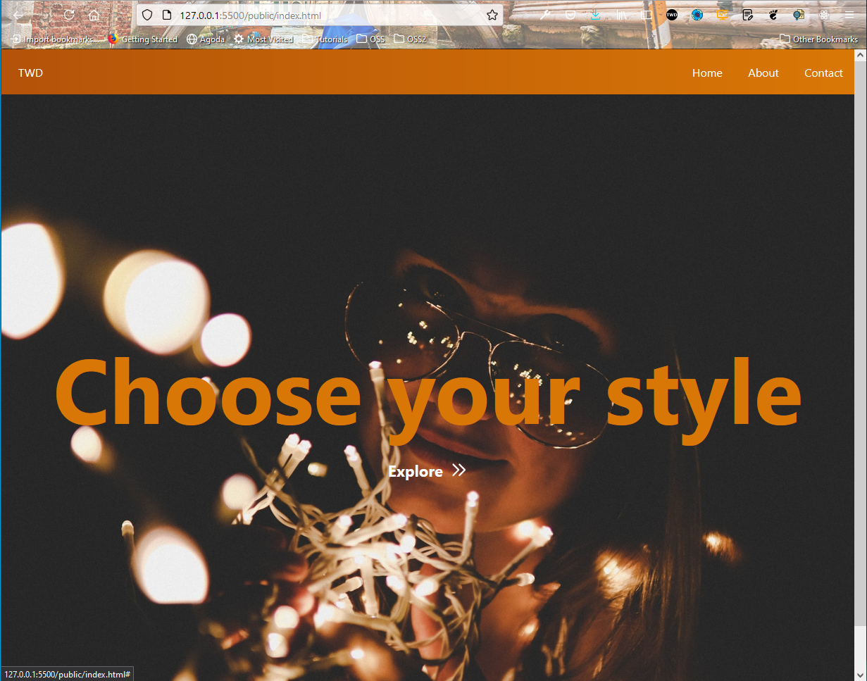 Desktop site
Now, in the mobile site, we want the bar to be clickable and show the menu. This functionality, we will be adding from the app.js file.
Here, we are first targeting the bars and the menu id. Now, we have added an event listener in bars and on clicking it, we are checking whether the menu contains a hidden class. It contains the hidden class first, so we remove it and then add additional classes to have a flex box, with direction column. The else part checks if the hidden class is not there, in which case it adds it.
We also have another event listener on window. It is created to check the special condition of a user changing from mobile view to desktop view, while the menu is open.
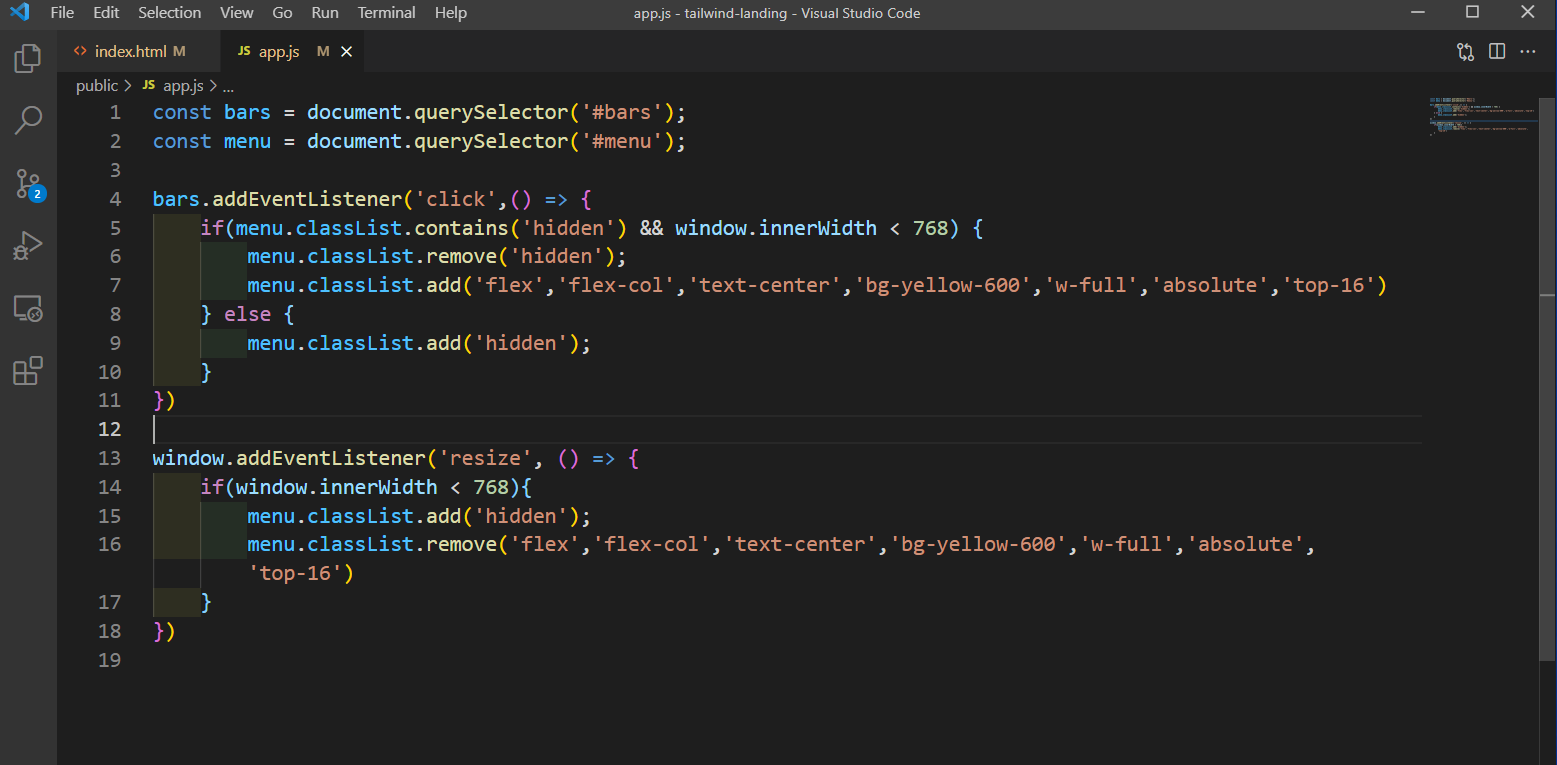 app.js
Now, our landing page is complete and fully working.
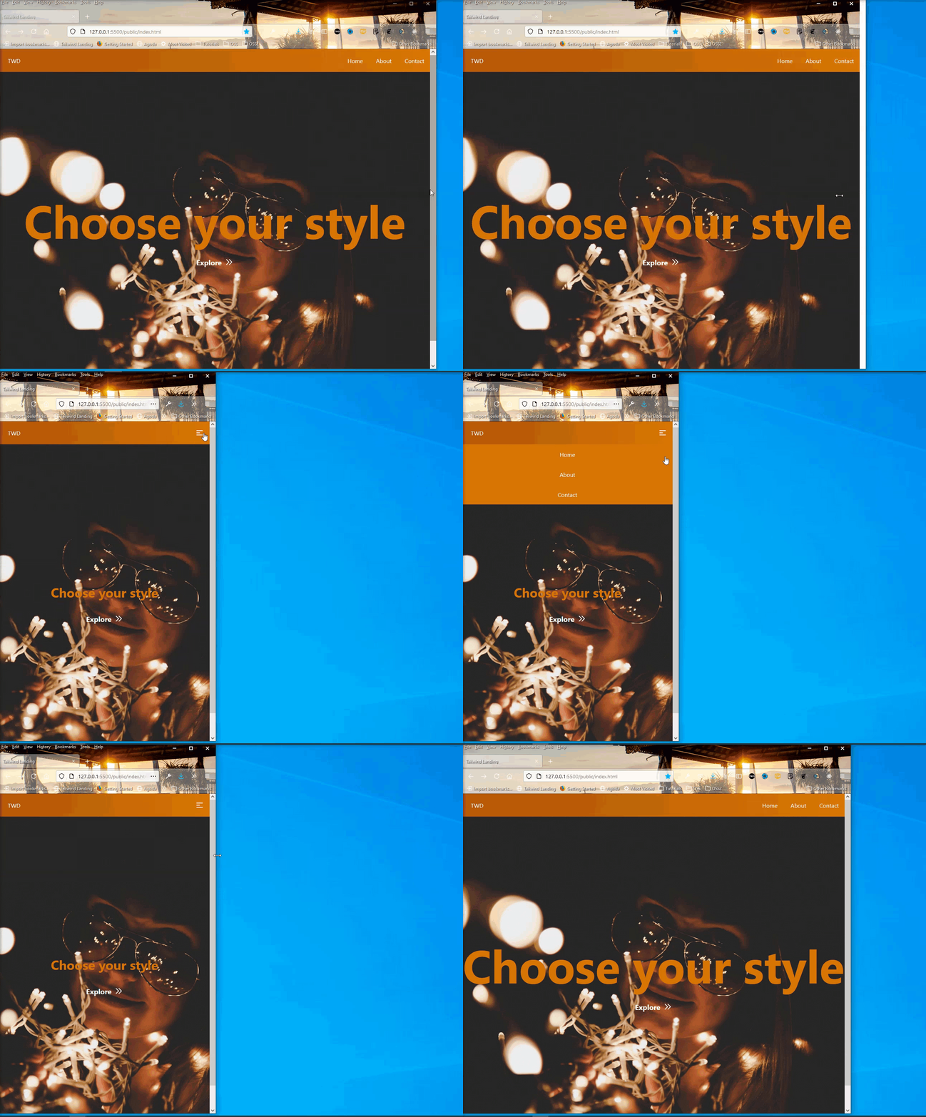 Site complete
You can find the GitHub repository for the same here.