Fixing my mobile site issues with position sticky
by Nabendu Biswas / June 28th, 2020
#javascript #css #gatsby
Series: Thewebdev-fixes
I get a lot of visits from mobile devices in my site https://thewebdev.tech/ and i got some issues while visiting my site on mobile.
So, finally decided to fix it. The first issue comes when the site loads, it shows the taglist component in the middle for a second.
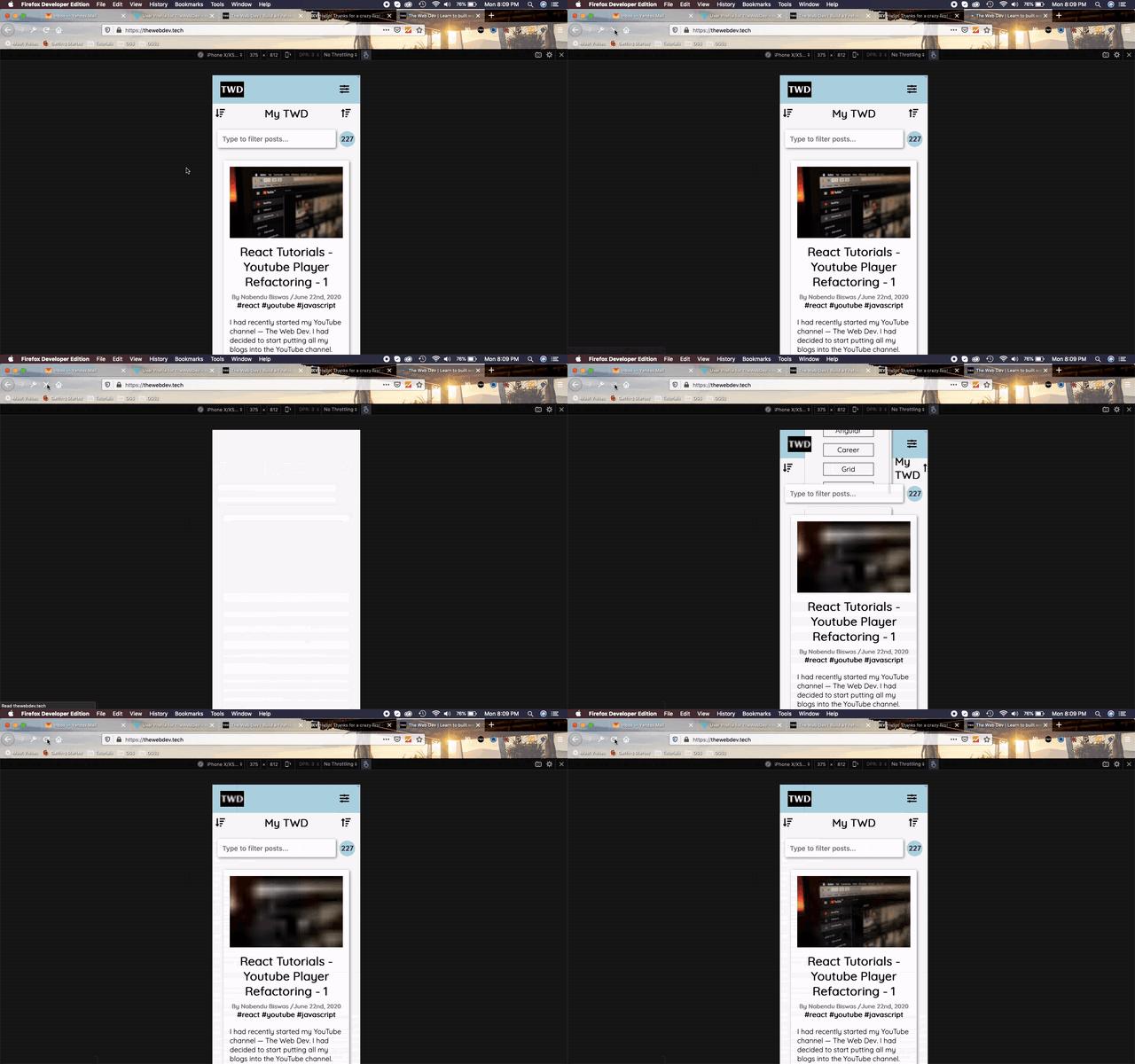 Site Loading
I did the following changes in home.module.css file. So, instead of display: none, i am using another trick to take the items, which needed to be hidden out of the screen.
Next, i am also making the mobile-menu sticky, so that it stays even if the user scrolls the page.
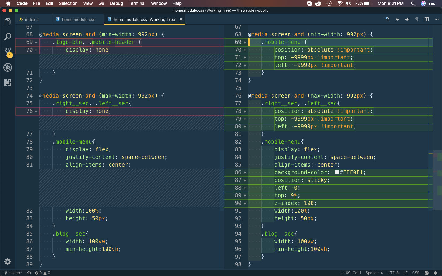 home.module.css
Now, i am also making the main navbar sticky on all screens, by again making it position: sticky in navbar.module.css file.
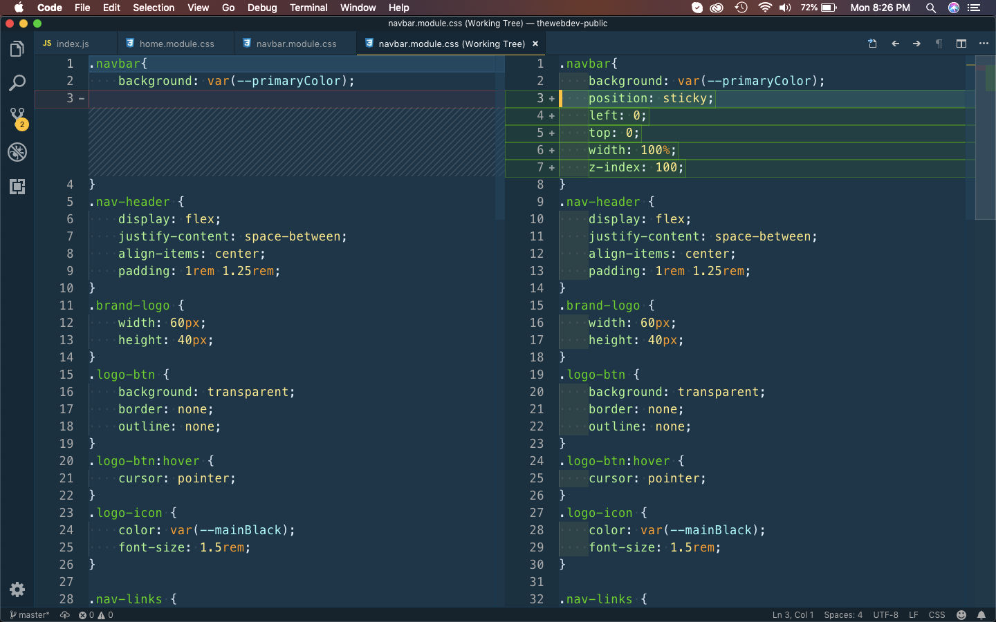 navbar.module.css
After this we are making the left menu in mobile of position: fixed and also increasing the width a bit. We are updating it in the Menu.styled.js file.
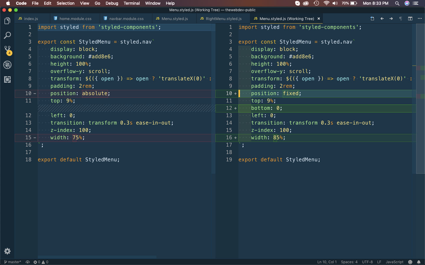 Menu.styled.js
Let’s also make the same changes in the right menu by updating the RightMenu.styled.js file.
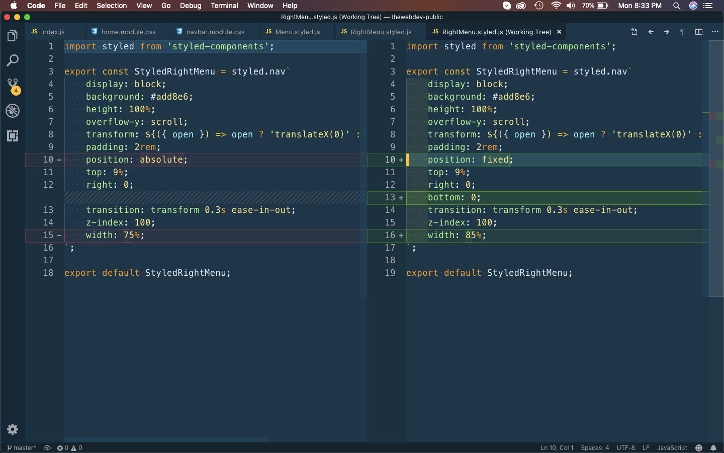 RightMenu.styled.js
Now, it fixes our mobile issues and the site is working fine.
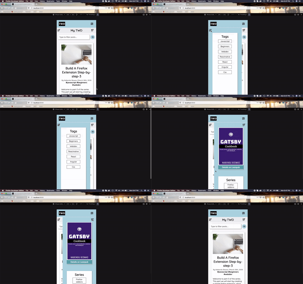 Issues Fixed
This completes the fixes and i had pushed the code to the public github repo here.